July 29, 2010

Juicy Camouflage


Not quite sure the theoretical implications of this object, but a friend once said to me, "this is like candy: I'm not sure if it's good for me, but I love it."

July 25, 2010

Style as Substance: Some Words on Betty Draper's Victorian Nonsense and Other Things Too

With the fourth season of Mad Men quickly approaching, I found myself spending the better part of today thinking about criticism the show has received for being more style than substance. That is, for covering up its plot imperfections with a slurry of beautiful objects: people, dresses, furniture, and everyday knick knacks.

In a lengthy critique of Mad Men, Mark Greif wrote in the London Review of Books (October 2008) that the series consisted of “soap opera antics” and inaccurate depictions of the history of advertising. Such flaws were apparently too much for the viewer to recover from. Slate Magazine (September 2009) picked up where Greif left off, denouncing the show as nothing more than a “guilty pleasure tv commercial.” 

It appeared as though Mad Men’s most serious flaw was that it looked too good. The image of the show was overpowering. Aesthetics had trumped content. The television show has become some sort of super-designed object - the motion picture equivalent of this.

Despite the critiscm, or perhaps in response to the criticsm, producer Matt Weiner created an episode that propelled the role of style into a much larger and aggressive role, marking what I consider to be a turning point in the series.  This all goes down in season 3 episode 7 for all of you Mad Men junkies, where conflicting desires for the future are told through design. 

For example, we see Duck, a fired executive from Sterling Cooper, attempt to exact his revenge by asking Sterling Cooper's own Peggy to join his company.  He does this by sending Peggy a designer Hermès scarf which she lovingly holds while contemplating his intentions.  Also we discover that Betty Draper’s secret affection for Henry (a politician whose job at selling ideas is ironically similar to Don Draper’s job in advertisement) is reciprocal when he "fondles" a stainless steel matchbox which has fallen out of her purse.  

The undoubted star of the episode, and the provocateur of my interest in all of this, is an awkwardly large antique Victorian sofa lovingly called the "Fainting Couch." This comes after the Drapers' living room gets a fresh make over with sleek new modern furniture.  Betty purchases the piece of furniture while on a low key date with Henry and - going against the advice of her decorator - places it directly in front of their fireplace: 
Decorator: What were you thinking!? It's awful. 
Betty: It's an antique.
Decorator: We discussed this for months, and we decided antiques were expected. Look around! You have ruined the whole room.
If the modern object embodies technologically sophisticated, opportunistic and forward-looking aspirations of modernism, Betty's purchase of an antique victorian sofa reveals her desire to return to the past. Her marriage trouble with Don, and her nostalgic home décor (have you seen that kitchen wallpaper!?) and traditionalist sensibilities, paired with Don's unavoidable focus on his future with Sterling Cooper are reflected in her affection for the Fainting Couch.  Betty argues with Don over his hesistance to sign a three year contract at work: "What's the matter?  You don't know where you're going to be in three years?"

Only a piece of massive fireplace-blocking victorian nonsense amidst a room of modernist designer objects could project the image of Mad Men's increasingly troubled relationships.  Further adding to the chaos of season 3 is the fact that all of this plays out amidst a growing tension between the city and the suburb: the masculinity of the corporate office place of the 1960’s vs. the femininity of domestic suburbia of that era.  It is as if the corporate modernism of Don's workplace has invaded the innocence of Betty's home.  


Where Mad Men ultimately succeeds is in the shear defiance of its critics.  Taking their disputed over-reliance on style and making it even more of an issue has created an exciting dialog between the cable tv show and the arts critic.  Interestingly enough, Slate ran another review after this episode aired under the title, “The Fainting Couch for Best Supporting Actor."  I highly recommend it, as Kate Bolick has eloquently described in much better detail Mad Men's reliance on style as substance.

In considering the divide between nostalgia and futurism, a separate, but somewhat relevant topic is the bizarre annual ritual paint companies partake in by selecting a "color of the year."  From Sherwin-Williams:
"In uncertain times, we find comfort in the memories and traditions that provide us with a sense of solid ground...Color plays a key role in triggering our nostalgia, and our Today’s Colors collection is a rediscovery of the styles, textures, patterns ― and hues ― of the past."
Interesting to note is the difference between pre and post-economic crash. For example, in 2007, references to the spirit of adventure, new technology, and the possibilities of the future:
“In 2007, there is an awareness of the melding of diverse cultural influences, and Chili Pepper is a reflection of exotic tastes both on the tongue and to the eye. Nothing reflects the spirit of adventure more than the color red. ... “The color red makes a bold statement. We’re seeing shifts in people’s opinions on current events and major changes in the way they are expressing themselves through new technology. People are open to the possibilities of the future and Chili Pepper celebrates that.”
2010, on the other hand, demands our collective desire for stress relief: 
"Combining the serene qualities of blue and the invigorating aspects of green, Turquoise evokes thoughts of soothing, tropical waters and a languorous, effective escape from the everyday troubles of the world, while at the same time restoring our sense of well being."
 

July 22, 2010

Ecstatic Aesthetics


We have managed to get some words published in the current issue of Beyond Magazine which concerns itself with trends and fads.  Our piece speculates on the legacy of green design. Along with the text, we included some imagery for all of you visual thinkers.

Concurrently, I've somehow managed to convince the Glasgow Film Theatre to prominently display a large exclamation point sign as part of their Empty Plinth Project.  The piece - pending delivery from USA to Scotland via post - will launch GFT's summer art show and will be on display from 26 July to 2 August.

I've been too busy reading this, this, and this to post anything of real substance but that will hopefully change soon as some thoughts on - among other topics - nostalgia, Toy Story, and floating palaces are in the works.  Until then, cheers.

July 20, 2010

Manifesto for Men's Clothing, circa 1913

We support the architectural equivalent of this...
an excerpt from Giacomo Balla, Futurist Manifesto for Men's Clothing, 1913:
"We are fighting against:

(a) the timidity and symmetry of colours, colours which are arranged in wishy-washy patterns of idiotic spots and stripes;
(b) all forms of lifeless attire which make man feel tired, depressed, miserable and sad, and which restrict movement producing a triste wanness;
(c) so-called 'good taste' and harmony, which weaken the soul and take the spring out of the step.

We want Futurist clothes to be comfortable and practical, and:


Dynamic
Aggressive
Shocking
Energetic
Violent
Flying (i.e. giving the idea of flying, rising and running)
Peppy
Joyful
Illuminating (in order to have light even in the rain)
Phosphorescent
Lit by electric lamps."

July 9, 2010

Moving Staircases

Just a quick note about Harrod's Department Store in London from Wikipedia:
"On Wednesday, 16 November 1898, Harrods debuted England's first "moving staircase" (escalator) in their Brompton road stores; the device was actually a woven leather conveyor belt-like unit with a mahogany and "silver plate-glass" balustrade.[3] Nervous customers were offered brandy at the top to revive them after their 'ordeal'."

July 8, 2010

Die Schwyzer Hut

Welcome to Sugarcreek: the Little Switzerland of Ohio!  I discovered this gem of a town purely by accident while browsing through vintage postcard stands at a local antique mall.  Needless to say, a roadtrip is already being planned...


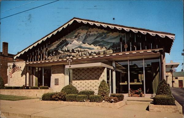
Die Schwyzer Hut!!! "The Swiss Hat Restaurant, Popular Sugarcreek eating place. Sugarcreek is the home of the Ohio Swiss Festival, held the fourth Friday and Saturday after Labor Day each year. It is also the center of the Swiss Cheese industry in Ohio, with 21 factories making 8,000,000 pounds of Swiss Cheese Annually."
Aside from the World's Greatest Decorated Shed (pictured above), Sugarcreek, Ohio is also where you can find the Reeves Banking and Trust Company Building.  Aesthetically, I admit this is quite radical and challenging to take in: an optimistic blend of mid-century modernism, Swiss traditionalism, and Bob Ross. 


As mentioned earlier, plans are in store for a visit during the much anticipated Ohio Swiss Festival in early October. More images to come then...