Showing posts with label decorated shed. Show all posts

July 8, 2010

Die Schwyzer Hut

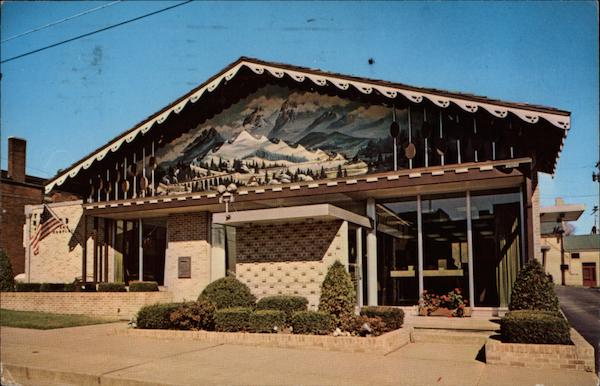
Welcome to Sugarcreek: the Little Switzerland of Ohio!  I discovered this gem of a town purely by accident while browsing through vintage postcard stands at a local antique mall.  Needless to say, a roadtrip is already being planned...


Die Schwyzer Hut!!! "The Swiss Hat Restaurant, Popular Sugarcreek eating place. Sugarcreek is the home of the Ohio Swiss Festival, held the fourth Friday and Saturday after Labor Day each year. It is also the center of the Swiss Cheese industry in Ohio, with 21 factories making 8,000,000 pounds of Swiss Cheese Annually."
Aside from the World's Greatest Decorated Shed (pictured above), Sugarcreek, Ohio is also where you can find the Reeves Banking and Trust Company Building.  Aesthetically, I admit this is quite radical and challenging to take in: an optimistic blend of mid-century modernism, Swiss traditionalism, and Bob Ross. 


As mentioned earlier, plans are in store for a visit during the much anticipated Ohio Swiss Festival in early October. More images to come then...

April 15, 2010

You're In Boot Country Now, Son

Behold, a decorated suburban ranch building. It brings to the commercial strip a refreshing mash-up of dazzle camoflauge and country nostalgia, Boot Country is a western themed store specializing in cowboy boots & hats for suburbanite cowboys (a fascinating demographic). Nevertheless, we need more aesthetically experimental buildings such as this:


An example of well-designed cow patterning: a large centralized spot conveniently covers an unsightly vent.


A bit of the stylized cow patterning from the prominent front facade made its way to the side of the building as if to thank the curious onlooker for exploring the depths of the building.  This is the best vantage point to take in the diagonal "work" themed yellow-black striping.  The pattern is mirrored along the center peak of the gable roof, wrapping smoothly around the building without breaking stride. 


A nice roadside sign with typography that bends and curves to fit the shape of a boot.

April 13, 2010

Adventures at Carnival Island

Carnival Island has been open for only two months, yet is quickly becoming an iconic local establishment.  Locals may recognize the Carnival Island name as it was open in years past, however this year a greatly expanded menu has helped to create an entirely new experience.  What is most satisfying about Carnival Island is their commitment to the local community.  Nestled among car dealerships, community colleges, and big box retailers, Carnival Island's unlikely location is one of  it's biggest strengths.  The corporate office park like setting provides a convenient dining option for nearby businesses and students.  This summer, the restaurant plans to provide extended hours to serve a crowd of baseball players from nearby ball parks. 

The approach to Carnival Island is most deceptive. Things that will run through your head while navigating to this miniature sized carnival food eatery is: 1.) Google Maps have deceived me; 2.) Car salesmen must love carnival foods; 3.) The restaurant is desperately in need of a sign as big (or bigger than) their building. 

Ice cream stands have a long history of uniquely attractive aesthetics and Carnival Island does not disappoint.  The overall design of the building is just as unexpected as the eatery's location. It is essentially a mobile home outfitted with restaurant equipment and flashy decoration. A water theme dominates the design of the exterior: applied wavy water graphics (perhaps inspired by Cincinnati's official flag?), an offset steamboat paddle wheel-styled roof canopy, all surrounded by Boise State blue landscaping pebbles.

Alternative design ideas could have incorporated faux palm trees, and/or steamboat gothic extreme ornamentation.

And what about the food? I opted for the "Carnival Fries" because of their catchy name and the footlong hot dog sans chili due to the fact that I would be eating while driving (a tricky act made all the more dangerous due to the elongated size of my meal). I passed on the ice cream, which gives me a good reason to return in the summer.

All in all, Carnival Island - in all of it's authenticiy and mystique - has the potential to become a suburban equivalent of Los Angeles' famous Pink's Hot Dogs  What is needed is more experimentation with the menu, and an expanded identity (specifically it's signage & packaging is lacking).  If you're in southwest Ohio, check it out.

April 6, 2010

Carnival Island

Driving through a landscape of parking lots and aging big box retailers, I discovered utopia, otherwise known as "Carnival Island." Coming soon, some thoughts and images about one of the most bizarre places I've seen. In the meantime, enjoy these:

February 21, 2010

A Journey to the End of the World

We found ourselves in a strange place, deep within the mysterious Ozark Mountains.  A sacred place which has seemingly shut down for the winter, or perhaps has been abandoned?


This bizarre victorian-brutalist combo appeared to us as a Hollandsian-Hatherlian mash up. Our curiosity had been peaked. We pressed onward. 


 Was this a guard tower, or an observation deck? Or a monument to nature!?  No time to stop and find out. The Towne Centre was quickly approaching.

December 15, 2009

Extra-Ordinary Buildings

Extra-Ordinary architecture is the opposite of Extraordinary architecture. It is terrible and naughty. In adopting Venturi's definition, Extraordinary (EO) architecture is heroic & original, while Extra-Ordinary (E-O) architecture is ugly & ordinary.

EO vs. E-O:
Homecoming Queen vs.Ugly Duckling
Iconic Buildings vs. Ordinary Buildings (subverting Iconic Buildings)
"Duck" vs. "Decorated Shed"
$$$$ vs. $
"I fit in with the crowd" vs. "I am (flamboyantly) restrained"
minimalism vs. M A X I M A L I S M
high art vs. pop art
"idiot avante garde" vs. "everyday populism"
"good" aesthetics vs. "bad" aesthetics
critically acclaimed vs. offensive and embarassing to the profession

Figure 1: "Look at me."

A simple wood-clad gable shed outshines it's historic brick-clad neighbors by presenting an attention-grabbing false front facade to the street.

Figure 2: "Monumentally tiny."


A curiously small, unassuming concrete building stands along side typical residential buildings. Perhaps a long lost twin brother of an obscure conceptual Corbusian house?

Figure 3: "Historical Marker."


One of my personal favorites: an economical concrete block office wearing a rather spectacular historic cupola top hat. This perhaps is the defining image of an extra-ordinary architecture.

Figure 4: "Elevated to new heights."


A shotgun-style house monumentally elevated on a CMU block pedestal. I am giddy with anticipation awaiting the installation of an equally monumental staircase for the front door (which seems quite lonely right now).

Figure 5: "Suburban Irony."


Oops! An asymmetrical entrance on an otherwise perfectly symmetrical building. Those witty developers! How dare them!

Figure 6: "Tectonic Follies, or, Built Jokes."


Ahhh suburbia: A large surface parking lot is presented with a monumental entrance to a retail building...just kidding. That's a brick wall. Ha. You stupid shoppers. This building mocks its want-to-be shoppers, luring them into parking near what they think is the entrance, only to force them to walk all the way around to the entrance on the opposite side.

December 6, 2009

Dueling Doors

dontknockitecture and myself have decorated the front door to my apartment to look like a door. Bet you can't guess which door is mine...


December 4, 2009

Decorated Sheds and Other Things


In the spirit of the upcoming holidays, the Mockitecture WebLog has designed a series of Christmas cards!  A collection of beautifully photographed modernist buildings have been unnecessarily decorated with festive holiday ornaments.  Mies' Seagram Building is topped with a monumental santa hat - and a minimal "clip art" santa hat, at that!  You're welcome, Mies.

Below, Mies' Farnsworth House is cluttered with - among other things - an extra-large inflatable Santa Claus.  It's quite surprising how unrecognizable the building looks under all of that applied ornament.  While designing this image, I came to the realization that high modernist buildings make fantastic decorated sheds.  Their simply pure forms  are essentially blank canvasses for the artist to attack.  Perhaps in the near future we will all be adaptively reusing minimalist glass and steel frame Miesian buildings into neon-clad hot dog stands?  I can only hope so...


I digress.  Next, a view of the Western Approach Car Park in Plymouth (Devon County, UK).  In this surreal scene, massive candy cane columns emerge out of the top deck of the brutalist parking structure.  Meanwhile, Santa is desperately clinging to a rope (detail photo at bottom) presumably because parking garages are lacking chimneys - which happen to be Mr. Claus' most comfortable form of egress.


Upon further research, I have discovered this is the lowest priced car park in Plymouth and is located adjacent to a Toys R Us!  Perhaps Santa was stealing borrowing toys?  As for the candy cane columns, I think they should be added to all brutalist buildings during the holidays.  How could you disagree!?

October 19, 2009

The World's Best Buildings


Earlier this month, Travel + Leisure (T+L) released what they consider to be the 15 "Ugliest Buildings in the World." Today, we would like to release a list of our choices for "Most Beautiful Buildings in the World." The two lists are included below:


Travel + Leisure's Ugliest Buildings in the World:
1. The Ryugyong Hotel, Pyongyang, North Korea
2. Secret Intelligence Service (SIS) Building, London
3. Harold Washington Library, Chicago, Illinois, USA
4. The Obelisk, Puerto Maldonado, Peru
5. Longaberger Home Office, Newark, Ohio, USA
6. Portland Building, Portland, Oregon, USA
7. The Fang Yuan Building, Shenyang, China
8. Bolwoningen Houses, Hertogenbosch, Netherlands
9. National Library, Minsk, Belarus
10. The UFO House, Sanjhih, Taiwan
11. The Ideal Palace, Hauterives, France
12. Metropolitan Cathedral, Liverpool, England
13. The Experience Music Project, Seattle


Mockitecture's Most Beautiful Buildings in the World:
1. The Ryugyong Hotel, Pyongyang, North Korea
2. Secret Intelligence Service (SIS) Building, London
3. Harold Washington Library, Chicago, Illinois, USA
4. The Obelisk, Puerto Maldonado, Peru
5. Longaberger Home Office, Newark, Ohio, USA
6. Portland Building, Portland, Oregon, USA
7. The Fang Yuan Building, Shenyang, China
8. Bolwoningen Houses, Hertogenbosch, Netherlands
9. National Library, Minsk, Belarus
10. The UFO House, Sanjhih, Taiwan
11. The Ideal Palace, Hauterives, France
12. Metropolitan Cathedral, Liverpool, England
13. The Experience Music Project, Seattle

Upon further consideration, you will notice that T+L's list tends to be an assault on (overly-hated) postmodernism. What good does it do to reinforce a grudge that has lasted nearly twenty years!? Nothing like kicking someone when they're down.

T+L's "Worst" list has treaded into the dangerous category of architectural taste and may not come out alive! Comments left by angry readers of the article include titles such as "Author needs to travel more," "Is this a joke?" and "World's Dumbest Author." Contradictorily, the Mockitecture WebLog team fully pardons the author because of his/her name, which happens to be Bunny Wong!

Why are so many people offended with Wong's accusation that these PM buildings are ugly? Perhaps pop architecture - which became too popular to be cool in the 1980's-1990's - has become cool again? ...Or at least enough time has passed for everyone to realize that a select number of buildings on T+L's list are actually stunning examples of innovation, creativity, and ambition.

Take the Longaberger Home Office Building in midwestern America. This classic example of a duck building puts the Longaberger basket company on the map with an iconic headquarters that defines & advertises the company while attracting costumers and providing a memorable sense of place (not to mention an award-winning construction method). If it were not for this building, none of us would know about the Longaberger basket.


Also featured is the Fang Yuan Building in China which successfully merges the eastern and western world with a capitalist/corporate office tower in the distinctive shape of an ancient Chinese coin (another Duck building, for those of you keeping count).


All in all, it turns out the World's Ugliest Buildings are actually rare examples of iconic architecture that dares onlookers to see beyond a hard-to-digest facade of gaudy blue glazing and stylized classical elements. If you indeed succeed at that, you will discover architecture at it's most authentic and aspirational state. I, for one, am looking forward to discovering more "bad" architecture in the near future. By the way, who wants to design a 10-story sofa for Crate & Barrel's headquarters? (Thanks for the tip, Wong).

N_O_R_T_O_N

October 1, 2009

The Ugly Duckling

Figure 1 Charmingly historic victorian architecture encounters a wildly inappropriate variation on brutalism.
In this scene, we see the latter attempting to blend in with the former: a "painted lady" and a want-to-be painted lady. This sets up what I would consider to be a sort of "transvestite" architecture. This simple sketch arises out of a curiosity for historic districts and their overarching control over architectural style and image. These two Painted Ladies raise some interesting questions. For instance, eclecticism (as exhibited on the right) can be a rather complex and witty endeavor. A purely minimal and honest building decorated with vivid layers of paint would make both modernists AND preservationists sick to their stomach. The result of such a pairing of historicism and modernism is something both curious and radical. I wonder what would happen if this situation were reversed: a victorian home force-fed a steady diet of concrete and modernism? Ultimately, the case of the Ugly Duckling is about buildings attempting to be something they are not. Is honesty and authenticity required in architecture today?

My answer to my question is NO - buildings have been lying to us for quite some time now...and we like it! They falsely tell us we have beautiful wood floors when in fact we have cheap, mass produced laminate laid over God knows what. They scream, "I am a brick building," when in fact they are a wood frame box with brick paneling. If such buildings resembled the children's tale, Pinocchio, the awnings over their entryway would project 50 feet outward...a growing nose for every lie they tell us. Perhaps false front buildings are just that: an exaggerated extrusion of the facade.


We live in uncertain and inauthentic times. Consider botox, viagra, and prescription drugs. Miraculous weight loss pills. A food industry with questionable food production, safety, and cleanliness issues. Also consider our suburban homes - especially McMansions - and their simulation of inflated wealth and success. Now everyone can own a mansion! (...or manor, or estate). Perhaps the ultimate image of inauthenticity in contemporary society is last years housing crash and the bursted bubble of wealth so many Americans were led to believe they had.

The Ugly Duckling - in this case a brutalist building forced to become a historic Victorian home - will undoubtedly be the loner of the neighborhood street. It may be laughed at and bullied by other homes in the neighborhood. It will be considered a poser and perhaps even a "Transvestite" Painted Lady. But ultimately it's eclectic image was simply generated by the context of the site: the desired uniformity of historic districts where Painted Ladies reside. For lack of better terms, the Ugly Duckling is successful because it is complex and contradictory. It's presence among Painted Ladies should be celebrated, not shunned! In the end, maybe historic districts are not so bad after all...

[images courtesy of N_O_R_T_O_N, EW and Laser Kit]

August 10, 2009

Newly Discovered Buildings

The blog has been relatively quiet the past few week. My apologies for that. While we get our act together and piece together a few reputable posts, let me share a few pictures from a drive on U.S. Route 50 today, which was largely inspired by Tom Brokaw's continuing explorations of Highway 50 (for the USA TV Network). This is what they have to say about the highway, which is called "the backbone of America":
Highway 50, the central most transcontinental route in the United States, is one of the nation's most historic roads. It spans over 3,000 miles, traversing 12 states and Washington D.C., as it stretches from Ocean City, Maryland on the Atlantic coast to Sacramento, California in the west. Along the way it passes through farmland and suburbs and even the occasional city, past historic Civil War battlefields and iconic Wild West towns, across the Ohio and Mississippi Rivers, the Continental Divide, the Great Plains and the Great Basin, and across a stretch of Nevada where signs proclaim it "The Loneliest Road in America."
I caught a glimpse of a curious little building for sale (the new potential headquarters for Mockitecture operations!? seems fitting...

A curious DUCK building was spotted as well: a "feed & seed" store with a sign proclaiming, "IAMS on sale: a gift from the bakers to the barkers." What's particularly troubling is how that traditionalist looking row house found it's way on top of their roadhouse. Perhaps this is the "Memory Bank" we've been dreaming up?...a symbol of the prominent building typology of a previous era? I wish I had answers.


And one last impressive roadside sign for your enjoyment:


I'm wishing all new buildings delegated that amount of money to unnecessarily spectacular Las Vegas-esque signage. I bet Tom Browkaw is wishing he consulted with the Mockitecture WebLog before his pass through Cincinnati on Route 50. You win some you lose some, Tom.

March 1, 2009

Finding The Greatest Decorated Shed Ever: An Application of Biogeographic Theories and Satellite Imagery

I tweeted this up a few days ago, and I apologize for the delay. It is an incredibly convoluted post, which took more time than usual to put together. In the search for the greatest decorated shed ever, I could not leave out any stops. This would require the big guns. Using sophisticated technology and advanced techniques, I have located a possibility for the greatest decorated shed in the history of mankind. So, here we go. Buckle up.

Based on the process in which geographers hypothesized bin Laden's whereabouts, I have put together a step by step graphic analysis of my own search for the greatest decorated shed. From the initial report:
Distance-decay theory states that as one goes further away from a precise location, there is an exponential decline in the turnover of species and a lower probability of finding the same composition of species. The theory of island biogeography states that large and close islands will have higher immigration rates and support more species with lower extinction rates than small isolated islands.
These theories can be applied over varying spatial scales to posit [the greatest decorated shed's] current location based on [its] last reputed geographic location. Distance-decay theory would predict that [it] is closest to the point where he was last reported and, by extension, within a region that has a similar physical environment and cultural composition (that is, similar religious and political beliefs).
Global Scale

The last known location of the "great decorated shed" phenomenon is Robert Venturi's Fire Station No. 4 in Columbus, Indiana. Ugly and Ordinary, this shed sets the bar high for contemporary sheds. In bin Ladens case, if he strays too far from the Tora Bora region and the tribal areas of Afghanistan and Pakistan, his risk of being turned in becomes greater due to differing cultural and political settings. The shed phenomenon cannot stray too far, because the settings may lack the banality required to support such a pure form of Ugly and Ordinary. {henceforth (U&O)}
Last Known Location of Shed

Using the distance-decay theory, we can assertain that the phenomenon of Venturi's shed would have higher probabilty of residing with in certain distances of its last known location.


Regional Scale


There are two cities nearby which meet our characteristics. Indianapolis is a large metropolitan area approximately 40 miles north. Bloomington is a medium sized college town, approximately 30 miles west. Both are well connected to Columbus and have many similar social structures. Both are with in the distance we would expect the shed to presently reside.
Species have better survival rates on large islands, much like someone hunted by the CIA would have better chances of being anonymous in a city. The shed would have the same inclination to go to a city where it can have other shed to compete against.


N_O_R_T_O_N calls it a duck turned decorated shed. It is a church with no steeple, but a neon "Jesus" sign instead. I was astounded when I saw this marvelous piece of mockitecture. It is the most glorious unwittingly high-folk architecture ever created. I feel truly priveleged to introduce the House of Victory to the world. These pictures were taken after scaling a fence and standing by the guard rail of I-70 west in Indianapolis. The best shots are from the highway. While struggling to get the right angle and light, a police officer approached me. I said I was just taking pictures of the building, and he let me go. He must be down with the shed.

P.S. The Runner-Up is "speedy text/racing sponsorship/looming warehouse/retractable roof" Lucas Oil Stadium...
After careful analysis, Bloomington is ruled out because it lacks banality. With a college and the its beautiful campus, the town of about 60,000 is not U&O enough for this shed. Using the process of elimination, we must move on to Indianapolis.

Local Scale

Using Life History Characteristics (aka Learning From Las Vegas) and another process of elimination: the definition of a decorated shed and physical analysis of potential buildings, three buildings have been selected. They meet the criteria set forth by Venturi, plus they have an added WOW factor. Upon completion of the study... The winner is House of Victory!!! In a landslide!

November 24, 2008

Buildings as Black Holes


Competition among surrounding luxury resorts and casinos in Las Vegas, Nevada has created an environment where each building attempts to "out do" their neighbor. The facade of the new Tropicana Casino in Vegas has been branded as a "WOW" experience by the architects, utilizing interactive media graphics on a glass facade to lure people into the casino. The interior rooms are, by contrast, very generic and not significantly important. The goal is to lure people in, thus creating a massive "black hole effect" on the Strip. As money continues to be pumped into the facades of such buildings, one has to wonder how far the "black hole" concept could be taken. Driven to the extreme, a superior building on the Strip would invest so much money in it's facade, that not enough money would be left for the interior, creating unsafe, and uninhabitable spaces. The very purpose of architecture - to create shelter - becomes threatened in this extreme case: luring in unsuspecting customers only to provide no way out. Black Hole Architecture.

Prada Meets the Wild West


Prada Marfa, located in the desolate West Texas landscape, off of the only major highway to cut through the area, blends advertising and art. It is a "time capsule" specifically designed to decay into the desert (through biodegradable adobe construction), responding to the dozens of decaying American frontier towns. Prada Marfa is part sculpture, part billboard, and part monument to America's consumer culture. For more images and description visit here (*image credits from linked website).