Showing posts with label culture. Show all posts

February 22, 2012

Pop/Building Combo: The Architecture of a Hopeless Place


Rihanna's "We Found Love", and Belfast, Northern Ireland's New Lodge Flats.


Architecture is often used in pop videos to define characters, set up scenarios, and create fictional worlds out of known building types. Rihanna and Calvin Harris' 2011 #1 hit video, We Found Love uses architecture to create a hopeless place. In the video, Rihanna and her love interest are shown falling in and out of love, and she leaves him. Intense scenes depict domestic violence, hallucination, and heartbreak.


What does a hopeless place look like?

The opening scene shows the main character looking out of her window as a narrator solemnly reflects on love and loss in a depressing, mournful tone. Rihanna's dark silhouette is set against images of Modernist housing blocks, the New Lodge Flats in Belfast, Northern Ireland. The use of these multi-story brick and concrete towers conjures thoughts of "hopelessness" in two ways. First, the appropriation of an existing "hopeless place" immediately sets the tone. It recalls the failed utopia of post-war housing, more specifically London's Robin Hood Gardens or Chicago's Cabrini Green. Our story is taking place inside the commonly understood, zombified grimness of project housing. Secondly and more subliminally, the out-of-scale authoritarianism of the minimal buildings make us feel defeated and ultimately, hopeless. In Kubrick's A Clockwork Orange, the same sort of failed, dystopian environments depict a future which is not bright, and not necessarily even possible. The last "future" never arrived, so why would any of today's dreams come true? Place-imagery associated with drug use is also implemented, such as skateparks, casinos, and late-night fast food restaurants. These places, as cultural signifiers, also serve as the backdrop for a lower-class narrative*, implying a financial hopelessness in addition to escalating substance abuse. Shots of pills and dilating pupils reminiscent of Aronofsky's Requiem For a Dream are mixed with fast-motion cuts of busy streetscapes. 


Despair also exists architecturally at the scale of the interior. The window apartment in which much of the story takes place is sparsely decorated, its bare white walls glowing with dull blue light. Here we witness a sex scene, drug use and subsequent domestic violence. This small space with no outside view turns architecture into a prison, shutting us away from the outside world, alone with our vices and demons. Confinement suggests entrapment spatially and emotionally, a form of hopelessness. If a hopeless place is confining, then a place full of promise, such as the setting for Timbuk 3's "The Future's So Bright", is often open and limitless. In the 1989 video, a pair of musicians sits outside of a camper in an inspiring, boundless desert landscape singing "The future's so bright, I gotta wear shades." The camper, along with the open road and big sky, is the perfect metaphor for hope. An endless amount of opportunity exists over the next horizon. The RV is only a small dot in the huge, open landscape. Early in the Rihanna video, the couple is outside when they are happily falling in love. They run through a field, and go to a rave in an open space. These open settings facilitate the good times of the blooming relationship. Most of the negative parts of the relationship take place inside. Good things happen outside, bad things inside. Spatial confinement is employed as both an atmospheric and symbolic element. 


These distinctions are often clear, but as the story unfolds, they become blurred, creating emotional disorientation. Love can be ambiguous, both positive and negative at the same time. The blurring of inside and outside via projected images creates the sensation of simultaneous love and hate, hope and despair, and the confusing entrapment of an abusive relationship. This ultimately distorts our sense of spatial reality. As the two fall in love, images of flowers blooming cover the walls of the apartment and Rihanna. This obvious visual reference to blooming love is also an expression of hope. When the strained relationship boils over and a video of a collapsing building is shown on a crying Rihanna. After a couple of cuts to shots of crying and drug use, burning buildings are projected onto her face. This blurring via exterior imagery in interior space is also hallucinatory, an important theme of the video.


Additionally, geographic disorientation is used analogously to emotional distortion. In order for the setting to be completely depressing, it must be devoid of geographical connotations that could suggest success. We do not make the connection that the actual buildings are in Northern Ireland, we simply make associations based on the image of this particular typology. The housing projects are cross-cultural in their evocations; there is no specific culture attached. This story could be taking place anywhere. If it were set in a specific city or place, then we could bring in our own biases. This "town" is more grim than any on earth. It is a place designed to convey hopelessness. All we see are generic buildings, such as fast food restaurants, casinos, and modernist housing blocks. While the video was filmed in Northern Ireland with an English boxer, Dudley O'Shaughnessy, as the supporting role, the aesthetic is a blurring of cultures. Rihanna's clothing is decidedly punk, colored in the hues of the American flag. This blurring of place and cultures eliminates cultural biases and therefore creates a blank canvas for the horrors of the drug-influenced love story. It allows us all to identify with it, because it could be anywhere. 


Architecture is this case is used as a metaphor for larger human expressions. Collapse, burning, entrapment, and longing are projected by using architecture as a narrative device. In the case of pop videos, architecture is often used this way.


*Similar to the supermarket in Pulp's Common People, a song about how a well-off woman cannot truly be "common", though she tries by sleeping with a common person, because she will always have a way out of poverty.  She will never actually feel the hopelessness being stuck in the lower class. The two videos explore different themes of class hopelessness, though Rihanna's creates a much more grim and drug fueled view of a hopeless situation.

**Another Pulp analogy: The architecture in We Found Love becomes people, as in Sheffield: Sex City.  In the song, Cocker tells a tale of his hometown as an object of sexual desire. "The city is a woman." While cocker fornicates with the city and a tower collapses in a building-scale orgasm via all of its residents simultaneous climax, Rihanna's imagery depicts a building collapsing under the stress of a failing relationship.  Her destruction is more emotional, but both Cocker and Rihanna make analogies to the character-role of architecture in pop.  For more on Pulp, see Owen Hatherley here or here.

November 9, 2010

Slow and Steady Wins the Race

nice piece of writing over at Frieze Mag:
Perhaps the truest screw heir is Paul Octavian Nasca, a Romanian programmer who wrote the software used to create recent viral hit ‘U Smile 800% Slower’ (2010) – a Justin Bieber track stretched to 800 percent of its original length while the pitch remains unchanged. A Florida-based electronic musician used Nasca’s algorithm to smear the three-minute single into a half-hour epic of shimmering, sensual ambience. Bieber-haters and his legions of fans were equally enthralled by the transformation, which made the Canadian teen star’s corn-syrup pop sound like Icelandic band Sigur Rós. In less than a month, it was heard by more than two million people, received the endorsement of Mr Bieber (he tweeted: ‘this version of u smile is incredible to just chill out and fall asleep to. feels epic’), and spawned copycat slowdowns. - Jace Clayton, Music: The slowed-down tempos of screw and its influence on contemporary bands

July 29, 2010

Juicy Camouflage


Not quite sure the theoretical implications of this object, but a friend once said to me, "this is like candy: I'm not sure if it's good for me, but I love it."

July 25, 2010

Style as Substance: Some Words on Betty Draper's Victorian Nonsense and Other Things Too

With the fourth season of Mad Men quickly approaching, I found myself spending the better part of today thinking about criticism the show has received for being more style than substance. That is, for covering up its plot imperfections with a slurry of beautiful objects: people, dresses, furniture, and everyday knick knacks.

In a lengthy critique of Mad Men, Mark Greif wrote in the London Review of Books (October 2008) that the series consisted of “soap opera antics” and inaccurate depictions of the history of advertising. Such flaws were apparently too much for the viewer to recover from. Slate Magazine (September 2009) picked up where Greif left off, denouncing the show as nothing more than a “guilty pleasure tv commercial.” 

It appeared as though Mad Men’s most serious flaw was that it looked too good. The image of the show was overpowering. Aesthetics had trumped content. The television show has become some sort of super-designed object - the motion picture equivalent of this.

Despite the critiscm, or perhaps in response to the criticsm, producer Matt Weiner created an episode that propelled the role of style into a much larger and aggressive role, marking what I consider to be a turning point in the series.  This all goes down in season 3 episode 7 for all of you Mad Men junkies, where conflicting desires for the future are told through design. 

For example, we see Duck, a fired executive from Sterling Cooper, attempt to exact his revenge by asking Sterling Cooper's own Peggy to join his company.  He does this by sending Peggy a designer Hermès scarf which she lovingly holds while contemplating his intentions.  Also we discover that Betty Draper’s secret affection for Henry (a politician whose job at selling ideas is ironically similar to Don Draper’s job in advertisement) is reciprocal when he "fondles" a stainless steel matchbox which has fallen out of her purse.  

The undoubted star of the episode, and the provocateur of my interest in all of this, is an awkwardly large antique Victorian sofa lovingly called the "Fainting Couch." This comes after the Drapers' living room gets a fresh make over with sleek new modern furniture.  Betty purchases the piece of furniture while on a low key date with Henry and - going against the advice of her decorator - places it directly in front of their fireplace: 
Decorator: What were you thinking!? It's awful. 
Betty: It's an antique.
Decorator: We discussed this for months, and we decided antiques were expected. Look around! You have ruined the whole room.
If the modern object embodies technologically sophisticated, opportunistic and forward-looking aspirations of modernism, Betty's purchase of an antique victorian sofa reveals her desire to return to the past. Her marriage trouble with Don, and her nostalgic home décor (have you seen that kitchen wallpaper!?) and traditionalist sensibilities, paired with Don's unavoidable focus on his future with Sterling Cooper are reflected in her affection for the Fainting Couch.  Betty argues with Don over his hesistance to sign a three year contract at work: "What's the matter?  You don't know where you're going to be in three years?"

Only a piece of massive fireplace-blocking victorian nonsense amidst a room of modernist designer objects could project the image of Mad Men's increasingly troubled relationships.  Further adding to the chaos of season 3 is the fact that all of this plays out amidst a growing tension between the city and the suburb: the masculinity of the corporate office place of the 1960’s vs. the femininity of domestic suburbia of that era.  It is as if the corporate modernism of Don's workplace has invaded the innocence of Betty's home.  


Where Mad Men ultimately succeeds is in the shear defiance of its critics.  Taking their disputed over-reliance on style and making it even more of an issue has created an exciting dialog between the cable tv show and the arts critic.  Interestingly enough, Slate ran another review after this episode aired under the title, “The Fainting Couch for Best Supporting Actor."  I highly recommend it, as Kate Bolick has eloquently described in much better detail Mad Men's reliance on style as substance.

In considering the divide between nostalgia and futurism, a separate, but somewhat relevant topic is the bizarre annual ritual paint companies partake in by selecting a "color of the year."  From Sherwin-Williams:
"In uncertain times, we find comfort in the memories and traditions that provide us with a sense of solid ground...Color plays a key role in triggering our nostalgia, and our Today’s Colors collection is a rediscovery of the styles, textures, patterns ― and hues ― of the past."
Interesting to note is the difference between pre and post-economic crash. For example, in 2007, references to the spirit of adventure, new technology, and the possibilities of the future:
“In 2007, there is an awareness of the melding of diverse cultural influences, and Chili Pepper is a reflection of exotic tastes both on the tongue and to the eye. Nothing reflects the spirit of adventure more than the color red. ... “The color red makes a bold statement. We’re seeing shifts in people’s opinions on current events and major changes in the way they are expressing themselves through new technology. People are open to the possibilities of the future and Chili Pepper celebrates that.”
2010, on the other hand, demands our collective desire for stress relief: 
"Combining the serene qualities of blue and the invigorating aspects of green, Turquoise evokes thoughts of soothing, tropical waters and a languorous, effective escape from the everyday troubles of the world, while at the same time restoring our sense of well being."
 

April 24, 2010

Making Meaning

Andy warhol eating a hamburger:

By creating a four minute video of himself eating a hamburger, Warhol - among many other things - transformed an act of ordinary stature into something quite extraordinary.  It's been suggested that Warhol was mocking his status as a celebrity artist, but perhaps he was just showing us that no matter how hard he tries, he will never be able to create something that is not valued.  He consumes a hamburger, we consume his art; he is "famous," we equate his work with value.

But just how much can the value of an object be pushed? And once value is increased, does it not become that much more desirable? Is "high" art really just "low" art with a mislabeled price tag, sold to an unsuspecting public?

Monica Narula of Delhi-based Raqs Media Collective explored just this topic in a 2006  installation where viewers encountered a stack of postcards in a museum quality display case in front of a large sign reading "please do not touch the art."  The ordinary, unassuming postcard transforms into an object of desire - accessible yet inaccessible all at once.
My point in all of this is that the making of meaning can be more important than meaning itself.  An object is only as beautiful as you are led to believe.

March 24, 2010

Going Gaga for Google

Google's recent announcement to install fiber optic cable systems in at least one American city has unexpectedly unleashed a firestorm of creativity from want-to-be towns of the future.  An entertaining 4 minute news segment from NPR reveals that aside from Topeka, Kanasas' name change to Google, Kansas, many other cities are desperately trying to get Google's attention.  From mock press conferences, to ridiculous publicity stunts, to catchy jingles, to parades; you name it, they've done it.

Quite frankly, we're envious of all the fun everyone else is having.  In response, we've devised our own plan (unofficially on behalf of Branson, Missouri. Their Chamber of Commerce can thank us later). Why Branson? Why not!? Architectural spectacles seem to be at home in Branson. A new city hall building will quite literally put them on the map.

It turns out, designing a Google-themed architectural monument is quite easy, as Google has already done much of the work for us.  First, our building is selected from a variety of pre-established templates.  The classic red map pin icon will do just fine for our project...

Next, we perform a simple Google Maps search for Branson, Missouri which effortlessly provides us what appears to be the towne centre.  Just like that, in 0.25 seconds, we have generated the site for Branson's new administrative headquarters.

And voilà, our building magically appears! It looks beautiful :) 

Branson's City Hall will have a commanding presence over the city below: a powerfully iconic building amidst one of America's greatest collections of iconic buildings.

Surrounded by the vast range of Ozarkian Mountains, only one question remains...when will the fiber optic cables be installed???

March 14, 2010

Some Books and Other Things

Fantastic Journal's focus on the architect's bookcase has gone viral.  In a shameless attempt to piggy back off of FJ's popularity, I present a bookshelf from my apartment.  Most prominently, you'll find a few Robert Venturi classics including copies of Mother's House and Complexity and Contribution.


Looking closer, you'll find a pair of outdated "2006" glasses from New York City's 2006 New Year's Eve, multiple decorative ceramic roosters, and perhaps the creepiest drawing ever created (purchased in Roswell, New Mexico). I am also particularly fond of my coffee table, pieced together from various bits of IKEA components.


October 10, 2009

YouTube As Cultural Vault

It is not often that the Mockitecture Weblog gets to debut a project or artist. Or at least one that anyone else would like to debut.

As the first decade of the 21st century comes to a close (yikes), YouTube has established a prominent role in pop culture. Started as a hosting site, it has quickly become much more. The role of the site has changed dramatically, including a transformation of its use, battles over its use, and the emergence of its meta-use. Within YouTube exists a survey of the current human condition. Reality TV, DIY movies, post-MTV music videos, etc. mesh with rapidly expanding social media. YouTube is not just a media, its is a medium. Many videos on youtube are in response to other videos, and a whole culture has developed within and around it.
YTDJ420_69 has encapsulated the idea of an international cultural vault in his live performances. From the artist's website...
"Part performance piece, part improv DJ set, and part video art, YTDJ420_69 creates a meta-use collage of youtube videos, incorporating youtube's infinite pool of video, music and historical footage. Uniquely tailored to each circumstance, the live YJing events can be anything from poorly executed DJ set to moving cinematographic masterpiece."


Within the format, many issues arise. The idea of chance, not knowing the next video's exact contents is exciting. When mixing, the overlap is the key relational element. A YJ cannot match beats, nor achieve production slickness, so the relationships of individual pieces are much more arbitrary. Further, the amount of information is doubled in YJing. The addition of visual material makes a fourfold matrix of overlay. Because YJing is performed on the fly, there is no way to know exactly what will happen. Chance takes over.

Also, DJ culture is critiqued. Anyone can be a DJ now. Forget turntables, if you have a computer, you're a DJ. Phil Oakey said about early Human League, "We thought we were the punkiest thing going at the time. We didn't even bother to learn to play guitar. We were using one finger." YJing is a part of the disintegration of internet culture. Uh Oh.

Also, the global experience economy is explicitly expressed by and finessed out of the defining internet application of our time. The limits of YouTube are, well, there are no limits. (In George W Bush voice) It is the virtual vault for all cultural artifacts, as well as a working storehouse of ideas. There are very few things as global as YouTube.

The beauty of the meta-use of YouTube and this technique is that when performed live and projected on a wall or screen, the audience can see everything that the YJ is doing on the screen.

August 12, 2009

¡Como tu lo quieres! The Geopolitics of Burger King's Globo-Regional Marketing

One of the most fascinating aspects of Burger King is their highly targeted global marketing campaign. Each country has an entirely different menu and branding strategy. Burger King has implemented cultural research which allows the products to appeal to each unique market. As trends and tastes change, so does Burger King. This approach requires people from all over the world to participate in the business philosophy of BK International.The best example of the Burger King's sublime multi-national scheme is the Chicken Sandwich. Or, in Britain, The Chicken Royale. Or in continental Europe, the Long Chicken. Or, in Spanish speaking countries, the King de Pollo. All the same delicious sandwich, but with different nomenclature. Historically, language has played a significant, almost dominant role in the regional boundaries of culture and politics; the Long Chicken is not immune. Here, the idea is flipped. The language did not form organically four separate words, but the sandwich was specifically named four different ways to adapt to each specific region. In the contemporary Global marketplace, language does not create difference, difference creates language.The same sandwich poses in 4 different ways. Each pose dependant on the targeted consumer. Notice that in the US, he brought a friend.

It is exactly the same sandwich in all the photos. While the lettuce looks equally fake, photo quality, graphics, and framing exemplify the King's Global Marketing adaptability.

The photo quality is different in each design as well. This is when Burger King becomes bizarre. Ordering a Chicken Royale for the first time is weird, but the products and their presentation in El Salvador is plain hilarious. The report between consumer and supplier trumps technical quality in this case. I have always wondered what would happen if Burger King was sold in convenience stores.

Slightly irritated that the Xtra Long Cheese has never made a US debut.Across the World, Burger King takes the familiar and makes it unfamiliar. The Whopper showcased on a soccer field, a burger made of steak, infinite creations, the fantastic flame-broiled hallucinations of a real life Wonka-esque dreamscape.

Argentina...
Mexico...
New Zealand...
Turkey...
Taiwan...

June 25, 2009

Controversial Cartoon Books

After a recent trip to Frisch's, a local cafe-of-sorts, for an all-you-can-eat breakfast on borrowed money (long story), I became captivated by the children's coloring book placemat my friend and I were given. It featured, of all things, dinosaurs with one of the city's architectural landmarks, Union Terminal, in the background!


WOW, I thought...kids of all ages are being treated to a fantastic meal AND are learning about the city's architectural heritage all in one happy event. THIS is what will put the profession of architecture back on the map!!! After some quick research back at the office, I discovered this children's cartoon has some controversial company.

Most notably, FEMA - the United State's disaster management organization - released an infamous cartoon coloring book, titled "A Scary Thing Happened" to the eWorld after 9/11 featuring burning buildings and the twin towers under attack by commercial airlines. Soccer moms nationwide were pissed, and rightfully so! If you have a free two minutes & eight seconds, check out the enjoyable YouTube video below.


Already inspired, I stumbled across more equally frightening coloring book imagery - this time religious-based. Scenes of friendly dinosaurs accompanied by bible verses from the book of Genesis had me trembling.

I came to a couple of key conclusions. The first being, children's coloring books are a creative source of propaganda that ALL governments, religious institutions, etc. should be aware of and exploit to their full advantage. The second being I will NEVER let my kids near crayons and coloring books...EVER.

In response to all of these controversial coloring books, and in the spirit of Contemporary Space's (CS13) recent "Greetings From Cincinnati" opening, I decided to make a coloring book of my own, after all, why not put on a clinic for all of Cincinnati's spoiled little brats? The following pages celebrate everything from the Queen City's colonization of Native American tribes, to our overly-industrialized landscape. CS13 and others doing a fantastic job at cleaning up Cincinnati's image after media attacks year after year were not too pleased with my work. I hope you are repulsed and offended by the following as well.


March 15, 2009

Hands of God Studio


Fantasy Factory is a show based on the premise that Rob Dyrdek has all the money anyone could ask for, and the creativity to match. With basically no one to answer to, he spends his days in his "office," a warehouse in LA where he runs DC Shoe Co. The warehouse is also his blank canvas to do whatever he can dream up, with unlimited resources behind him. Sometimes it is as simple as buying a tennis ball gun and shooting everyone with it, but sometimes he takes on grander challenges.

In this episode, his cousin Drama tells him that he wants to be a record producer, but doesn't have the equipment. So Rob buys him everything he needs. The result is a hodge-podge of "maximalism," and a well-honed balance of meaning and non-meaning. The insane randomness of the space makes it not only work for these guys and express these guys, but also hilarious.

February 17, 2009

Goldstein House vs. Steely Dan

The Goldstein House is John Lautner's 1963 masterpiece. Peg is Steely Dan's 1977 master piece.


McNuggetini


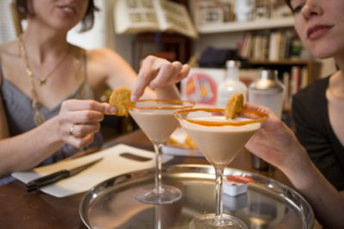
"McDonald's chocolate milkshake w/vanilla vodka, rimmed with barbeque sauce, garnished with a chicken McNugget."

(via thisiswhyyourefat)

February 16, 2009

Taking Graffiti to the Next Level

a MUST WATCH video by an artist named Blu...perhaps you've seen this stop animation classic?  regardless, definitely check it out when you have a free 5 minutes...


January 20, 2009

Obama, McFly, and the Future

First, let me start off by saying that it was a great inauguration day, and I am feeling relatively at ease with the way things are heading. Change has really caught on, as evidenced by the swift change in aesthetics of Pop in America. Literally everything seems to be changing, from advertising to the way we discuss race and politics, to how we view America. Colin Powell was spot-on with his prediciton that Obama would be a "transformational figure." It truly has impacted nearly every aspect of society. Things are remarkably positive, even in the worst "crisis" most of us have experienced.
  
Many people were disallusioned by the last decade or so (ok, I'll say it, 8 years) and now feel that we can catch up so to say, and maybe move forward. Many of the Neo-Con policies and tactics that have set us back seem to be fading, and I think that Pop is reflecting that. I haven't noticed a significant change in generational Pop for the last decade or so. even as we have significant trends blistering forward in the arenas of personal connectivity. But literally in the last three months, I have noticed that we seem to have met a critical mass of sorts, and now have realized what was bubbling beneath the surface for the last few years. We are in the future.


That clip is amazing. Start off with the accurate projection that we would love the 80's. Then, the hybridization of culture (cajun sushi). It portrays almost perfectly the two conflicting responses we experience when thinking of the future. One is a disbelief in the future, an awe inspiring phenomena which is the equivalent of looking into the future. We get a glimpse of what is to come. Because they are usually familiar objects, made unfamiliar, we percieve them as strange. The second way that we think of the future is looking back. Is this the future? If this were a movie, could this be the future. This is how I am feeling right now. It is much like 2015 from Back to the Future. I almost feel as if the whole world changed really quickly around me. We have realized the critical mass, and we are in the future. Instead of sitting around playing Phish on our guitars, we are playing Wii and listening to Daft Punk. Hello future.


The intersting thing about Obama's campaign was his embracing of popular culture, and vica-versa. He latched on to the aforementioned personal connectivity revolution, and it made all the difference in the campaign. He was on everything from facebook to twitter, and was using skype and youtube. Probably more important were the artists and musicians who gave him so much free publicity. He may not have even been nominated if not for them. The unique innovation and mix of Pop and politics (maybe I just like it because its Beyonce, but that clip is amazing, especially at the end) is another prime example of how revolutionary Obama is.
The effect of this mix is increased political awareness for everyday people. This is why Pepsi and many others have latched onto these ideas. They are not only catching on in politics, but in everyday people's lives. How will architecture respond? Will architecture speak to everyday people? Can it be political? Or popular? Will there be architecture that people understand? Can architecture transcend the boundaries that politics has and make people more aware of their surroundings? Can it participate in the pop culture/political/whatever else discourse? Could it even contribute to it?