Showing posts with label comical regionalism. Show all posts

April 7, 2012

America's Pastime and the New Romanticism

The architecture of America's Pastime is riddled with emblems of nostalgia and patriotism: a construct of contemporary romanticism.

Beginning in the early-ninties, epitomized by Oriole Park at Camden Yards, a radical wave of New Urbanist NeO-rEtRoIsM shook the crumbling concrete foundations of heoric, all-in-one 70's avant garde sports arenas. New-Old buildings were the hottest thing since Old-Old buildings.

The multi-purpose "all-in-one" arena of the 1970's: ballpark as heroic object independent from the City. (source
Neo-Retro Contextualism of the 1990's: ballpark as well-mannered piece of the City. (source)
When Oriole Park at Camden Yards opened on April 6, 1992, a new era of Major League Baseball began. The park was brand new, but still old-fashioned. State-of-the-art, yet quaint. At less than a day old, it was already a classic. 
Oriole Park at Camden Yards inspired a generation of ballpark construction. No longer would communities across America build multipurpose stadiums devoid of character, surrounded by vast parking lots. Ballparks would now be created to nestle neatly into existing and historic neighborhoods and play key roles in the revitalization of urban America.
The bastardization of this movement occurred roughly one decade later (March 31, 2003) when the Great American Ballpark in Cincinnati, Ohio was completed. Criticism of the stadium began at its conception, often focusing on the further dissolution of the idea of the ballpark as a heroic, structurally rigorous object of authenticity:

Overlay of Entertainment onto the Neo-Retro ballpark, circa 2000's (source)
"They made a neutral space and then they filled it with diversions."
"a theme park with a bad structure,"
"There is no logic to the way the structural system was developed."
"The building lacks a singular spirit. It's a restaurant and it's this plaza, and then the field and the billboards. It felt like we were in eight different places."
"There is nothing well composed about it. They didn't even do a good job of place-making, which is one of the most basic urban design concepts."
"It looks to me like there were 20 people saying: `I need a smokestack. I need double-hung windows because it reminds me of Crosley Field.'"
etc...
Desperation, due to chronically low attendance numbers (see Here and Here), has yielded an even more spectacular result in Miami, home of the re-branded Marlins. Their recently (2012) completed stadium features two signature aquariums behind home plate, constructed of 1-1/2" thick bullet proof acrylic to ensure no foul ball "accidents." The result yields a new vision of the contemporary ballpark, camouflaged as an entertainment-saturated theme park spectacle: A collision of Disney and SeaWorld; Vegas and Cooperstown.  

At some point in history, America's pastime offered an escape from reality, providing entertainment and pleasure to the masses. Inherent in this new 21st century evolution of stadia, however repulsive to the discriminating eyes of architects, lies an incredibly redeeming quality. Entertainment has somehow extended beyond the capacity of the game, and into the core of the building. Carlos Rojas of Cincinnati-based Environ Group puts it like this:
"The things we have criticized will make those slow innings go by a little faster.  There's a lot of visual excitement; it's like going to Barnum & Bailey's circus ... The magic happens once you get in your seat." 
In this manner, the romanticized notion of "America's Pastime" has become overrun by an even more romantic idea of the ballpark as a palace of visual excitement: a magical, re-imagined circus.


January 6, 2012

Columbus, Indiana: B-Sides, Part 1

"Travels from nesting space will take you to a broader cultural horizon." 
Chinese Fortune Cookie

@N_O_R_T_O_N made the 1.5 hour drive over from Cincinnati to Columbus, Indiana to join @mockitecture for an architectural mystery tour.  Known for its strong High Modernist roots, Columbus is an architectural circus which provides plenty of entertainment for the cultural tourist.  It is "Different by Design",  and many great architects, designers and artists have made their marks on the small town of 44,000. J Irwin Miller, owner of Cummins Engine Company, was the benefactor who single-handedly turned Columbus into a museum of classic Mid-Century Modernism, exemplified by six National Historic Landmarks.

These are the B-sides...

An abandoned mall, architect unknown: Fair Oaks Mall is an early nineties masterpiece, an upscale shopping center with an edge.  When first erected, it contained many of the hottest stores, such as Foot Locker, and took business away from Cesar Pelli's downtown Commons Mall. Ironically, Fair Oaks is now nearly abandoned, with mainly local and seasonal shops struggling to fill the spaces (literally and metaphorically) vacated by the large chain stores. It is an abandoned late Post-modern mall, about a quarter mile from Robert Stern's Columbus Regional Hospital, which was built almost simultaneously.
Above, neon is used in two ways. There are small architectural shapes scattered, floating throughout the tile-clad mall.  Red, blue, and yellow neon is also masterfully tucked into reveals, creating a three-tiered architectural massing/ornament combo which pairs well with the large skylight above the Christmas and palm trees. It is the architecture of an electronic age.
Each store front is customized for the store.  This was a novelty/party store.  The signage was bright, and the store was full of all sorts of naughty sundries. Now all that is left is memories and a bit of tile which vaguely resembles a nightclub. Also note the tile patterns in the floor.
Above is one of the many strains of marble used in the mall to denote a jewelry store.  These small window displays were used to glorify their contents, but sadly all are empty.
Another tile pattern outside of a jewelry store.  In this example, the jeweler's cases are now used for NASCAR memorabilia (Tony Stewart is from Columbus, Indiana).  Below is the former food court, which is now completely empty.  The man sitting on the counter underneath the beautiful tiles is a construction worker.  This shot shows the neon dancing through the ghost mall.  Pretty amazing stuff.

On a more serious note, here is the story of Mannerist Brutalism...

Two notable elementary schools worth comparing are Southside and Smith, located on opposite sides of town.  They were both built in 1969 by separate members of the Harvard Five: Elliot Noyes and John Johansen respectively.

Below, Southside Elementary (Elliot Noyes, 1969) is classic American Campus High Modernist Brutalism, appropriately scaled for small children. Brutalism is one form of High Modernism. This school is on the nice side of town, and is where @mockitecture went for High School dances, though he went to elementary school at Southside's rival, Parkside Elementary. 
Noyes' building presents a no nonsense approach to geometrical and organizational purity (what one might expect from a high modernist) through a near perfect symmetry and an all encompassing, relentless repetition of concrete planes. We sense a monumental purity and definitive authority when in the presence of this building. Arguably, the only ornament on this school are the security cameras mounted noticeably about.  This is all comically inappropriate for an elementary school.

Across town, in the style of Mannerist Brutalism, L Frances Smith Elementary (1969) by John Johansen pulls off the seemingly impossible: undermining the absolute truths of Noyes' building.   Johansen's building feels more dynamic as its internal rooms are expressed individually rather than collectively, and scattered about the grounds of the school. 
The secret is that many of Columbus' buildings pioneer the idea of Mannerist High Modernism (in this case Mannerist Brutalism) in architecture. In Smith's case, Johansen sought a more human condition in his buildings, both in scale and form, breaking from the establishment Modernism of contemporaries like Noyes and I.M. Pei, who also studied under Gropius. Pei designed the Cleo Rogers Library in Columbus.
The origins of Johansen's eventual exuberant, colorful mashups, based on orthogonal reinforced concrete construction and systems theory, are evident above in this arrangement of quasi-brutalist solids joined by brightly colored steel tubes.

Johansen's reaction to the Noyes High Modernism camp is hugely significant as it situates the struggle to establish a well mannered Mannerism within the context of dying High Modernism by injecting brightly colored vitality into existing architecture trends. (see Johansen's 1970's Mummers Theater in Oklahoma City for a more radical version of this Mannerist High Modernism (MHM)). 
Above, a sidewalk in the sky, in the manner of Brutalism.  It is a painted steel tube and is also only about 15 feet in the sky.  Below, The 1997 expansion is exquisite and is one of many renovation/additions which has been carefully executed in Columbus.
A tunnel connects an entrance to the office.  Unfortunately Smith's signage is not obnoxiously big and on the floor below, thats a rug.

Our last stop of the day was the Holiday Inn.  It's everydayness - its hotel-ness - is hidden within an insanely intense fictional experience. All sense of reality and time is lost within the hotel's old-new indoor "public spaces". One might be tipped off at the collapsing of history and reality immediately upon entering. The brick facade and the Inn's latest 2000's addition is terrifyingly back-dated to 1884.

An undersized faux marble statue of Christopher Columbus greets visitors in the main lobby, with a strangely dangling cartoon bubble hanging over his head. He proclaims how wonderful he has found Columbus, Indiana to be. Nevermind that the town was settled only a mere 300+ years after his death. This mind-bending alternative history, expressed through an impossible object, is a perfect metaphor for Columbus Holiday Inn's hallucinatory atmosphere.
Mashing together history creates an escapist fantasy-land, while ideas of interior and exterior are also blurred.  Below, a man takes it all in on the "street", while a hotel guest gets information at the front desk.

These steampunk elevators incorporate carnival lighting, creating one of the strongest mashups of histories and environments.  The lights don't make sense, but they work well to celebrate the elevator doors.  This wood lattice is overused to perfection, taking the ordinary and making it extraordinary. When contrasted with the lights, this space comes alive.  These fictional designs blur the line between imaginary and real by disintegrating genres and the lines of traditional building typologies.
A bit further down the brick lined street-hallway, past the barber shop and boutique candy shop, are two signs which continue the hybridized history theme.
Here, an American Western log cabin style sign, above, has been placed next to an Olde English Victorian themed sign, below.
Behind this is a miniature gothic church model holding a list showing the location of all churches in Columbus.  The ornate detailing found in the hotel brings a slice of Disneyland to Columbus, IN.  The dramatic lighting turns this hotel lobby into a stage set for... staying at a hotel. The building tells an epic about vacation, about getting away to another place. 
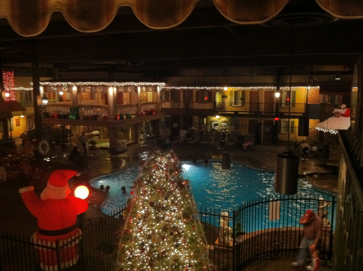
Passing through the dining room and its period furniture replicas from the victorian era, lies the main attraction - the famed Holidome. A Holidome is a special recreation area featured at select Holiday Inn's.  They typically are a souped up indoor pool area, with an arcade, sauna, hottub, etc. This is a particularly fantastic Holidome; the indoor-outdoor space features street lamps, brick lined walks, covered porches, shutters & siding, and a covered bridge. The only indication of being indoors is the potent smell of chlorine from the pool in the center of the 'dome. The feel of the Holidome is decidedly early nostalgic suburban village. It possibly exists as a model of Columbus (pre-1950s) in a box within the actual City of Columbus, but at times feels more like a romanticized collective view of a fantasized nostalgia for a utopian past. The Holidome offers visitors to Columbus a taste of their own imaginations about the quintissential small Midwestern town. 
One of the best things about Holidome is the deconstruction of interior and exterior, shown above by the indoor pool, and below by the interior window to the inside, complete with faux shutters.
The experience as a whole rapidly jumps from promoting American and English nostalgia. Upon exiting, a few other formal gestures hinted at the madness within. Mannerist, over-scaled elements found along the side of the Holidome.
Perhaps the romantiscism of the Holiday Inn from the 70s was a small, but heroic, attempt at reclaiming territory all but lost through Columbus' wave of modernism, offering - at a time of decorationless geometrical and functional rigor - an alternative future for Columbus. But it's more likely that this building is designed for a different set of people than the JI Miller-sponsored classics. 

To be continued....

October 30, 2011

Green Design Troublemakers

The beginning of the self-parody of the green design movement is upon us. "Green" can now function both as resource conserver and disruptive force: parody saturated with symbolically loaded, eco-friendly green washed content. Such an agenda might best be understood as a mannerist reaction to the Green Design Movement.

Central to this discussion is Peter Hutchinson's Mannerism in the Abstract, appearing first in Art and Artists (1966) and later reprinted in Minimal Art: A Critical Anthology (1968). The article identifies works of art which seem to subtly attack the emerging Minimal Art movement from within. Hutchinson describes these pieces as largely unnoticed, yet profoundly radical in their departure from the purist values of Minimal Art. Just how something could play by the rules of Minimalism while at the same time challenging it's ideals requires extreme intellectual rigor and restraint.

Untitled, Larry Poons, 1960s. (image credit)
"Larry Poon's ovals, while strongly suggesting an undiscovered, perhaps musical symmetry, refuse to rely on such symettry. Instead they leap accross the surface. The eye jumps from one oval to the next, as the eye jumps from detail to detail in a Mannerist facade...the purist philosophy of absolute "rightness" is already breaking down."
Hutchinson unleashes an onslaught of Mannerist reaction to Minimalist Art:

"Anuszkiewicz destroys the extreme classicality of his compositions simply by causing the eye to jolt back and forth...Hinman's convoluted canvases have a curving diagonal space plunging out at the viewer, who must retreat...Ginnever's green and black sculpture appears voluminous. Seen from the side, it reveals itself as a superstructure, a false-front...Grosvenor's giant structures mock other giantist sculptures in a Mannerist way...Valledor's parallelograms lean forward, in a way mocking geometric stability yet retaining symettry...There is no end to the Mannerist love of reversal, double meaning and spoof."

Kazimir Malevich's refined and pure 'Black Square' (1913) paired with Dan Flavin's "dramatic hysterical" take on Minimal Art, 'the diagonal of May 25' (1963).
The purist philosophy of 1960's Minimal Art seems almost as unanswerable as the absolute truths of today's Green Design movement, which seeks to "eliminate negative environmental impact completely through skillful, sensitive design." How could anyone in their right mind reject or even dare challenge a design movement with such lofty ambitions!? A home improvement project/art installation in the Ohio River Valley suggests a possible future for Mannerist Green Design. A developer installed solar panels on his property, blocking the views of his next door neighbor, a builder (who built the developer's house).

The developer is quoted saying, "The only way it would function is to cut down all the trees" ... "It was placed there because that's the only spot where it could collect the rays of the sun and function appropriately."
The builder's wife contends, "I don't know how you do this to somebody. I just don't. We want to retire here. This is our retirement home. And then we have to be neighbors with someone who would do that, for the rest of our life? My question is why?"

Gonzosaint's colorful comments on the article importantly hint at the connections between the self-parody of the green design movement and a capitalist desire for greed à la green:
"Are we actually supposed to feel sorry for this "victim"? Only the enquirer could be this tone deaf. Today is the 10th anniversary of 9/11 and our local paper is "reporting" on the trials and tribulations of some rich strumpet having one of her 3 views obstructed by her even richer neighbor's solar panels. Of course there is no mention of the poor people whose neighborhood was eminent domained and subsequently razed to make room for these monuments to American excess. My only regret is that her neighbor's solar panels aren't in the shape of an extended middle finger."
The essence of the slippery nature of Mannerist Green Design is called out by Tara Dodrill, of the Yahoo! Contributor Network : "Is Neyer [the Developer] a rude neighbor or did he simply place the solar panels in the direct path of the sunshine to fuel his home?" 
Green Design as idea (left) and reality (right). Right Image Credit: The Enquirer/Patrick Reddy.
Hutchinson, in talking about Mannerist Minimal Art, could just as easily have been talking about this solar panel slop fest: "This new sensibility looks at first sight remarkably like the [eco-friendly construction] from which it departs. It appears to the causal viewer as a [solar collecting device]. It is disguised as [required for LEED credit], shrugged off as [malicious]. Behind the charming but "impure" [array] are great disquiet, turmoil, cynicism, and self-doubt."

Mannerist Green Design might also take on the role of the Spite House, or the Spite Fence: a bending of the rules for selfish gain, yielding the architectural equivalent of the exclamation point. Numerous examples exist, from the Richardson Spite House in New York City of 1882 to Atelier Bow Wow's catalog of Pet Architecture in 2002. Mannerist Green Design might contribute to this tradition of building in spite of your neighbor. It will certainly challenge our evolving understanding of natural resource rights (i.e. the right to solar access, public vs. private rights to water, wind leases & easements, air rights, etc.).

Jan Pol's (b. 1894) "Monument to Injustice" (image credit) paired with 1m wide by 10m tall house in Madre de Deus, Brazil (image credit) 
Hutchinson's conclusion is at once both beautiful and deeply dark. It might be one of my favorite pieces of writing on art. It's brilliant in that it gives us an understanding of just why somebody would want to challenge (or disrupt) the Minimal Art, and subsequently, the Green Design Movement:
"Contemporary Mannerist work sometimes gets so extreme in its use of acid color, exaggeration of shape, and in its drama that it appears hysterical. Indeed in today's reaction against Romanticism, against Freudian explanation, against pure logic, these artists see themselves as useless members in a society where everybody is useless. Where art was once the only useless thing, now everything has lost meaning. If the artist himself feels he is losing meaning, no wonder he reacts with hysteria. He does super works with the directionless energy of a hysteric - and the result is often hysteria's attendant paralysis. The coldness, the lack of motion, the acidity of color, the lack of detail (expression), are Mannerist symptoms felt before in other centuries in times of mounting disbelief. Bronzino's human contemporary view will break out into horizons broader than hitherto, views not seen entirely from the human scope. It would be a true Mannerist convention that works done despairingly, that desperately parody, should turn out to be truly significant.
The scientist offers a hopeful world, a world where inevitable progress discovers more and more, a world that gets better and better. This world is sane, stable, and knows where it is going. The Mannerist counters with a world in intellectual hysteria, punctuated by frozen activity, a world where space-time cease to have meaning, a world of soundless gestures, where humans do not live."

July 8, 2010

Die Schwyzer Hut

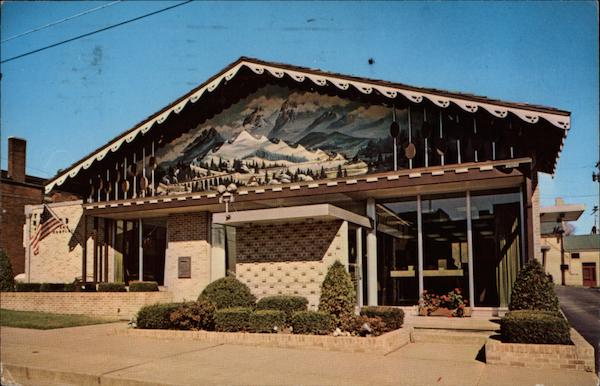
Welcome to Sugarcreek: the Little Switzerland of Ohio!  I discovered this gem of a town purely by accident while browsing through vintage postcard stands at a local antique mall.  Needless to say, a roadtrip is already being planned...


Die Schwyzer Hut!!! "The Swiss Hat Restaurant, Popular Sugarcreek eating place. Sugarcreek is the home of the Ohio Swiss Festival, held the fourth Friday and Saturday after Labor Day each year. It is also the center of the Swiss Cheese industry in Ohio, with 21 factories making 8,000,000 pounds of Swiss Cheese Annually."
Aside from the World's Greatest Decorated Shed (pictured above), Sugarcreek, Ohio is also where you can find the Reeves Banking and Trust Company Building.  Aesthetically, I admit this is quite radical and challenging to take in: an optimistic blend of mid-century modernism, Swiss traditionalism, and Bob Ross. 


As mentioned earlier, plans are in store for a visit during the much anticipated Ohio Swiss Festival in early October. More images to come then...

June 6, 2010

Society as Spectacle

American Highway Roadmaps from the 60s are perhaps the single greatest cultural artifact from the modernist era.  The purpose of these maps were to encourage multi-day auto trips to discover the vast corners of the country.  They embrace the spirit of modernism by celebrating the triumph of man over nature: the progress of a nation through innovative use of technology.  Seen from the perspective of the ongoing BP oil spill, a technological blooper in the grandest sense, these postcards and maps present an image of society as spectacle: a no longer accurate view of technology as savior. 
 
This playful 1962 South Dakota highway map packs a punch.  Imagine the shocking surprise I received after opening up the map to read this text on the inside cover:
"The Missouri is being gentled. A whole generation of human intelligence, muscle and desire, armies of brute machines, and billions of wealth are transmuting the wild proud river into a vast chain of blue water lakes that stretch across South Dakota. Four gigantic dams - dams so big they beggar the imagination and confound the camera's ability to capture their hugeness - are harnessing the Missouri ... there is a sense of involvement in America, in knowing and understanding a strong free nation whose direction is west and which creates its own future."
The "World's Largest Interchange" in Ohio gives South Dakota a run for it's money.  A family somewhere between these two places must have had a difficult time deciding whether to head east or west.  
 
Concurrently, in 1963, we see an aerial view of the Iowa landscape: a lone highway slices through the agricultural heartland of the country.    

 
Unfortunately, not all attractions seem worthy of visiting to me, but for some reason still warranted a postcard.  Take, for instance, the "Sweeden House Smorgasbord" pictured above...

 
...or the Anderson Clock Exhibit: "An entire room is devoted to this display owned by Mr. H. E. Anderson. We like to refer to it as horology's finest hour. Some are more than 250 years old. All are in excellent condition."

It seems fitting here to conclude a post about artifacts from the American Roadside with Guy Debord, and his 1967 Society of the Spectacle: "In societies where modern conditions of production prevail, all of life presents itself as an immense accumulation of spectacles. Everything that was directly lived has moved away into a representation."

*for more of this, see Postcards From the Future
**I've stolen the same link to Debord's text which was was included in a456's post just two days ago. I'm secretly proud of this, but somehow think that it is a new experimental contemporary/subversive form of plagiarism that should be brought to your attention.

April 13, 2010

Adventures at Carnival Island

Carnival Island has been open for only two months, yet is quickly becoming an iconic local establishment.  Locals may recognize the Carnival Island name as it was open in years past, however this year a greatly expanded menu has helped to create an entirely new experience.  What is most satisfying about Carnival Island is their commitment to the local community.  Nestled among car dealerships, community colleges, and big box retailers, Carnival Island's unlikely location is one of  it's biggest strengths.  The corporate office park like setting provides a convenient dining option for nearby businesses and students.  This summer, the restaurant plans to provide extended hours to serve a crowd of baseball players from nearby ball parks. 

The approach to Carnival Island is most deceptive. Things that will run through your head while navigating to this miniature sized carnival food eatery is: 1.) Google Maps have deceived me; 2.) Car salesmen must love carnival foods; 3.) The restaurant is desperately in need of a sign as big (or bigger than) their building. 

Ice cream stands have a long history of uniquely attractive aesthetics and Carnival Island does not disappoint.  The overall design of the building is just as unexpected as the eatery's location. It is essentially a mobile home outfitted with restaurant equipment and flashy decoration. A water theme dominates the design of the exterior: applied wavy water graphics (perhaps inspired by Cincinnati's official flag?), an offset steamboat paddle wheel-styled roof canopy, all surrounded by Boise State blue landscaping pebbles.

Alternative design ideas could have incorporated faux palm trees, and/or steamboat gothic extreme ornamentation.

And what about the food? I opted for the "Carnival Fries" because of their catchy name and the footlong hot dog sans chili due to the fact that I would be eating while driving (a tricky act made all the more dangerous due to the elongated size of my meal). I passed on the ice cream, which gives me a good reason to return in the summer.

All in all, Carnival Island - in all of it's authenticiy and mystique - has the potential to become a suburban equivalent of Los Angeles' famous Pink's Hot Dogs  What is needed is more experimentation with the menu, and an expanded identity (specifically it's signage & packaging is lacking).  If you're in southwest Ohio, check it out.

June 27, 2008

Brutalism meets Beach Town


Biking around Hilton Head, I saw perhaps the most out of place building I have ever seen in my life.  The remnants of a past era.  A monument to the architectural styles of yesteryear.  However, this building was no typical call-it-what-you-will post war modernist building.  It is said that every building tells a story and this example is no different.  Like a parasite invading its host, the brutalist style certainly invaded even the most serene of places.  However, this virus was met with an anti-viral cure: the Hilton Head planning department.  The result? A sleek new building, half brutalist, half beach/resort style.  


A virus, by definition, cannot multiply until it is inside the body's cells.  By restraining trendy, stylish architectural design as it was invading the town, Hilton Head's government effectively restrained the virus, preventing its spread outward into the rest of the beach-resort town.