January 31, 2011

The Coming Self-Parody of the Green Movement


{originally published in Beyond No. 3: Trends and Fads by Pedro Gadanho}

Today I ate a McDonald's Mac Snack Wrap. Despite distinguishing itself as a healthy tortilla-wrapped light meal, Mac Snack was a sort of camouflaged hamburger: the Trojan horse of the health food genre. Consumers can no longer acknowledge the snack wrap as an object of nutritional sensibility. In fact, the packaging of sandwich contents into a thin wrap (once an ingenious solution to low-carb dieting) has become a convenient method for selling unhealthy foods. The demise of this health food movement shows how content and function can eventually become overshadowed by aesthetic manipulation. The decline of sophisticated movements into crude fads is not an uncommon occurrence, and can provide a departure point for considering the coming self-parody of the green movement.

The green movement has been relegated to a fad by American political and corporate values, aligned with profit-driven media and funded by oil companies. By denying global warming, and killing any measure that addresses the issue, Neo-Conservatives have successfully dispelled the movement’s ethos. As a result, "green" has been become a fad; something fashionable, yet lacking substance. "Green is the new black." This "cool factor" has been co-opted by capitalism, which is trying to cash in. A prime example of this is the green NBC logo. The normally rainbow-hued logo is green for a week now and then. Sprinkle some green dust on a fading public image and it immediately becomes aligned with the hip, the fashionable. Many celebrities drive Priuses (Prii?) to their private jets, which spew more carbon than a hummer limo could dream. "Green" is one of today's most transparent phenomena.

The punk movement of the 1970’s was similarly espoused by the mainstream. By rejecting all notions of rock and roll modernism, punk’s mission was to break down the corporate hierarchy that was music. As the agenda grew, it was killed by its own success, transitioning from a form of protest to fashion style. The perversion of “punk” occurred as capitalism embraced mainstream popularity surrounding the movement. Quite ironic, actually. Today's equivalent of fashion self parody serves as a model when looking at the future of the green movement.

What does the self-parody of green design look like? Perhaps it is manifest in architectural typologies facilitating non-sustainable practices creatively modified to meet “TREND AND FAD” specifications. Such an approach suggests a contemporary version of the “false front” building, or Potemkin village. Architects can capitalize on this agenda by boldly promoting the image of "green" over the form or content of their designs. Just as faux wood siding, faux shutters, and faux masonry construction have come to define suburban residential design, a faux green aesthetic is possible. "Green" as aesthetic craze will soon trump "green" as ideology. If a building is camouflaged with "green" style, it will be accepted by society as trendy, responsible, and valuable. Thus, a demand for affordable, yet symbolic icons of sustainable building is created. Consider faux solar arrays molded out of coloured plastics, fake ivy hung over vertical trellises, and sculptural fixed-in-place windmills. Such is the image of a "green" society and the unavoidable self-parody of the green movement as we know it.


January 16, 2011

IKEA Catalog for Deviants

After reading some haunting words on Minimalism (thanks to Sam Jacob and the New City Reader), I couldn't not pay IKEA a visit.
Minimalism is the undead form of Modernism, animated by Aesthetics. Like Ed Gein cavorting in suits made from the skin of his victims, Minimalism is a perverted and psychotic condition. It is there every time we look at something beautifully Modern. Its simplicity, its order, its calmness, its smoothness are displayed like the severed heads on Traitors’ Gate: a beautiful warning to architecture. The real perversion? Architects willingly and joyfully enact this macabre ritual. - "Minimalism, An Obituary" by Sam Jacob
With a commanding presence in a spectacular, ever-changing location, where the metropolis dissolves into the heartland countryside, IKEA resembles a giant museum full of Dwellist contemporary pop modern objects. Hybrid Sweedish-English labels add mystique to the event. Where modernism in America has ultimately fallen short in spreading moderism to the masses (motels), minimalism has wildly succeeded (IKEA/Dwell/HGTV).

Nevertheless, IKEA quietly boasts a subversive collection of furniture, rejecting the very minimalism which has led to it's success. These objects play a critical role within IKEA: IKEAn art (minimalism) demands a Neo-DADAian counter-art (maximalism?). Whereas DADA influenced pop art and postmodernism, anti-IKEAn objects sample from pop and pomo. One of DADA's missions was to reject the commodification of art, something IKEA strongly champions through innovative branding, packaging, and product delivery.

Much as the way we have come to discuss DADA-influenced art, the IKEA Catalog for Deviants can be collectively read as an attitude: as an attack on the co-opting of Swedish modernism for soulless, gut-wrenching capitalist minimalism. Alas, a collection of monstrous objects united in the spirit of refusing convention:

EKTORP: A strangely Venturian floral print sofa peeks out from behind a collection of solid colored furniture.
In a brilliantly symbolic gesture, EKTORP's bed is extended. A middle finger is raised to the surrounding IKEA establishment of polite modernism.
HEMNES: The profile of this mirror also evokes Venturi-Knoll-ism.
TROLLSTA: Vika Fintorps used to be all the rage, until sadly they were pulled from the shelves (of the IKEA I visit). Now, all that remains is this little guy: a 6.5 inch (17cm) tall side table (with legs reminiscent of the the voluptuous VIKA FINTORPS).
VIKA GLASHOLM: A flower-patterned glass table attached to minimal IKEAn stainless steel legs. When the light hits the just right, flower-patterned light disrupts the serenity and purism of the Dwell subscribers' minimal environment. Mmm.

SKRUVSTA: The elephant in the room...the "anti-desk chair" desk chair. Work should never be that fun.
MARKUS: The ... giraffe ... in the room!? Textile design is not the only way to subvert IKEA's grasp on the minimal.  Here, the form of the chair is extruded to the deviant desires of the designer, Henrik Preutz.
LEKPLATS:  A children's play mat (lek plat?) presents bits of New York, Antarctica, Egypt, Switzerland, Miami, etc. compressed into a singular globalized place: a collective identity for us all.

LUSY BLOM: Variations on an asterisk
LUSY: This haphazard collection of color and form evokes nothing and everything. The noise and clutter of today's world as we know it. A large "NEW" sign to one side, a large white rug hiding it on the other side, this object represents the underbelly of IKEAn fashion: a possible new direction for the future of the company? We can only hope so.

LUSY: incomprehensible nonsense. Stylized characters in Helvetica type face graphically construct an image which makes as little sense in the States as it does in Europe. I still contend this piece was informed by Japanese (game show) graphics, however my colleagues remain confused and unconvinced.

This LUCY unfolds to reveal two 2D kimono shirts adding to the spectacle and confusion of the piece.
The monsters of IKEA, manifested in wildly patterned textiles and/or curiously proportioned everyday objects, are at their most pressing and most extreme when their visual language becomes illegible to a global audience. Perhaps LUCY's illegibility occurs from a series of critical mis-translations across the production of the object - from Sweedish designer, to Chinese manufacturer, to American retailer. Or perhaps LUCY's illegibility is derived from a more intentional series of decisions: a rogue designer fed up with minimalism, provoked by the masses. We might never know for sure. When nobody, nowhere knows what to think, anti-IKEAn design will have succeeded.

Carl Wilson, in his book on "taste," questions the existence of a "risk gene" for artistic adventurousness in music. The conversation holds true for design as well:
"Balancing repetition and novelty is crucial: some songs feel too complicated to enjoy and others too clichéd to hold interest. There's little explanation, though, of why people gravitate toward different ratios of surprise to familiarity."
Wilson turns to journalist Jonah Lehrer for answers:
"There's a network of neurons in the brain stem specifically geared to sort unfamiliar sounds into patterns. When they succeed, the brain releases a dose of pleasure-giving dopamine; when they fail, when a sound is too new, excess dopamine squirts out, disorienting and upsetting us. Lehrer suggests this explains events such as the 1913 riots at the Paris premiere of Igor Stravinsky's dissonant 'The Rite of Spring.' [...] a year later, another Parisian audience cheered for 'The Rite of Spring.' [...] It seems implausable it was mainly the rioters returning to give him another chance. No, it would have been the hipsters of 1914, lured by the succéss de scandale and eager to be shocked, to take the dopamine overdose."
Anti-IKEAn objects are to be consumed by today's versions of the 1914 Parisian hipsters - whatever that may mean. Anti-minimalism is a drug. It is to be consumed by dopamine junkies "eager to be shocked."

This catalog could go on and on. To those who demand MORE IKEA DADA, continue on to the images below, and to here (STUVA) and here (KLIPPAN)...


MULA: A toy for the avant garde, discarded amongst heaps of wooden hangars (toys for common folk).

January 9, 2011

A Playground for Cars


The Tower Place Garage is an outrageous modernist object lost amidst a core building stock of historically relevant commercial architecture. The 1967 building was constructed with the mission to attract an increasingly large suburban demographic to return downtown to support commercial activity.


Formally, the garage is an extension of the city's streets, actually appropriating pedestrian sidewalks for ramps which feed into the garage. This decision, paired with a continued lack of maintenance (and lack of funds stemming from poor sales) threatens the future of the garage. What was once a by-product of technological efficiency - a key player towards the understanding of the city as a machine for creating wealth - has been relegated by the public as a stereotypical example of ugly modernist urban renewal contributing to, rather than saving, the continued decline of the city.


Nevertheless, moving through Tower Place Garage is a delightful experience. It's perimeter is lined with delicately sloping ramps, rising one story for every pass. This arrangement allows ample space for an interior courtyard, a surprising and rarely seen element of parking garages today. The opening is bisected by a series of stacked, orderly walkways-in-the-sky feeding into a bunker-like staircase which returns the driver to the wilderness of the city sans car.


Typically walking is the best way to observe your surroundings, but the verticality of this garage, in tandem with it's repetitive structural bays and required slow speed limit generates a fantastic cinematic experience for the driver. The city unfolds behind the safety of the windshield: slow and steady, building by building, floor by floor. Oh how I wish it was possible to experience all cities this way!


Upon reaching the top of the garage, the concrete frame concludes with a simple curvature. The city below has disappeared.  All that remains is a strangely quiet space of vast expanse. It is cheaper to park on the roof.

The circular ramp represented in Google Map's cartoon-stylized plan as a simple cylinder. 


The most spectacular exit discharge sequence occurs through the core of the garage by means of a 9 story continuous spiral ramp.  Pleasantly designed to the turning radius of an average car, minimal turning is required. Such a design begs the driver into a speedy descent. This radical infrastructure requires it's own set of rules. Signs are plastered throughout the descent: 5 M.P.H., NO Pedestrians Allowed on Ramp, CAUTION, Merging Traffic! Hundreds of scrapes of every possible automobile color add a touch of unexpected decoration to an otherwise no-nonsense concrete playground for cars.  


Before you know it, you are ramping back into the city. I wanted to immediately return and drive down the ramp again, a feeling I'm sure is shared by many first-timers to the garage. Never mind that stop sign I ran towards the end. I was inflicted with a euphoric high rarely inflicted by an architectural experience. 

Ironically, contempt for the garage continues despite the fact that it's existence has allowed adjacent Tower Place mall to continue operating throughout year after year of depressing sales: “The only reason [Tower Place] hasn’t folded is because of its parking asset [...] It’s a revenue generator, and it’s been keeping the mall afloat.”


Juxtaposed against the lovingly soft pink painted concrete and unabashedly optimistic prancing of the ramps over the sidewalk (Morris Lapidus would be proud), the garage is looking more and more like some unresolved, unachieved bit of utopianism (autopianism?): a Jetson-ian vision of the city where the freedom of technologically sophisticated speeding autos trump boring, slow-paced pedestrianism.

Nevertheless, the garage is showing depressing signs of decay, while the 70,000 S.F. adjacent mall sits nearly completely vacant (foreclosure is pending for both). Things are not looking well. Rusting pipes and cracking concrete signal the end may be near for Plaza Tower Garage. To destroy this place would tremendously impact a piece of Cincinnati's history. Ugly or beautiful, the city needs places like this to remind us how the city was once used. Homogeneity is bad. Monsters are good. Buildings are to Cities as Rings are to Trees. 

January 2, 2011

New Pop PoMo

Nearly two years ago, we created the "blogger's sport" of Building/Song pairings. If you're not familiar with the game, educate yourself with our attempt at an exhaustive list of the game and it's players: (let me know if there are any omissions...)

We're back in the game, this time taking a look at today's pop music scene, selecting a trio of songs which seem to negotiate between past and future realities. They share a common desire to reconstruct the past on their own terms, sparking what could be considered a new youthful (and fashionable) wave of postmodernism. The aesthetics of these songs are captured through experimental variations on the "music video" (e.g. The Black Eyed Peas pioneering of 360 degree 3D film, Lady Gaga reclaiming Hollywood for herself through a cinematic borrowing/stealing, and the music video turned full-length, self-deirected film by Kanye West.

Science fiction could never have predicted a new millenium saturated with groovy 70's fonts, polaroid photo shoots, arcade 8-bit bliss, and late '80's soft rock electrodiscodance combos. Nevertheless, watching these videos, take note of how typical pomo material (e.g. reinterpretation of nostalgia + multiculturalism) is taken to the next level . These weapons-grade pop samples demand an architecture which is firmly rooted in hybrid realities surrounding truthful (or deceitful) narratives of the past (and future).

1.) The Black Eyed Peas - The Time (Dirty Bit) paired with Neo-Rococo furniture from Smansk:


Within today's globalized, network urban world, the music video begins with the futurism of outer space juxtaposed with the sampling of a soft rock song from the late 1980's. The aesthetics of the video flash into a heady blend of google street view, drug-infused pixelization, and avatar hallucinations all packaged with an aged, nostalgia-inducing photo filter (also see The Black Eyed Peas - Light Up The Night for the co-opting of '80s arcade nostalgia with QR Code overlays). It's agenda is to convey happiness through maximum visual stimulation and hypnotic beat. Neo-Rococo, as artistic style closely resembles the 'Peas' attempt at space/time maximalism. Sorry, no building here, but a successful curatorial performance in my opinion.


Not much can be said about Lady Gaga that has not already been said in this delightful experiment. She's into challenging gender (and celebrity) identity roles, the aestheticization of tragedy, haute couture, etc. Best put here:
At the start of the video, as Gaga is shown plummeting from the balcony to the ground in slow motion, a synthesizer sonority enters emulating Gaga’s heartbeat; moments later, the listener is inundated with the sound of paparazzi anxiously snapping away at their cameras. The snaps and clicks combined with the pulsating heartbeat create their own distinct rhythmic pattern, and persist until they meld seamlessly into the song’s ostinato bass line – a slightly simpler version of the initial rhythm. Thus, we can say that the beat propelling the entire song grew out of both Gaga's heartbeat and the snapping and clicking of the paparazzi, a resonance that is at once organic and fabricated – an important dichotomy in this video.
Café Was in Hollywood, CA designed in 2009, featured in Dark Nostalgia, addresses Gaga's experimentalism and theatricalism, and is perhaps the first of many Gagaian spaces to emerge. From Café Was' website:
A Unique Hollywood Architectural Experience: Enter a reflective dream world, sensitive and severe, always seductive and never overt, where you are invited to enjoy delicacies while discovering new talent
Cafe Was is a thoughtful amalgam of "recycled" architectural/interior design related ideas. We assembled these ideas in varying stages of deconstruction and whimsy, ultimately creating a theatrical environment in the form of a restaurant/live music venue, where not only the piano player, but the patrons as well, will be compelled to play a role.
With a revolving grand piano at the center of the room, Ivan Kane and RKIT set about to create an opulent, bohemian dream world. The diverse space offers several options where patrons can dine, including multiple levels surrounding the piano. While achieving a collaboration of time in both design and style, including columns at the ground floor turning into Victorian posts at the intimate mezzanine level overlooking the piano below, Café Was also features hidden lounges tucked into nooks and crannies, a mysterious balcony turned into a lavish candle display and Café Was' most unique vantage point to sit and listen from, a grand staircase leading nowhere.

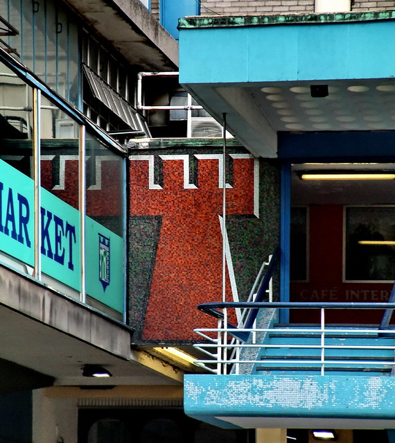
3.) Kanye West - Runaway (2010) paired with Castle Market, Sheffield, 1967


Rowe's Transparent Modernism full of Victorian furniture, African chants, and hip hop mixology.
The New Postmodernism.
Michael Jackson and the Spectacle.


Notably found within this half-hour self-directed film are African dance rituals paired with 1980s/90s sound mixing technology, and a post-industrial hangar/bunker housing what appears at first glance to be a reinterpretation of the Last Supper (a genre-bursting, symbolically loaded scene highlighted by a 2 minute solo featuring "interpretive ballerina dancing" (within a rusting post-industrial hangar) to a spoken melody broadcast via 80s-era sound distortion technology):
"There is a dinner table scene that jumps from [something] from a Noah Baumbach film — where the camera stays on the scene just long enough to make the viewer feel a little bit uncomfortable — to something out of what could be a Jim Henson creation ... within the same scene too." - Pete Wentz, reporting for MTV News
Ultimately West's film is about "social ostracism and rebirth". As we've mentioned earlier, the architectural equivalent to such themes is undoubtedly brutalism as both idea and aesthetic. So for this pairing, Sheffield's endangered Castle Market (a building I've never visited and only read about) wins. It's association with a movement whose aims are decidedly utopian and whose aesthetics are a radical departure from the heritage industry, make this place as polemic as Kanye himself (Apologies to both purist hip hop enthusiasts and architectural historians alike - two groups who probably rarely associate with one another). On the one hand you have West - and his thirty minute effort to rebel against the culturally constructed symbolism (queue Hennessy Youngman) of our day. On the other hand, Castle Market, whose brutalism (with a touch of mid-90's PoMo leftovers) overlaid on the foundations of Sheffield's authentic/original castle create the 20th century reinterpretation of the 16th century castle: a civic monument via defensive infrastructure.