 |
| Figure 1 Destroying the Farnsworth House |
December 23, 2010
Happy Holidays
Here's to a thoroughly enjoyable 2010, and an ever-more promising 2011. Season's Greetings.
November 9, 2010
Slow and Steady Wins the Race
nice piece of writing over at Frieze Mag:
Perhaps the truest screw heir is Paul Octavian Nasca, a Romanian programmer who wrote the software used to create recent viral hit ‘U Smile 800% Slower’ (2010) – a Justin Bieber track stretched to 800 percent of its original length while the pitch remains unchanged. A Florida-based electronic musician used Nasca’s algorithm to smear the three-minute single into a half-hour epic of shimmering, sensual ambience. Bieber-haters and his legions of fans were equally enthralled by the transformation, which made the Canadian teen star’s corn-syrup pop sound like Icelandic band Sigur Rós. In less than a month, it was heard by more than two million people, received the endorsement of Mr Bieber (he tweeted: ‘this version of u smile is incredible to just chill out and fall asleep to. feels epic’), and spawned copycat slowdowns. - Jace Clayton, Music: The slowed-down tempos of screw and its influence on contemporary bands
October 9, 2010
Ohio Swiss Fest: A Photo Essay
Sugarcreek, Ohio is a tiny town about 2 hours north of Columbus, Ohio. It consists of a spectacular Alpine Village nestled amidst the endlessly rolling hills of Amish country. But what sets this place apart from other rural towns of Middle America is a bustling cheese industry and an unexpeted dose flaboyantly decorated buildings. I recently visited this "Little Switzerland of Ohio" and have returned triumphantly with what I hope to be a dazzling photo essay.


We have finally arrived! Welcome to Sugarcreek, the Little Switzerland of Ohio!

Main Street is full of buildings like the one pictured above, however none are as large or impressively ornate as the Alpine Hills Museum: a must-see destination inside and out for visitors of all ages.


Vintage posters, newspaper articles, and children's depictions of Sugarcreek can be found among historical re-creations of Amish interiors and old cheese-making barns.

The interior lobby of the Alpine Hills Museum is a bizarre mash-up of general country nostalgia/folk art, Swiss heritage, and conservative Middle America propaganda. This space is perhaps the epicenter of Sugarcreek's identity: a place where one would expect Google's little red map pin to land while searching for Sugarcreek, Ohio. Nevertheless, this space projects the dark, unsettling side to Sugarcreek: for this is a non-place, torn between conflicting identities of Swiss heritage and Middle American conservatism. Celebrate cheese, chocolate, and those omnipresent snowcapped Alps, but don't you dare fly that red and white crossed flag!

Pure spectacle, but unfortunately the world's largest functioning cuckoo clock (debatable) is currently being restored. Thankfully, there's always YouTube.


Architecturally, the most impressive area of Sugarcreek can be found at the intersection of Main St & Factory St. It is here that artist Tom Miller has created fantastic murals on the gabled facades of commercial buildings. The Swiss Alp landscapes are highlighted by moving model trains and alpine skiers. The concept of motion in architecture is witnessed here at a most miniature scale. A whole building provides the canvas for a motorized small piece of metal. I call these fantastic pieces of art "active facades" and have uploaded a couple of examples over on YouTube.


As for the actual festival, 8 million pounds of cheese are annually produced in Sugarcreek, which create the (desperate) need for a massive event to sell all of the excess cheese reserves. Many different awards are given, but to the average cheese eater such as myself, it is all mouthwateringly (?) delicious. This region also produces wine, but I would (politely) defer similar high praise to the California varieties.


There were all sorts of spectacles to witness including a "cheese chase" (5K run), grown men wearing traditional Swiss folk gear, an Alphorn concert, a Steintossen competition, and a curiously American-themed parade complete with an impressive car show of hot rods and post-war gas-guzzling muscle cars.


The winning float in the parade was provided by McDonald's. Who knew Ronald McDonald was so crafty!? A late afternoon visit to McDonald's revealed that Sugarcreek's Swiss Miss Main Street spirit had begun to penetrate the global superpower's cookie cutter red and yellow boxes. A surprising end to an equally surprising (but unfortunately brief) visit to Little Switzerland.
October 5, 2010
Stephen Colbert's Mickey Mosque
Stephen Colbert touches on themes of fashion, mascots, Disney, and architecture as he discusses America's fear of ethnic groups.

(too busy to watch the whole segment? fast forward to 5:15)
| The Colbert Report | Mon - Thurs 11:30pm / 10:30c | |||
| The Word - It's a Small-Minded World | ||||
| ||||
September 30, 2010
"Architect"
First search result on YouTube for "Architect"...
p.s. I'll be attending Ohio's very own "Swiss Festival" this weekend: a 50+ year old tradition that originated in Amish Country due to the understandably dire need to sell excessive cheese. Needless to say, the festival is held in what is considered to be the Little Switzerland of Ohio. I'll be tweeting on scene using the tag, #swissfest, and will subsequently be posting a review of my architectural discoveries here in due time.
p.s. I'll be attending Ohio's very own "Swiss Festival" this weekend: a 50+ year old tradition that originated in Amish Country due to the understandably dire need to sell excessive cheese. Needless to say, the festival is held in what is considered to be the Little Switzerland of Ohio. I'll be tweeting on scene using the tag, #swissfest, and will subsequently be posting a review of my architectural discoveries here in due time.
August 24, 2010
August 14, 2010
The Downfall of Nick Wynn

"The Day After Eternity," by Lawrence Chandler, is a 1950's novelette published in Fantastic, an aptly named bi-monthly journal featuring a blend of fantasy and science-fiction stories. We join our good friends Diana, Joe, and Nick amidst their journey to a mysterious planet in search of an even more mysterious enemy...
"We armed ourselves with two ice guns and stepped into the air-lock. Sixty seconds later, the shell port opened and the ladder slid to the ground. I walked down ... The air was good, the sun was warm, and there was a cool pleasant breeze. The flora was strange, however; yellow, fat-bladed grass, thick and luxuriant and soft ... 'Looks like Kentucky with the yellow jaundice,' Nick said ...
Then, out on that yellow prairie, it came into being; the thing we both saw at the same instant. A city, bright and sparkling in the sun. It could have been Detroit, or New York, or Atlanta, with their overslung highways and streets, their flying terraces, their tall, slim buildings. But there on the broad avenue a couple hundred yards from us, was something that didn't belong in any city I'd ever seen; an old automobile right out of a museum, with big spoked wheels, brass radiator fittings and an open tonneau.
... There were two people in the car, a man and a woman ...
My mind was spinning. I felt dizzy, as though some great force was pulling at me, trying to force me down. I was filled with a sense of great, unseen power around me.
Nick's reaction was different. He smiled at the strange couple, waved back at the woman, and began running toward the car. I yelled, 'Nick! Nick! Come back here! It's an order! Come back!'
But he didn't seem to hear me. The car was moving slowly away, now, and Nick began to run. He called, 'Wait! Wait!' and the man at the wheel turned and looked back and stopped the car. The woman made a beckoning motion and Nick increased his speed.
I shook off my dizziness and started after him, but at that moment, Diana's voice came through the amplifier in the nose of the rocket. 'Joe! For God's sake, stay where you are! Don't follow him! Come back to the ship!'
At that moment Nick Wynn reached the side of the ancient automobile. The woman held out her hand. Joe took it and put his foot on the big, ugly running board of the car. Then there was a quick, bright explosion that knocked me to the ground. It thundered and reverberated through the air, faded into echoes, and was gone.
I struggled to me feet and looked around like a punch-drunk fighter hunting for his opponent. But there was nothing. No city. No automobile. Only the torn, yellow meadow and Nick Wynn - or the remnants of him that were left.
He had been blown to pieces."
July 29, 2010
Juicy Camouflage


Not quite sure the theoretical implications of this object, but a friend once said to me, "this is like candy: I'm not sure if it's good for me, but I love it."
July 25, 2010
Style as Substance: Some Words on Betty Draper's Victorian Nonsense and Other Things Too
With the fourth season of Mad Men quickly approaching, I found myself spending the better part of today thinking about criticism the show has received for being more style than substance. That is, for covering up its plot imperfections with a slurry of beautiful objects: people, dresses, furniture, and everyday knick knacks.
In a lengthy critique of Mad Men, Mark Greif wrote in the London Review of Books (October 2008) that the series consisted of “soap opera antics” and inaccurate depictions of the history of advertising. Such flaws were apparently too much for the viewer to recover from. Slate Magazine (September 2009) picked up where Greif left off, denouncing the show as nothing more than a “guilty pleasure tv commercial.”


In a lengthy critique of Mad Men, Mark Greif wrote in the London Review of Books (October 2008) that the series consisted of “soap opera antics” and inaccurate depictions of the history of advertising. Such flaws were apparently too much for the viewer to recover from. Slate Magazine (September 2009) picked up where Greif left off, denouncing the show as nothing more than a “guilty pleasure tv commercial.”
It appeared as though Mad Men’s most serious flaw was that it looked too good. The image of the show was overpowering. Aesthetics had trumped content. The television show has become some sort of super-designed object - the motion picture equivalent of this.
Despite the critiscm, or perhaps in response to the criticsm, producer Matt Weiner created an episode that propelled the role of style into a much larger and aggressive role, marking what I consider to be a turning point in the series. This all goes down in season 3 episode 7 for all of you Mad Men junkies, where conflicting desires for the future are told through design.
Despite the critiscm, or perhaps in response to the criticsm, producer Matt Weiner created an episode that propelled the role of style into a much larger and aggressive role, marking what I consider to be a turning point in the series. This all goes down in season 3 episode 7 for all of you Mad Men junkies, where conflicting desires for the future are told through design.
For example, we see Duck, a fired executive from Sterling Cooper, attempt to exact his revenge by asking Sterling Cooper's own Peggy to join his company. He does this by sending Peggy a designer Hermès scarf which she lovingly holds while contemplating his intentions. Also we discover that Betty Draper’s secret affection for Henry (a politician whose job at selling ideas is ironically similar to Don Draper’s job in advertisement) is reciprocal when he "fondles" a stainless steel matchbox which has fallen out of her purse.
The undoubted star of the episode, and the provocateur of my interest in all of this, is an awkwardly large antique Victorian sofa lovingly called the "Fainting Couch." This comes after the Drapers' living room gets a fresh make over with sleek new modern furniture. Betty purchases the piece of furniture while on a low key date with Henry and - going against the advice of her decorator - places it directly in front of their fireplace:
Decorator: What were you thinking!? It's awful.
Betty: It's an antique.
Decorator: We discussed this for months, and we decided antiques were expected. Look around! You have ruined the whole room.
If the modern object embodies technologically sophisticated, opportunistic and forward-looking aspirations of modernism, Betty's purchase of an antique victorian sofa reveals her desire to return to the past. Her marriage trouble with Don, and her nostalgic home décor (have you seen that kitchen wallpaper!?) and traditionalist sensibilities, paired with Don's unavoidable focus on his future with Sterling Cooper are reflected in her affection for the Fainting Couch. Betty argues with Don over his hesistance to sign a three year contract at work: "What's the matter? You don't know where you're going to be in three years?"
Only a piece of massive fireplace-blocking victorian nonsense amidst a room of modernist designer objects could project the image of Mad Men's increasingly troubled relationships. Further adding to the chaos of season 3 is the fact that all of this plays out amidst a growing tension between the city and the suburb: the masculinity of the corporate office place of the 1960’s vs. the femininity of domestic suburbia of that era. It is as if the corporate modernism of Don's workplace has invaded the innocence of Betty's home.


Where Mad Men ultimately succeeds is in the shear defiance of its critics. Taking their disputed over-reliance on style and making it even more of an issue has created an exciting dialog between the cable tv show and the arts critic. Interestingly enough, Slate ran another review after this episode aired under the title, “The Fainting Couch for Best Supporting Actor." I highly recommend it, as Kate Bolick has eloquently described in much better detail Mad Men's reliance on style as substance.
In considering the divide between nostalgia and futurism, a separate, but somewhat relevant topic is the bizarre annual ritual paint companies partake in by selecting a "color of the year." From Sherwin-Williams:
In considering the divide between nostalgia and futurism, a separate, but somewhat relevant topic is the bizarre annual ritual paint companies partake in by selecting a "color of the year." From Sherwin-Williams:
"In uncertain times, we find comfort in the memories and traditions that provide us with a sense of solid ground...Color plays a key role in triggering our nostalgia, and our Today’s Colors collection is a rediscovery of the styles, textures, patterns ― and hues ― of the past."Interesting to note is the difference between pre and post-economic crash. For example, in 2007, references to the spirit of adventure, new technology, and the possibilities of the future:
“In 2007, there is an awareness of the melding of diverse cultural influences, and Chili Pepper is a reflection of exotic tastes both on the tongue and to the eye. Nothing reflects the spirit of adventure more than the color red. ... “The color red makes a bold statement. We’re seeing shifts in people’s opinions on current events and major changes in the way they are expressing themselves through new technology. People are open to the possibilities of the future and Chili Pepper celebrates that.”
2010, on the other hand, demands our collective desire for stress relief:
"Combining the serene qualities of blue and the invigorating aspects of green, Turquoise evokes thoughts of soothing, tropical waters and a languorous, effective escape from the everyday troubles of the world, while at the same time restoring our sense of well being."

July 22, 2010
Ecstatic Aesthetics

Concurrently, I've somehow managed to convince the Glasgow Film Theatre to prominently display a large exclamation point sign as part of their Empty Plinth Project. The piece - pending delivery from USA to Scotland via post - will launch GFT's summer art show and will be on display from 26 July to 2 August.
I've been too busy reading this, this, and this to post anything of real substance but that will hopefully change soon as some thoughts on - among other topics - nostalgia, Toy Story, and floating palaces are in the works. Until then, cheers.

July 20, 2010
Manifesto for Men's Clothing, circa 1913
We support the architectural equivalent of this...
an excerpt from Giacomo Balla, Futurist Manifesto for Men's Clothing, 1913:
"We are fighting against:
(a) the timidity and symmetry of colours, colours which are arranged in wishy-washy patterns of idiotic spots and stripes;
(b) all forms of lifeless attire which make man feel tired, depressed, miserable and sad, and which restrict movement producing a triste wanness;
(c) so-called 'good taste' and harmony, which weaken the soul and take the spring out of the step.
We want Futurist clothes to be comfortable and practical, and:
Dynamic
Aggressive
Shocking
Energetic
Violent
Flying (i.e. giving the idea of flying, rising and running)
Peppy
Joyful
Illuminating (in order to have light even in the rain)
Phosphorescent
Lit by electric lamps."
July 14, 2010

July 9, 2010
Moving Staircases
Just a quick note about Harrod's Department Store in London from Wikipedia:
"On Wednesday, 16 November 1898, Harrods debuted England's first "moving staircase" (escalator) in their Brompton road stores; the device was actually a woven leather conveyor belt-like unit with a mahogany and "silver plate-glass" balustrade.[3] Nervous customers were offered brandy at the top to revive them after their 'ordeal'."
July 8, 2010
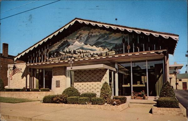
Die Schwyzer Hut
Welcome to Sugarcreek: the Little Switzerland of Ohio! I discovered this gem of a town purely by accident while browsing through vintage postcard stands at a local antique mall. Needless to say, a roadtrip is already being planned...


Die Schwyzer Hut!!! "The Swiss Hat Restaurant, Popular Sugarcreek eating place. Sugarcreek is the home of the Ohio Swiss Festival, held the fourth Friday and Saturday after Labor Day each year. It is also the center of the Swiss Cheese industry in Ohio, with 21 factories making 8,000,000 pounds of Swiss Cheese Annually."
Aside from the World's Greatest Decorated Shed (pictured above), Sugarcreek, Ohio is also where you can find the Reeves Banking and Trust Company Building. Aesthetically, I admit this is quite radical and challenging to take in: an optimistic blend of mid-century modernism, Swiss traditionalism, and Bob Ross.
As mentioned earlier, plans are in store for a visit during the much anticipated Ohio Swiss Festival in early October. More images to come then...
June 22, 2010


June 19, 2010
Party In The City Where The Heat Is On
Ignore your surroundings. Ignore the economy! With technology and LEED Points, we will prevail!! It's time for a new decade!!! THE FUTURE IS HERE!!!!


The Bacardi Building makes me want to use any Meis building I can get my hands on as a canvas for experimental decorative art. I can't help but wonder if the convention center's aggressive use of movie theater carpeting was a symbolic nod to the Lapidus & co.'s cinematic take on Miami:


Who thought getting 15,000 architects together in one of the country's hottest cities (during the summer) would be a good idea? The AIA, of course! Nevertheless, there we were sitting in a larger-than-usual air conditioned box listening to messages about the future broadcast to us via teleprompter-informed surrogates. "Design for the Next Decade," as it was called, came complete with branding images showing a serene view of Earth from outer space - creatively dodging the political/social/environmental turmoil of today. The events were ironically held within a rather large flamboyantly pastel and neon decorated PoMo box. After spending four days there, I got the feeling no one else saw the humor in the situation. Toss in the awarding of the AIA Gold Medal to Peter Bohlin - a life-long modernist (the humanist type, not the angry type) - and you have some theoretically confusing environments to take in. I predict this will all subconsciously rub off on the emerging architects who attended the conference which will end up designing in an awkward hybrid 1980's style well into the 21st century out of confusion. This is probably why I am not a trend forecaster.

The convention itself consisted of all the predictable themes: globalization, BIM, and of course the dreaded "s" word, sustainability. Such jaded themes were nearly unbearable to take in, but the aggressive use of movie theater stylized carpeting throughout the convention center, paired with what could only be described as a spectacle of building products in the expo's main floor kept me on my toes. After all, this was the super bowl of the building trades industry! Partaking in "the scene," I felt what Wall Street traders must go through, being constantly bombarded by hungry salesmen showing off everything from virtual reality headsets, to oversized double hung windows, to fancy paver stones. The experience was somehow both my worst nightmare and the most interesting architectural spectacle I have ever witnessed.

Biggest disappointment: the lack of discussion of the convention's dicey history in Miami vis-à-vis Morris Lapidus vs. the Modernists at the Americana in 1963. I did, however, stumble across Art Center on Lincoln Road which did a good job of showcasing both Lapidus' work and personality. Aside from drawings and photographs, a presentation of his bow ties were prominently displayed around a minimally black monolithic bow tie shaped table. This managed to satisfy most of my MiMo cravings. Additionally, I managed to drive by the Bacardi Building by Enrique Gutierrez, one of my absolute favorites. It's international corporate style overlaid with radical tropical-influenced aesthetics must have caused quite a commotion fifty years ago:
The Bacardi Building makes me want to use any Meis building I can get my hands on as a canvas for experimental decorative art. I can't help but wonder if the convention center's aggressive use of movie theater carpeting was a symbolic nod to the Lapidus & co.'s cinematic take on Miami:


No overview of Miami would be complete without mentioning 1111 lincoln which was at the time still under construction. This parking garage/"mixed-use" space actually scares unsuspecting tourists. It looks as though the garage has swallowed a portion of the nearby 1960's era SunTrust Bank building. No mercy.

When seen in context with Lapidus' Lincoln Road the car park begins to make a bit more sense. From the Wall Street Journal:
"'I envisioned a park-like mall with pools and fountains and exotic concrete shelters,' wrote Lapidus, whose plan included plantings and splashing waterworks interspersed with a series of architectural follies made from concrete white-painted stucco, each with its own flamboyant shape--flaring shells, fin-like canopies, undulating vaults, simple slab roofs hovering on narrow steel pylons--Lapidus's own vocabulary of forms, minimal but whimsical."


The most powerful moment of the entire convention occurred in Peter Bohlin's last comments which seemed to undermine the futurist theme of the convention. Upon being asked what advice he could give to young architects, Bohlin simply reached into his pocket, pulled out a pencil and held it up saying don't forget about this. The gesture generated a great deal of applause more so than at any other point during the convention, suggesting perhaps the popularity and value of low-tech in an increasingly high-tech era.
June 6, 2010
Society as Spectacle
American Highway Roadmaps from the 60s are perhaps the single greatest cultural artifact from the modernist era. The purpose of these maps were to encourage multi-day auto trips to discover the vast corners of the country. They embrace the spirit of modernism by celebrating the triumph of man over nature: the progress of a nation through innovative use of technology. Seen from the perspective of the ongoing BP oil spill, a technological blooper in the grandest sense, these postcards and maps present an image of society as spectacle: a no longer accurate view of technology as savior.
 This playful 1962 South Dakota highway map packs a punch. Imagine the shocking surprise I received after opening up the map to read this text on the inside cover:

"The Missouri is being gentled. A whole generation of human intelligence, muscle and desire, armies of brute machines, and billions of wealth are transmuting the wild proud river into a vast chain of blue water lakes that stretch across South Dakota. Four gigantic dams - dams so big they beggar the imagination and confound the camera's ability to capture their hugeness - are harnessing the Missouri ... there is a sense of involvement in America, in knowing and understanding a strong free nation whose direction is west and which creates its own future."
The "World's Largest Interchange" in Ohio gives South Dakota a run for it's money. A family somewhere between these two places must have had a difficult time deciding whether to head east or west.


It seems fitting here to conclude a post about artifacts from the American Roadside with Guy Debord, and his 1967 Society of the Spectacle: "In societies where modern conditions of production prevail, all of life presents itself as an immense accumulation of spectacles. Everything that was directly lived has moved away into a representation."
*for more of this, see Postcards From the Future
**I've stolen the same link to Debord's text which was was included in a456's post just two days ago. I'm secretly proud of this, but somehow think that it is a new experimental contemporary/subversive form of plagiarism that should be brought to your attention.
May 23, 2010

Subscribe to:
Posts (Atom)