"Travels from nesting space will take you to a broader cultural horizon."
Chinese Fortune Cookie
These are the B-sides...
An abandoned mall, architect unknown: Fair Oaks Mall is an early nineties masterpiece, an upscale shopping center with an edge. When first erected, it contained many of the hottest stores, such as Foot Locker, and took business away from Cesar Pelli's downtown
Commons Mall. Ironically, Fair Oaks is now nearly abandoned, with mainly local and seasonal shops struggling to fill the spaces (literally and metaphorically) vacated by the large chain stores. It is an abandoned late Post-modern mall, about a quarter mile from Robert Stern's
Columbus Regional Hospital, which was built almost simultaneously.
Above, neon is used in two ways. There are small architectural shapes scattered, floating throughout the tile-clad mall. Red, blue, and yellow neon is also masterfully tucked into reveals, creating a three-tiered architectural massing/ornament combo which pairs well with the large skylight above the Christmas and palm trees. It is the architecture of an electronic age.
Each store front is customized for the store. This was a novelty/party store. The signage was bright, and the store was full of all sorts of naughty sundries. Now all that is left is memories and a bit of tile which vaguely resembles a nightclub. Also note the tile patterns in the floor.
Above is one of the many strains of marble used in the mall to denote a jewelry store. These small window displays were used to glorify their contents, but sadly all are empty.
Another tile pattern outside of a jewelry store. In this example, the jeweler's cases are now used for
NASCAR memorabilia (Tony Stewart is from Columbus, Indiana). Below is the former food court, which is now completely empty. The man sitting on the counter underneath the beautiful tiles is a construction worker. This shot shows the neon dancing through the ghost mall. Pretty amazing stuff.
On a more serious note, here is the story of Mannerist Brutalism...
Two notable elementary schools worth comparing are Southside and Smith, located on opposite sides of town. They were both built in 1969 by separate members of the Harvard Five: Elliot Noyes and John Johansen respectively.
Below, Southside Elementary (Elliot Noyes, 1969) is classic American Campus High Modernist Brutalism, appropriately scaled
for small children. Brutalism is one form of High Modernism. This school is on the nice side of town, and is where @mockitecture went for High School dances, though he went to elementary school at Southside's rival, Parkside Elementary. Noyes' building presents a no nonsense approach to geometrical and organizational purity (what one might expect from a high modernist) through a near perfect symmetry and an all encompassing, relentless repetition of concrete planes. We sense a monumental purity and definitive authority when in the presence of this building. Arguably, the only ornament on this school are the security cameras mounted noticeably about. This is all comically inappropriate for an elementary school.
Across town, in the style of Mannerist Brutalism, L Frances Smith Elementary (1969) by John Johansen pulls off the seemingly impossible: undermining the absolute truths of Noyes' building. Johansen's building feels more dynamic as its internal rooms are expressed individually rather than collectively, and scattered about the grounds of the school.
The secret is that many of Columbus' buildings pioneer the idea of Mannerist High Modernism (in this case Mannerist Brutalism) in architecture. In Smith's case, Johansen sought a more human condition in his buildings, both in scale and form, breaking from the establishment Modernism of contemporaries like Noyes and I.M. Pei, who also studied under Gropius. Pei designed the Cleo Rogers Library in Columbus. The origins of Johansen's eventual exuberant, colorful mashups, based on orthogonal reinforced concrete construction and systems theory, are evident above in this arrangement of quasi-brutalist solids joined by brightly colored steel tubes.
Johansen's reaction to the Noyes High Modernism camp is hugely significant as it situates the struggle to establish a well mannered Mannerism within the context of dying High Modernism by injecting brightly colored vitality into existing architecture trends. (see Johansen's 1970's Mummers Theater in Oklahoma City for a more radical version of this Mannerist High Modernism (MHM)). Above, a sidewalk in the sky, in the manner of Brutalism. It is a painted steel tube and is also only about 15 feet in the sky. Below, The 1997 expansion is exquisite and is one of many renovation/additions which has been carefully executed in Columbus.
A tunnel connects an entrance to the office. Unfortunately Smith's signage is not obnoxiously big and on the floor below, thats a rug.
Our last stop of the day was the Holiday Inn. It's everydayness - its hotel-ness - is hidden within an insanely intense fictional experience. All sense of reality and time is lost within the hotel's old-new indoor "public spaces". One might be tipped off at the collapsing of history and reality immediately upon entering. The brick facade and the Inn's latest 2000's addition is terrifyingly back-dated to 1884.
An undersized faux marble statue of Christopher Columbus greets visitors in the main lobby, with a strangely dangling cartoon bubble hanging over his head. He proclaims how wonderful he has found Columbus, Indiana to be. Nevermind that the town was settled only a mere 300+ years after his death. This mind-bending alternative history, expressed through an impossible object, is a perfect metaphor for Columbus Holiday Inn's hallucinatory atmosphere.
Mashing together history creates an escapist fantasy-land, while ideas of interior and exterior are also blurred. Below, a man takes it all in on the "street", while a hotel guest gets information at the front desk.

These steampunk elevators incorporate carnival lighting, creating one of the strongest mashups of histories and environments. The lights don't make sense, but they work well to celebrate the elevator doors. This wood lattice is overused to perfection, taking the ordinary and making it extraordinary. When contrasted with the lights, this space comes alive. These fictional designs blur the line between imaginary and real by disintegrating genres and the lines of traditional building typologies.
A bit further down the brick lined street-hallway, past the barber shop and boutique candy shop, are two signs which continue the hybridized history theme.
Here, an American Western log cabin style sign, above, has been placed next to an Olde English Victorian themed sign, below.
Behind this is a miniature gothic church model holding a list showing the location of all churches in Columbus. The ornate detailing found in the hotel brings a slice of Disneyland to Columbus, IN. The dramatic lighting turns this hotel lobby into a stage set for... staying at a hotel. The building tells an epic about vacation, about getting away to another place.

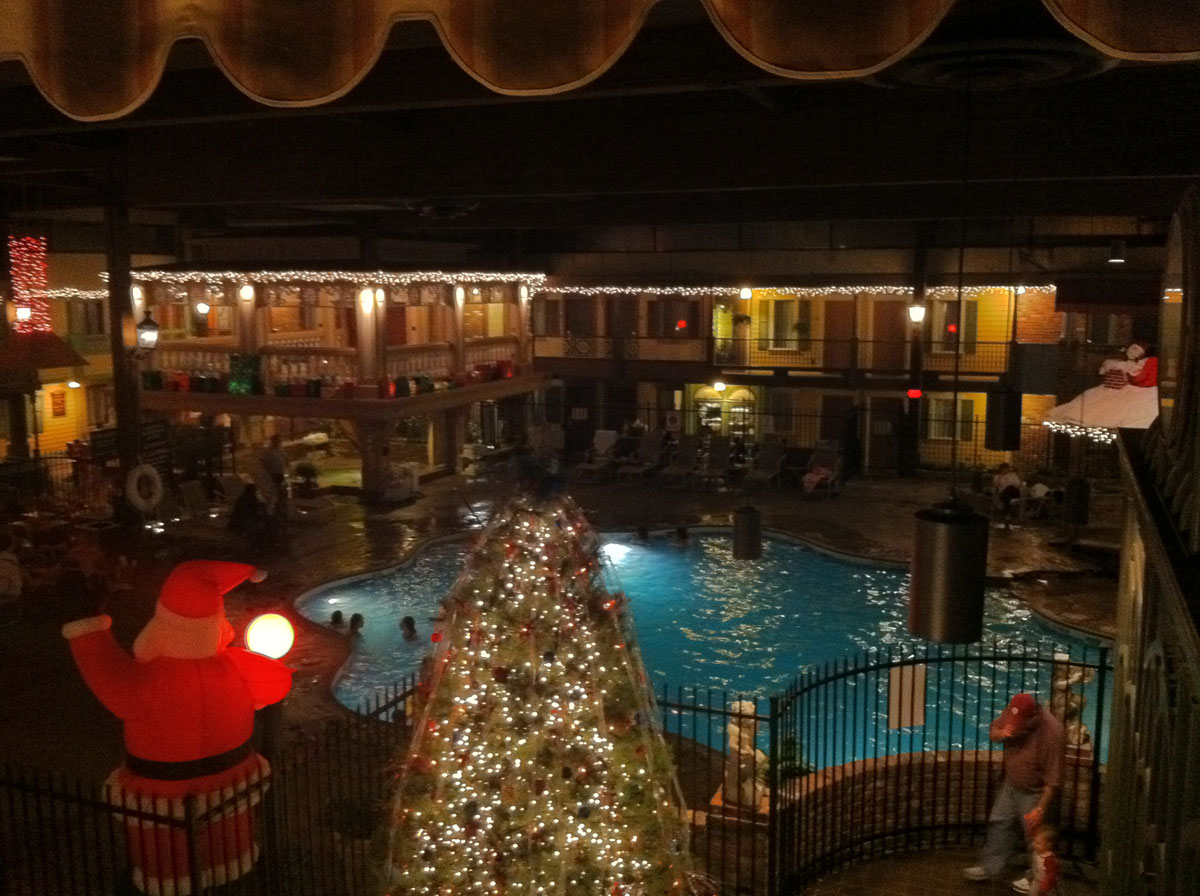
Passing through the dining room and its period furniture replicas from the victorian era, lies the main attraction - the famed Holidome. A Holidome is a special recreation area featured at select Holiday Inn's. They typically are a souped up indoor pool area, with an arcade, sauna, hottub, etc. This is a particularly fantastic Holidome; the indoor-outdoor space features street lamps, brick lined walks, covered porches, shutters & siding, and a covered bridge. The only indication of being indoors is the potent smell of chlorine from the pool in the center of the 'dome. The feel of the Holidome is decidedly early nostalgic suburban village. It possibly exists as a model of Columbus (pre-1950s) in a box within the actual City of Columbus, but at times feels more like a romanticized collective view of a fantasized nostalgia for a utopian past. The Holidome offers visitors to Columbus a taste of their own imaginations about the quintissential small Midwestern town.

One of the best things about Holidome is the deconstruction of interior and exterior, shown above by the indoor pool, and below by the interior window to the inside, complete with faux shutters.
The experience as a whole rapidly jumps from promoting American and English nostalgia. Upon exiting, a few other formal gestures hinted at the madness within.
Mannerist, over-scaled elements found along the side of the Holidome.
Perhaps the romantiscism of the Holiday Inn from the 70s was a small, but heroic, attempt at reclaiming territory all but lost through Columbus' wave of modernism, offering - at a time of decorationless geometrical and functional rigor - an alternative future for Columbus. But it's more likely that this building is designed for a different set of people than the JI Miller-sponsored classics.
To be continued....