December 24, 2011

An Alternative History of the Christmas Ornament

The Christmas ornament is a curious object. Its success is directly dependent on its ability to legibly communicate symbols of nostalgia, religion, and/or popular culture. The evolution of the ornament has been (perhaps accidentally) documented through the US Patent process and digitized for the masses via Google.


Early ornaments evoke a somewhat mystical, Primitive Hut phase of decoration. These late-19th century decorations were composed of natural tree twigs, small beads and fabrics, manipulated into primitive geometric shapes of circles and ovals. 
"It will be seen that the ornament is of a brilliant and beautiful nature, its beauty being increased by covering the balls with colored floss-silk, said silk being wound around the balls and concealing the periphery thereof." - Bernhard Wilmsen, US Patent No. 424,916, ca. 1890 (pictured above)
As the complexity of ornamentation grew in the early to mid 20th century, it was possible to embed new narratives into the object. These stories were most notably driven by either religion or family heritage.

"the entire assembly will be of attractive appearance and will, when agitated, respond with a bell-like tinkle." - John Sexton, US Patent No. 328,708, ca. 1940
Geometrical complexity was driven by the popularity of the star as religious symbol:

Millard Pretzfelder's "Christmas Tree Ornament," ca. 1936.

Jack Burnbaum's "Christmas Ornament," ca. 1966.

As three-dimensional ducks emerged to compete with two-dimensional decorated sheds, new innovations in the structuring of ornaments were required. The hook evolving from an object of utility to an object of desire:
JoAnn Matthews' "Christmas Ornament Hook," ca. 1990.

Dale Dieringer's "Christmas Ornament Hanger," ca. 1995.

John Brown's "Ornamental Hook," ca. 1998.

And while the representation of some patents lacked inspiration in the laziest of ways...

Anthony Giglio's "Phosphorescent Coloring Method" applied to a Christmas ornament, ca. 1993.

Dominik Grube's "Combined Card and Christmas Tree Ornament," ca. 1995.

...others succeeded. We found the most compelling ornaments to be those which sought to perform double (or sometimes triple) duty. Tree watering devices, fire extinguishers, smoke alarms, and so on all camouflaged as ornaments. We've labelled these as heroic objects, and seek to find their architectural equivalent someday.

 
Anthony Panetta's "Fire Safety Christmas Ornament," ca. 1978.

 
Michael Mastriano's "Combination Greeting Card, Ornament, and Seed Germination Box," ca. 1983.

 
Katie Sands' "Christmas Tree Self-Watering Ornament," ca. 1991.
Ken Swerdlick's "Christmas Tree Watering Ornament," ca. 1996.

Yeoun Soo Jung's "E-Z Christmas Tree Waterer," ca. 1996.


Peiki Tsou's "Christmas Tree Ornament-Shaped Fire Alarm," ca. 1997.

Until then, Merry Christmas, you guys...

Brigette Talevski's "Santa Claws," ca. 1990.


Lloyd Fuss' "Christmas Tree Ornament," ca. 1990.

Brian Kucheran's "Christmas Ornament," ca. 1993.

Andrew Lewis' Mistle-Toe Christmas Ornament, ca. 1995.

David Whitman's "Illuminable Christmas Ornament," ca. 2003.

Juliane Puntch's "Christmas Ornament," ca. 2004.


November 17, 2011

"Men (specifically designers) Who Lack Supervision"

Gotta admit, the title resonates with me. A Hollandian collection of "inferior quality photographs linked by facetious comments", this is a curated collection of designs that I received via chain email from a family member. There are some real innovators in here, and some radical designs.

Let me know if you would like me to forward you the entire email.
Highlighting the domesticity of the American automobile lifestyle, automotive design borrows from architecture.
A dangerously incomplete utilitarian design, this chair/toilet hybrid really only functions as a toilet and is easily mass produced. Presumably this idea grew hastily from a dire situation.
A twisted take on Farm to Table, this makes us aware of where our food comes from and the processes that deliver it to us.
Really just genius, the material and its packaging are appropriated to function in harmonious beauty.
Is it a conversation pit or a barge? In this case, the pool forms a mote, an isolating element not normally associated with couches.
Collaborative Design that unites people around a cause.
Meeting of the minds. I bet some good thinking is done around that fire pit.
Even interior fixtures offer a chance to show off taste.
Highly expressive, this gate latch serves as a gate latch protecting the gasoline, which can be expensive.
Hybrid cooler/scooter. This guy is always the life of the party.
Not really design, but he has the right idea.

October 30, 2011

Green Design Troublemakers

The beginning of the self-parody of the green design movement is upon us. "Green" can now function both as resource conserver and disruptive force: parody saturated with symbolically loaded, eco-friendly green washed content. Such an agenda might best be understood as a mannerist reaction to the Green Design Movement.

Central to this discussion is Peter Hutchinson's Mannerism in the Abstract, appearing first in Art and Artists (1966) and later reprinted in Minimal Art: A Critical Anthology (1968). The article identifies works of art which seem to subtly attack the emerging Minimal Art movement from within. Hutchinson describes these pieces as largely unnoticed, yet profoundly radical in their departure from the purist values of Minimal Art. Just how something could play by the rules of Minimalism while at the same time challenging it's ideals requires extreme intellectual rigor and restraint.

Untitled, Larry Poons, 1960s. (image credit)
"Larry Poon's ovals, while strongly suggesting an undiscovered, perhaps musical symmetry, refuse to rely on such symettry. Instead they leap accross the surface. The eye jumps from one oval to the next, as the eye jumps from detail to detail in a Mannerist facade...the purist philosophy of absolute "rightness" is already breaking down."
Hutchinson unleashes an onslaught of Mannerist reaction to Minimalist Art:

"Anuszkiewicz destroys the extreme classicality of his compositions simply by causing the eye to jolt back and forth...Hinman's convoluted canvases have a curving diagonal space plunging out at the viewer, who must retreat...Ginnever's green and black sculpture appears voluminous. Seen from the side, it reveals itself as a superstructure, a false-front...Grosvenor's giant structures mock other giantist sculptures in a Mannerist way...Valledor's parallelograms lean forward, in a way mocking geometric stability yet retaining symettry...There is no end to the Mannerist love of reversal, double meaning and spoof."

Kazimir Malevich's refined and pure 'Black Square' (1913) paired with Dan Flavin's "dramatic hysterical" take on Minimal Art, 'the diagonal of May 25' (1963).
The purist philosophy of 1960's Minimal Art seems almost as unanswerable as the absolute truths of today's Green Design movement, which seeks to "eliminate negative environmental impact completely through skillful, sensitive design." How could anyone in their right mind reject or even dare challenge a design movement with such lofty ambitions!? A home improvement project/art installation in the Ohio River Valley suggests a possible future for Mannerist Green Design. A developer installed solar panels on his property, blocking the views of his next door neighbor, a builder (who built the developer's house).

The developer is quoted saying, "The only way it would function is to cut down all the trees" ... "It was placed there because that's the only spot where it could collect the rays of the sun and function appropriately."

The builder's wife contends, "I don't know how you do this to somebody. I just don't. We want to retire here. This is our retirement home. And then we have to be neighbors with someone who would do that, for the rest of our life? My question is why?"

Gonzosaint's colorful comments on the article importantly hint at the connections between the self-parody of the green design movement and a capitalist desire for greed à la green:
"Are we actually supposed to feel sorry for this "victim"? Only the enquirer could be this tone deaf. Today is the 10th anniversary of 9/11 and our local paper is "reporting" on the trials and tribulations of some rich strumpet having one of her 3 views obstructed by her even richer neighbor's solar panels. Of course there is no mention of the poor people whose neighborhood was eminent domained and subsequently razed to make room for these monuments to American excess. My only regret is that her neighbor's solar panels aren't in the shape of an extended middle finger."
The essence of the slippery nature of Mannerist Green Design is called out by Tara Dodrill, of the Yahoo! Contributor Network : "Is Neyer [the Developer] a rude neighbor or did he simply place the solar panels in the direct path of the sunshine to fuel his home?" 
Green Design as idea (left) and reality (right). Right Image Credit: The Enquirer/Patrick Reddy.
Hutchinson, in talking about Mannerist Minimal Art, could just as easily have been talking about this solar panel slop fest: "This new sensibility looks at first sight remarkably like the [eco-friendly construction] from which it departs. It appears to the causal viewer as a [solar collecting device]. It is disguised as [required for LEED credit], shrugged off as [malicious]. Behind the charming but "impure" [array] are great disquiet, turmoil, cynicism, and self-doubt."

Mannerist Green Design might also take on the role of the Spite House, or the Spite Fence: a bending of the rules for selfish gain, yielding the architectural equivalent of the exclamation point. Numerous examples exist, from the Richardson Spite House in New York City of 1882 to Atelier Bow Wow's catalog of Pet Architecture in 2002. Mannerist Green Design might contribute to this tradition of building in spite of your neighbor. It will certainly challenge our evolving understanding of natural resource rights (i.e. the right to solar access, public vs. private rights to water, wind leases & easements, air rights, etc.).

Jan Pol's (b. 1894) "Monument to Injustice" (image credit) paired with 1m wide by 10m tall house in Madre de Deus, Brazil (image credit) 
Hutchinson's conclusion is at once both beautiful and deeply dark. It might be one of my favorite pieces of writing on art. It's brilliant in that it gives us an understanding of just why somebody would want to challenge (or disrupt) the Minimal Art, and subsequently, the Green Design Movement:
"Contemporary Mannerist work sometimes gets so extreme in its use of acid color, exaggeration of shape, and in its drama that it appears hysterical. Indeed in today's reaction against Romanticism, against Freudian explanation, against pure logic, these artists see themselves as useless members in a society where everybody is useless. Where art was once the only useless thing, now everything has lost meaning. If the artist himself feels he is losing meaning, no wonder he reacts with hysteria. He does super works with the directionless energy of a hysteric - and the result is often hysteria's attendant paralysis. The coldness, the lack of motion, the acidity of color, the lack of detail (expression), are Mannerist symptoms felt before in other centuries in times of mounting disbelief. Bronzino's human contemporary view will break out into horizons broader than hitherto, views not seen entirely from the human scope. It would be a true Mannerist convention that works done despairingly, that desperately parody, should turn out to be truly significant.
The scientist offers a hopeful world, a world where inevitable progress discovers more and more, a world that gets better and better. This world is sane, stable, and knows where it is going. The Mannerist counters with a world in intellectual hysteria, punctuated by frozen activity, a world where space-time cease to have meaning, a world of soundless gestures, where humans do not live."

October 22, 2011

Tectonic Folly Folk Ballad


The building cried and wept when it wanted to. The ancients didn't fully understand this, but in their trepidation resided respect. One particularly hot afternoon amidst a heat wave of similar brutally hot days the building again became active, violently ejecting water as if it were a volcano. This came at a time when the ancients had almost forgotten what water looked like, for the summer drought had lasted what seemed like an eternity.

BOOOOM. WOOOOOOSHHHHH. S H H H H H H  H  H  H  h  h   h   h   h   .    .     . 

Reverberations of the event rippled through the narrow streets and alleys of the town. Passersby stopped and stared. Shocked into a trance. A glistening wall of water captured the rays of the sun, redirecting them in all directions. The building had briefly turned into a supermassive prism! Just for a fleeting second or two, but oh! It was so brilliant you should have been there. Steam instantly filled the streets as this rare bit of water, striking the thirsty asphalt below, vaporized.

The next several weeks, the ancients would flock to the building, or at least somewhere in the vicinity of the building. They were never quite sure which building it was or when it would happen again. Tension filled the desperate crowd. The optimists eagerly attempted to tell the cynics about the building they remembered, "...it felt like a struggle to reject the rules of our town; to overcome the expected by producing moments of surprise and richness!" The cynics always responded with an undeniable anger in their voice. "We need that water to drink and bathe with! The architecture of this town has turned against us. Hoarding it all. Playing games with us." One day as the sun was beating down on the crowd, a man somewhere in the middle snapped. "THIS IS A MATTER OF LIFE AND DEATH, GODDAMMIT! GIVE US OUR F*#@ING WATER." It wasn't clear if he was yelling at the building or the sky, but neither listened. It didn't rain again that summer.

October 19, 2011

Boston City Hall: A Brutalist Icon


We distrust and have reacted against an architecture that is absolute, uninvolved and abstract. We have moved towards an architecture that is specific and concrete, involving itself with the social and geographic context, the program, and methods of construction, in order to produce a building that exists strongly and irrevocably, rather than an uncommitted abstract structure that could be any place and, therefore, like modern man— without identity or presence.”

– Architect Gehardt Kallmann

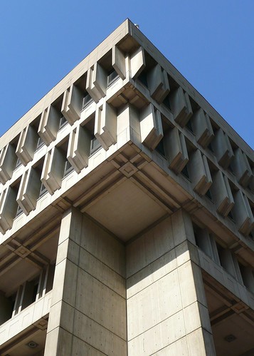
In 1962, Kallmann, McKinnell & Knowles won an international competition to design the Boston City Hall. Their bold design broke from the sleek, stylish glass boxes usually associated with the era. Poured-in-place and pre-cast concrete volumes define public space and private space, while breaks and protrusions in the facade allow the public a glimpse inside the mayor's office. The concrete is of the "brutalist" style, a sort of secondary "modernism" which was beginning to crop up around the US and Europe. The Boston City Hall exemplifies this movement through the use of concrete, rough materials and finishes, and large sculptural volumes.

Built elements materialize the concept of government transparency. This building is probably the closest that American Brutalism came to the ethos of movement. The use of "beton brut" concrete expresses and makes clear the construction methods to a broad audience. Concrete is relatively inexpensive, and the technology trumpets "progress". The large, open volumes create a physical and spatial transparency. This civic statement that the building makes formally is strong, successful, and in the spirit of Brutalism. The building could be considered "aloof" (like the government). It is unclear where to enter, and from a distance the functions of the building are not apparent. Volumetrically, the building creates marvelous interior spaces, though taxpayers do not appreciate the subsequent high cost of heating or the wasted space in the building. I believe that Boston City Hall is a wonderful example of civic monumentality and modernist architecture, however as a functioning building it fails miserably.

Upon completion, the building was praised by New York Times architecture critic Ada Louise Huxtable as "a notable achievement ...Old and New Boston are joined through an act of urban design that relates directly to the quality of the city and its life." Huxtable was not the only critic to praise the design. In his survey of Boston architecture, historian Douglass Shand-Tucci called Boston City Hall "one of America's foremost landmarks" and "arguably the great building of twentieth century Boston." These individual sentiments are echoed by architects who, in a 1976 survey, crowned the BCH the sixth greatest building in America. High praise for any building, these accolades are especially provocative in the case of City Hall.

Boston City Hall was recently named "The World's Ugliest Building" in an online poll. The building has been called "ugly", "a bunker," "a heavily muscled, thick-fingered, knuckle-dragging, semi-monstrous intransigent brute with a slow stupid stare," and a prototypical example of "sweater-snagging Brutalism, concrete not friendly to tender fingertips or to the eye." Legend has it that the criticism of City Hall started when the architects unveiled their design. The crowd let out a mixture of cheers, gasps, and a voice that said, "What the hell is that?" Mayor John Collins reportedly let out an inadvertent gasp of horror. (The design had been chosen by four architects and three businessmen, not the mayor.) The building got the last laugh, however, as Collins was so excited to be the first mayor to work in the new city hall that he moved in before the building was complete and he caught pneumonia. He missed his successor's inaugural speech, bedridden.

Walt Lockley, in a lively 2006 critique wonders, "It is interesting to know how this happened, exactly who in 1962 thought this was a good idea, but the much better question is what now?" A Boston Globe article in 2004, asked "Is there a pox on the building?" Mayor Thomas Merino responded, "Cursed? Nah, it's not cursed. C'mon, it's just had a bad beginning. It's a tough building, though, confusing, too much wasted space, expensive to heat, and it's modernistic and not typical of Boston." Merino, however has led a campaign to destroy the building and move government functions to a site in South Boston. He favors the design of a more "aesthetically pleasing" building. A group of activists have formed the "Friends of Boston City Hall" in order to prevent its destruction. Merino embraced the 2008 "Ugliest Building" award as "good for tourism." As of 2011, plans to demolish BCH are on hold. Architect Gehardt Kallman holds out hope. "I get a sense I may live to see City Hall come back into fashion."

The critics range from architects to critics to city workers. Critics love the building, as do architects, though the flaws do not go unnoticed. The public and the people who work in the building hate the building and do not care about the historical or cultural value of it. Ada Louise Huxtable praised the building, as did Douglass Shand-Tucci. The AIA loves it. So why do the city workers and public hate it? It has a grim aesthetic which takes effort to enjoy. Most people do not understand the beauty of raw concrete. Most people are not able to piece together the construction process through the treatment of the concrete. And most importantly, the public doesn't understand the history of this type of building or the futurist-progressive innovation of the material. Their interaction with the building is very limited. The people who work inside the building hate it because it is dark, cold, hard to navigate, and generally uncomfortable. Boston City Hall raises an importan question, whose opinion do we trust in matters of preservation?

The Lockley piece highlights this question. He is knowledgable and has a humorous yet critical tone. (As many critics of BCH have.) The timing and nature of his critique make me wonder what his intentions are. I suspect he is writing this piece as an activist pre-empting the backlash toward Mayor Merino's plan to demolish the building and sell the land to private developers. He says, "So when the City of Boston finally wants to begin public hearings, inevitably some conservationist will file suit to preserve the building...trust your own judgment and the judgment of those who use and work in the building. Those opinions are the ones that count." Whose opinion do we trust in a circumstance like this one? Do we differ to the educated and informed opinion of architects and critics who love the building as a great work of art, a monument to our civilization? Or is the poor functionality of the building, the leaks, drafts, and dim spaces, enough to condemn and destroy? In this case we should leave the building. Many structures with no redeeming qualities have performance issues. BCH has enough significance beyond function that we should leave it be.

September 13, 2011

A Larry-Davidian Bike Messenger Incident

This summer I was working at Studio-X, perched peacefully on the 16th floor at Varick St. and Houston St. The neighborhood is quaint and mainly comprised of offices and small residences. This creates a relatively peaceful environment, even when compared with nearby Soho. I would take advantage of the surroundings by walking around the block a few times per day. These escapes broke up the day and connected me to the city. One particular experience served as a learning experience for me and highlighted the contrast of everyday living in the city with the romantic nature of this neighborhood.

I was on one of my walks, getting ready to turn from the residential side street back on to busier and commercial Varick St. As I passed a small and shoddy storefront, a bike messenger burst out of the door. He began to run down the sidewalk with his bike before even saddling up. I was in the wrong place at the wrong time and the derelict, clown-looking bike messenger screamed “Get the F#@$ out of my way, NOW!” I shifted my step and he sped down the side walk on his very hi-tech bicycle. I was startled. Obviously, I had the right-of-way on the sidewalk. Bikes are meant to be ridden on the street.

I yelled back at him “Get off the sidewalk!” He stopped, turned around, and rode his bike very quickly back towards me. He went through his high-strung bike messenger act, yelling at me and cursing. I told him to calm down, and refused to fight him (A fight would have gone poorly for me). He got his tough-guy licks in, and scurried off to his next destination. I continued back on my walk, into 180 Varick and up the elevator, to the safety of the 16th floor.

This was a learning experience. It is said that some people learn visually and some learn audibly. I learn the hard way. If anyone had asked me “Should you yell at people on the streets of Manhattan?” I would answer “No.” But apparently I needed proof. Midwestern car-culture allows this sort of behavior, as one is protected by the safety of a car's interiority and mobility. Give someone the finger and just drive away, it will be ok. On the mean streets of New York there is no escape and bike messengers will chase you down.

This was part of the New York acclimation process. Sometimes people are having bad days, and the external stressors cause tempers to flare. The dichotomy between the peaceful walk and the bike messenger incident highlights the nature of Manhattan. John Berger describes living here as a simultaneous dream and nightmare being lived by each inhabitant. It is something that takes getting used to.

I also learned that bike messengers are crazy and to be avoided.

September 9, 2011

Guest Contribution

Our friends at the BI-Blog were kind enough to give us a cameo on their internet website (per se), and this happened. On one hand, we have the beautiful built-silver-linings of crisis, and on the other, an attempt to make sense of a shadowy boat figure in Stanley Tigerman's Titanic.