August 29, 2011

Old/New


if you are the owner of an image and would like it taken down contact us.

August 18, 2011

Nevada’s Frontier Urbanism: Beyond the Las Vegas Strip

Nevada’s unique brand of urbanism grew out of its history, politics, culture, and physical terrain. It remains a fantastic landscape and even its cities evoke the frontier. This “Frontier Urbanism” is the American Dream built on Libertarian ideology and preserved in Nevada.
Nothing is more American than Manifest Destiny. It embodies the roots, the "rugged individualism" that the nation prides itself on. Anglo-Saxons were "destined" to make their way across and inhabit the width of this new continent. Only God could stop them. It was 1776, and a new era of freedom and democracy was expanding westward towards California. Wagons and explorers blazed trails through rough wilderness. Every person had the opportunity to make his way in the free country. While Europe industrialized historic cities into modern metropoleis, America had a blank canvas. The American West, and specifically Nevada, is a living history of this American-ness played out on the open range.
By the end of the 19th century the entirety of the West had been inhabited. Today, our politics has evolved and the rugged individualism manifests itself in subtler, tamer ways. In Nevada, the frontier that was once conquered by pioneers remains only halfconquered, with a unique collection of quasi-urban, suburban, and rural-urban conditions. With cities increasingly homogenous (they can be described simply as "the city") it is areas like Nevada that keep the traditions and ideas of yesteryear alive. These Western towns are also relics of a time, not long ago, when unfettered capitalism was rivaled only by our territorial instinct. Nevada’s towns were vehicles for an insane gold rush in unclaimed lands. Towns included main streets with the most wonderful of false fronts, behind them the opium dens, cathouses, and saloons of the "wild west." The "live free" attitude is alive and well in its purest form on the open ranges of Nevada.
Libertarian ideology of "no government is good government," defines Nevada and its landscape today. This differs from the mid-western family-values-oriented strain of conservatism, where cries for government involvement in social issues dominate the discussion. In Nevada, people just want to be left alone. They hate taxes, planning commissions, and building codes. This bodes well for the architectural adventure seeker. The resulting “Frontier Urbanism" is a freeform, hodgepodge lack of planning which retains the feel of the frontier, even in the most urban areas. This is a direct result of the political ideology of Nevada: No new taxes, minimal service, and minimal regulation.
When thinking about relocating to Nevada’s rural Humboldt County, potential residents are warned about the perils of living on the modern frontier. On the planning department website, users are encouraged to download “The Code of the West.” It cautions prospective land buyers about water rights, rural road conditions, lack of cell phone service, sensitivity of utilities, grazing rights, and many other issues not present in most areas.
You may not have access to a supply of treated domestic water…If your road is unpaved, it is highly unlikely that Humboldt County will pave it in the foreseeable future…Nevada has an open range law. This means if you do not want cattle, sheep or other livestock on your property, it is your responsibility to fence them out…do not expect county government to intervene in the normal day-to-day operations of your agri-business neighbors...Easements may require you to allow construction of roads, power lines, MINING, etc. across your land…The water flowing in irrigation ditches belongs to someone. You cannot assume that because the water flows across your property, you can use it.
It reads like a stern planning department bureaucrat warning of the perils of this difficult terrain. It also serves as a vivid look at the current conditions of America’s last frontier. The land is very lightly developed, if at all. When the trailblazers seeking the coast stopped passing through, development slowed, nearly freezing. Unlike other parts of the country, the majority of Nevadans do not want that to change.
In Reno, the biggest northern city, streets operate on a loose grid in the downtown, but quickly melt into the landscape. It is not a typical suburban development grid breakdown, however. There is simply a lack of cohesion. Each part of town has a different layout. Many are very loose, meandering through the landscape. In the neighborhoods around University of Nevada, quasi-residential areas interlock with half-gridded off-campus housing. Defining the landscape across McCarran Blvd. is New Frontier Urbanism, 2000's style sprawl. This is the American Spirit, updated. The car is the new wagon, the road the new trail, the sky still big, all in a wild-west landscape. One such development is Damonte Ranch, a mammoth collection of eerily similar looking homes arranged in a blob-like street system on old Damonte Ranch. These are the new false fronts, re-conquering the west. By the way, it’s also half deserted.
Within each different piece of Reno’s ungridded collage, you will find differentiation at street scale. Whether it is a tattoo parlor next to luxury condominiums next to a casino, or a Mexican restaurant next to an art gallery next to a motel, the lack of planning and design review makes for a unique and diverse landscape. It is reminiscent of the old west’s varied false fronts reading "blacksmith," "bath house," and "saloon." Today's false front is often more sculpted, three dimensional, and contains a healthy dose of neon and garish color. Each town has a main street resembling something between an old west town and the Las Vegas strip. At building scale, the downtowns are a historical goldmine. They remind us that Nevada is still very much dependent on two industries, gaming and mining. The cities look the part, with neon and older bulb-illuminated signs glowing on top of authentic wooden false front buildings right out of western film. Carson City is the state's capitol. A town of 60,000 with a railroad museum, it has a handful of casinos at its core. The local political battle is funding for a public-private partnership to revitalize downtown with a new parking garage for the Carson Nugget, the city’s biggest casino.
Political heritage is not the only force molding Nevada into a fantastic landscape. The harsh desert makes it one of the least developed areas in the US, next to Alaska. Nevada got its start when gold seeking "49'ers,” headed towards California, stopped at the Sierra Nevada mountains. The Sierra is a jagged, snowy mountain range and many settlers died on its passes. As pockets of gold and silver were discovered in the rough Nevada desert Miners and surveyors moved east looking for new lodes. This was the 19th century, and the state was virtually all wildernesses. Towns would pop up almost overnight to provide access to the new mines of precious metal buried in the hills. A network of towns was created to get supplies deep into the frontier, each town smaller than the next. The pop up nature of the camps gives Nevada an extraordinary number of ghost towns. The network did not last, but some of the larger towns are now rural outposts to this day.
Las Vegas is in some respects a pop up frontier city. The mining towns were founded throughout the 19th century and like Las Vegas, they captured the zeitgeist. Las Vegas is the largest US city founded in the 20th century; it grew extremely fast, much like the mining camps did. Its history parallels the boom and bust cycles of America. Las Vegas was founded in 1905, and Ford's Model T popularized the car in 1908. In 1911, Las Vegas was home to 800 people. It boomed post-WWII along with the American dream. In the 60’s Howard Hughes started the trend of corporate investment in Las Vegas. The population began to soar, and “gambling” turned into “gaming” in the 1980’s. It is currently home to the country’s highest metropolitan foreclosure rate. For these reasons, Las Vegas has long been a topic of urban discourse. The Strip is the gold standard for the commercial vernacular drive-by architecture. Outside of the strip, you will find a city completely designed for cars, much like Frank Lloyd Wright’s Broadacre city. There is no historical city center that was built before the car. The city is a very clear arterial grid. These roads run east-west and north-south, much like a typical gridded city, but with much more distance between each road. The blocks are designed for driving. Within each of the grid's squares, there are unique systems of smaller roads, depending on the development. The roads are very wide and accommodate multiple lanes of traffic easily. Las Vegas exemplifies the frontier urbanist paradigm of cars on the open range, moving about as freely as possible in a city of 2,000,000.
Nevada’s unique brand of urbanism grew out of its history, politics, culture, and physical terrain. It remains a fantastic landscape and even its cities evoke the frontier. This “Frontier Urbanism” is the American Dream built on Libertarian ideology and preserved in Nevada.

April 14, 2011

This Post Needs A Title

This is a piece I put together when asked to write a manifesto. It is a couple years old, but i serves as a departure point for the question "What is Mockitecture?" Been thinking about that alot, and hopefully we can get back to the roots of Mockitecture...comedy as architectural derivative.

Throughout the ages, an architectural “pendulum of meaning” has been swinging back and forth from meaning to non-meaning. The basis is this: classicism/neoclassicism (A – meaning) and its communicative properties, to modernism (B - non-meaning) and its high tech aesthetic. We went [Back] to PostModernism (A – meaning), then [back] to the blob/ NeoExpressionism/ NeoModernism (B – non-meaning) and its high-tech aesthetic. It is only a matter of time before we go [back] to our historicist roots. However, this time around meaning will manifest itself in a new, contemporary language. Both Robert Venturi and Rem Koolhaas speak of the contemporary condition of “meaninglessness.”

In 1972, Venturi stated, “The substitution of expression for representation through disdain for symbolism and ornament has resulted in an architecture where expression has become expressionism.” This condition exists today, as well. Koolhaas’ 2007 description of the contemporary landscape:

“…a desperate effort to differentiate one building from the next – has been characterized by a manic production of extravagant shapes. Paradoxically, the result is a surprisingly monotonous urban substance, where any attempt at ‘difference’ is instantly neutralized in a sea of meaningless architectural gestures.”

Due to the recent global financial crash (and impending fallout), architecture will see the end of the high modernist paradigm of global genericization. This would result from a cultural shift to quality over quantity. Rather than aiming at creating an expressionist icon, a new Cultural and Political system will be realized in architecture, in order to differentiate with in cultural context. This has been the ideal for sometime, but very seldom is it realized.

A recent trend that has hurt our cities is the ignorance of the object. The object is inevitable. There will be a building there. That is what architecture is. So beyond the reorganization of space, architecture has an opportunity to be the signifier of culture. Think Chartres Cathedral or western fronts. When the object is ignored, our cities grow banal and inhumane. Charles Jencks would refer to the architects’ “responsibility for the public and esoteric meanings of a civic building.” Unfortunately, Jencks simultaneously advocates and writes off what he calls enigmatic signifiers as “an especially difficult task in a global culture without a shared value system” (a too often held nihilist perspective on the role of architecture.) The rethinking/reversion of this role is where the recent financial calamities will positively affect culture and architecture in the future. This can happen if we can break away from viewing architecture as resultant force, and make it proactive. Architecture can serve the client, and still hold great meaning. The public can enjoy architecture.

Alejandro Zaero-Polo addressed these issues in a recent article entitled “The Politics of the Envelope,” He states in the article that “the building envelope is now a technology at the vortex of the political storm.”

The envelope exceeds the surface by incorporating a much wider set of attachments. It includes the crust of space affected by the physical construction of the surface, by the scale and dimension of the space contained, by its permeability to daylight and ventilation and by its insulation values and solar-shading capacities. It also involves the space that surrounds the object, its orientation in respect to sun, wind, views, etc. The envelope has the capacity to re-present, not in the sense to which the architectural critique has accustomed us, but in the ancient political role that articulates the relationships between humans and non-humans in a common world. The envelope is the surface and its attachments.

This is where architecture happens. These technologies and constructions hold meaning, and the architect has the ability to make very widely accepted (or denied) statements with this amount of public visibility. This is where we can break away from the oft-accepted idea that architecture is the merely the representation of power, or manifestation of culture: a resultant phenomenon. Zaera-Polo would agree that we could

“…re-empower the discipline as a truly transformative force in the reorganisation of contemporary power ecologies. As an alternative to historical directionality, this experiment wants to propose an analysis of the political dimensionality of space.”

When discussing representation and communication in architecture, literature is a very strong analogy. Willem-Jan Neutelings states that, “There is no writer that would say, that because books are now typed on computers, he makes a different literature. But that is what architects say.” This is the criticism of the contemporary architectural condition. How do the principles of literature and semantics translate into architectural form? One such way, as described by Charles Holland, is the issue of “taste.” When reading a piece of literature, the words are carefully chosen to describe the characters. In this same way, Holland explains, “The signs and symbols of domestic architecture serve as a form of shorthand for the people who live in it.” Issues of class and social standing conveyed in a home are the same kinds of symbols and messages that on a larger scale, a civic building would address.

Alejandro Zaera-Polo’s work, represents one of the most important positions on the world and architecture. Zaera-Polo’s ideas about facades link the technological and representational, in a sort of ultimate architectural expression. I believe that this return to meaning and the repoliticization of the public sphere of architecture is called for if we are to reclaim our streets and cities.

January 31, 2011

The Coming Self-Parody of the Green Movement


{originally published in Beyond No. 3: Trends and Fads by Pedro Gadanho}

Today I ate a McDonald's Mac Snack Wrap. Despite distinguishing itself as a healthy tortilla-wrapped light meal, Mac Snack was a sort of camouflaged hamburger: the Trojan horse of the health food genre. Consumers can no longer acknowledge the snack wrap as an object of nutritional sensibility. In fact, the packaging of sandwich contents into a thin wrap (once an ingenious solution to low-carb dieting) has become a convenient method for selling unhealthy foods. The demise of this health food movement shows how content and function can eventually become overshadowed by aesthetic manipulation. The decline of sophisticated movements into crude fads is not an uncommon occurrence, and can provide a departure point for considering the coming self-parody of the green movement.

The green movement has been relegated to a fad by American political and corporate values, aligned with profit-driven media and funded by oil companies. By denying global warming, and killing any measure that addresses the issue, Neo-Conservatives have successfully dispelled the movement’s ethos. As a result, "green" has been become a fad; something fashionable, yet lacking substance. "Green is the new black." This "cool factor" has been co-opted by capitalism, which is trying to cash in. A prime example of this is the green NBC logo. The normally rainbow-hued logo is green for a week now and then. Sprinkle some green dust on a fading public image and it immediately becomes aligned with the hip, the fashionable. Many celebrities drive Priuses (Prii?) to their private jets, which spew more carbon than a hummer limo could dream. "Green" is one of today's most transparent phenomena.

The punk movement of the 1970’s was similarly espoused by the mainstream. By rejecting all notions of rock and roll modernism, punk’s mission was to break down the corporate hierarchy that was music. As the agenda grew, it was killed by its own success, transitioning from a form of protest to fashion style. The perversion of “punk” occurred as capitalism embraced mainstream popularity surrounding the movement. Quite ironic, actually. Today's equivalent of fashion self parody serves as a model when looking at the future of the green movement.

What does the self-parody of green design look like? Perhaps it is manifest in architectural typologies facilitating non-sustainable practices creatively modified to meet “TREND AND FAD” specifications. Such an approach suggests a contemporary version of the “false front” building, or Potemkin village. Architects can capitalize on this agenda by boldly promoting the image of "green" over the form or content of their designs. Just as faux wood siding, faux shutters, and faux masonry construction have come to define suburban residential design, a faux green aesthetic is possible. "Green" as aesthetic craze will soon trump "green" as ideology. If a building is camouflaged with "green" style, it will be accepted by society as trendy, responsible, and valuable. Thus, a demand for affordable, yet symbolic icons of sustainable building is created. Consider faux solar arrays molded out of coloured plastics, fake ivy hung over vertical trellises, and sculptural fixed-in-place windmills. Such is the image of a "green" society and the unavoidable self-parody of the green movement as we know it.


January 16, 2011

IKEA Catalog for Deviants

After reading some haunting words on Minimalism (thanks to Sam Jacob and the New City Reader), I couldn't not pay IKEA a visit.
Minimalism is the undead form of Modernism, animated by Aesthetics. Like Ed Gein cavorting in suits made from the skin of his victims, Minimalism is a perverted and psychotic condition. It is there every time we look at something beautifully Modern. Its simplicity, its order, its calmness, its smoothness are displayed like the severed heads on Traitors’ Gate: a beautiful warning to architecture. The real perversion? Architects willingly and joyfully enact this macabre ritual. - "Minimalism, An Obituary" by Sam Jacob
With a commanding presence in a spectacular, ever-changing location, where the metropolis dissolves into the heartland countryside, IKEA resembles a giant museum full of Dwellist contemporary pop modern objects. Hybrid Sweedish-English labels add mystique to the event. Where modernism in America has ultimately fallen short in spreading moderism to the masses (motels), minimalism has wildly succeeded (IKEA/Dwell/HGTV).

Nevertheless, IKEA quietly boasts a subversive collection of furniture, rejecting the very minimalism which has led to it's success. These objects play a critical role within IKEA: IKEAn art (minimalism) demands a Neo-DADAian counter-art (maximalism?). Whereas DADA influenced pop art and postmodernism, anti-IKEAn objects sample from pop and pomo. One of DADA's missions was to reject the commodification of art, something IKEA strongly champions through innovative branding, packaging, and product delivery.

Much as the way we have come to discuss DADA-influenced art, the IKEA Catalog for Deviants can be collectively read as an attitude: as an attack on the co-opting of Swedish modernism for soulless, gut-wrenching capitalist minimalism. Alas, a collection of monstrous objects united in the spirit of refusing convention:

EKTORP: A strangely Venturian floral print sofa peeks out from behind a collection of solid colored furniture.
In a brilliantly symbolic gesture, EKTORP's bed is extended. A middle finger is raised to the surrounding IKEA establishment of polite modernism.
HEMNES: The profile of this mirror also evokes Venturi-Knoll-ism.
TROLLSTA: Vika Fintorps used to be all the rage, until sadly they were pulled from the shelves (of the IKEA I visit). Now, all that remains is this little guy: a 6.5 inch (17cm) tall side table (with legs reminiscent of the the voluptuous VIKA FINTORPS).
VIKA GLASHOLM: A flower-patterned glass table attached to minimal IKEAn stainless steel legs. When the light hits the just right, flower-patterned light disrupts the serenity and purism of the Dwell subscribers' minimal environment. Mmm.

SKRUVSTA: The elephant in the room...the "anti-desk chair" desk chair. Work should never be that fun.
MARKUS: The ... giraffe ... in the room!? Textile design is not the only way to subvert IKEA's grasp on the minimal.  Here, the form of the chair is extruded to the deviant desires of the designer, Henrik Preutz.
LEKPLATS:  A children's play mat (lek plat?) presents bits of New York, Antarctica, Egypt, Switzerland, Miami, etc. compressed into a singular globalized place: a collective identity for us all.

LUSY BLOM: Variations on an asterisk
LUSY: This haphazard collection of color and form evokes nothing and everything. The noise and clutter of today's world as we know it. A large "NEW" sign to one side, a large white rug hiding it on the other side, this object represents the underbelly of IKEAn fashion: a possible new direction for the future of the company? We can only hope so.

LUSY: incomprehensible nonsense. Stylized characters in Helvetica type face graphically construct an image which makes as little sense in the States as it does in Europe. I still contend this piece was informed by Japanese (game show) graphics, however my colleagues remain confused and unconvinced.

This LUCY unfolds to reveal two 2D kimono shirts adding to the spectacle and confusion of the piece.
The monsters of IKEA, manifested in wildly patterned textiles and/or curiously proportioned everyday objects, are at their most pressing and most extreme when their visual language becomes illegible to a global audience. Perhaps LUCY's illegibility occurs from a series of critical mis-translations across the production of the object - from Sweedish designer, to Chinese manufacturer, to American retailer. Or perhaps LUCY's illegibility is derived from a more intentional series of decisions: a rogue designer fed up with minimalism, provoked by the masses. We might never know for sure. When nobody, nowhere knows what to think, anti-IKEAn design will have succeeded.

Carl Wilson, in his book on "taste," questions the existence of a "risk gene" for artistic adventurousness in music. The conversation holds true for design as well:
"Balancing repetition and novelty is crucial: some songs feel too complicated to enjoy and others too clichéd to hold interest. There's little explanation, though, of why people gravitate toward different ratios of surprise to familiarity."
Wilson turns to journalist Jonah Lehrer for answers:
"There's a network of neurons in the brain stem specifically geared to sort unfamiliar sounds into patterns. When they succeed, the brain releases a dose of pleasure-giving dopamine; when they fail, when a sound is too new, excess dopamine squirts out, disorienting and upsetting us. Lehrer suggests this explains events such as the 1913 riots at the Paris premiere of Igor Stravinsky's dissonant 'The Rite of Spring.' [...] a year later, another Parisian audience cheered for 'The Rite of Spring.' [...] It seems implausable it was mainly the rioters returning to give him another chance. No, it would have been the hipsters of 1914, lured by the succéss de scandale and eager to be shocked, to take the dopamine overdose."
Anti-IKEAn objects are to be consumed by today's versions of the 1914 Parisian hipsters - whatever that may mean. Anti-minimalism is a drug. It is to be consumed by dopamine junkies "eager to be shocked."

This catalog could go on and on. To those who demand MORE IKEA DADA, continue on to the images below, and to here (STUVA) and here (KLIPPAN)...


MULA: A toy for the avant garde, discarded amongst heaps of wooden hangars (toys for common folk).

January 9, 2011

A Playground for Cars


The Tower Place Garage is an outrageous modernist object lost amidst a core building stock of historically relevant commercial architecture. The 1967 building was constructed with the mission to attract an increasingly large suburban demographic to return downtown to support commercial activity.


Formally, the garage is an extension of the city's streets, actually appropriating pedestrian sidewalks for ramps which feed into the garage. This decision, paired with a continued lack of maintenance (and lack of funds stemming from poor sales) threatens the future of the garage. What was once a by-product of technological efficiency - a key player towards the understanding of the city as a machine for creating wealth - has been relegated by the public as a stereotypical example of ugly modernist urban renewal contributing to, rather than saving, the continued decline of the city.


Nevertheless, moving through Tower Place Garage is a delightful experience. It's perimeter is lined with delicately sloping ramps, rising one story for every pass. This arrangement allows ample space for an interior courtyard, a surprising and rarely seen element of parking garages today. The opening is bisected by a series of stacked, orderly walkways-in-the-sky feeding into a bunker-like staircase which returns the driver to the wilderness of the city sans car.


Typically walking is the best way to observe your surroundings, but the verticality of this garage, in tandem with it's repetitive structural bays and required slow speed limit generates a fantastic cinematic experience for the driver. The city unfolds behind the safety of the windshield: slow and steady, building by building, floor by floor. Oh how I wish it was possible to experience all cities this way!


Upon reaching the top of the garage, the concrete frame concludes with a simple curvature. The city below has disappeared.  All that remains is a strangely quiet space of vast expanse. It is cheaper to park on the roof.

The circular ramp represented in Google Map's cartoon-stylized plan as a simple cylinder. 


The most spectacular exit discharge sequence occurs through the core of the garage by means of a 9 story continuous spiral ramp.  Pleasantly designed to the turning radius of an average car, minimal turning is required. Such a design begs the driver into a speedy descent. This radical infrastructure requires it's own set of rules. Signs are plastered throughout the descent: 5 M.P.H., NO Pedestrians Allowed on Ramp, CAUTION, Merging Traffic! Hundreds of scrapes of every possible automobile color add a touch of unexpected decoration to an otherwise no-nonsense concrete playground for cars.  


Before you know it, you are ramping back into the city. I wanted to immediately return and drive down the ramp again, a feeling I'm sure is shared by many first-timers to the garage. Never mind that stop sign I ran towards the end. I was inflicted with a euphoric high rarely inflicted by an architectural experience. 

Ironically, contempt for the garage continues despite the fact that it's existence has allowed adjacent Tower Place mall to continue operating throughout year after year of depressing sales: “The only reason [Tower Place] hasn’t folded is because of its parking asset [...] It’s a revenue generator, and it’s been keeping the mall afloat.”


Juxtaposed against the lovingly soft pink painted concrete and unabashedly optimistic prancing of the ramps over the sidewalk (Morris Lapidus would be proud), the garage is looking more and more like some unresolved, unachieved bit of utopianism (autopianism?): a Jetson-ian vision of the city where the freedom of technologically sophisticated speeding autos trump boring, slow-paced pedestrianism.

Nevertheless, the garage is showing depressing signs of decay, while the 70,000 S.F. adjacent mall sits nearly completely vacant (foreclosure is pending for both). Things are not looking well. Rusting pipes and cracking concrete signal the end may be near for Plaza Tower Garage. To destroy this place would tremendously impact a piece of Cincinnati's history. Ugly or beautiful, the city needs places like this to remind us how the city was once used. Homogeneity is bad. Monsters are good. Buildings are to Cities as Rings are to Trees. 

January 2, 2011

New Pop PoMo

Nearly two years ago, we created the "blogger's sport" of Building/Song pairings. If you're not familiar with the game, educate yourself with our attempt at an exhaustive list of the game and it's players: (let me know if there are any omissions...)

We're back in the game, this time taking a look at today's pop music scene, selecting a trio of songs which seem to negotiate between past and future realities. They share a common desire to reconstruct the past on their own terms, sparking what could be considered a new youthful (and fashionable) wave of postmodernism. The aesthetics of these songs are captured through experimental variations on the "music video" (e.g. The Black Eyed Peas pioneering of 360 degree 3D film, Lady Gaga reclaiming Hollywood for herself through a cinematic borrowing/stealing, and the music video turned full-length, self-deirected film by Kanye West.

Science fiction could never have predicted a new millenium saturated with groovy 70's fonts, polaroid photo shoots, arcade 8-bit bliss, and late '80's soft rock electrodiscodance combos. Nevertheless, watching these videos, take note of how typical pomo material (e.g. reinterpretation of nostalgia + multiculturalism) is taken to the next level . These weapons-grade pop samples demand an architecture which is firmly rooted in hybrid realities surrounding truthful (or deceitful) narratives of the past (and future).

1.) The Black Eyed Peas - The Time (Dirty Bit) paired with Neo-Rococo furniture from Smansk:


Within today's globalized, network urban world, the music video begins with the futurism of outer space juxtaposed with the sampling of a soft rock song from the late 1980's. The aesthetics of the video flash into a heady blend of google street view, drug-infused pixelization, and avatar hallucinations all packaged with an aged, nostalgia-inducing photo filter (also see The Black Eyed Peas - Light Up The Night for the co-opting of '80s arcade nostalgia with QR Code overlays). It's agenda is to convey happiness through maximum visual stimulation and hypnotic beat. Neo-Rococo, as artistic style closely resembles the 'Peas' attempt at space/time maximalism. Sorry, no building here, but a successful curatorial performance in my opinion.


Not much can be said about Lady Gaga that has not already been said in this delightful experiment. She's into challenging gender (and celebrity) identity roles, the aestheticization of tragedy, haute couture, etc. Best put here:
At the start of the video, as Gaga is shown plummeting from the balcony to the ground in slow motion, a synthesizer sonority enters emulating Gaga’s heartbeat; moments later, the listener is inundated with the sound of paparazzi anxiously snapping away at their cameras. The snaps and clicks combined with the pulsating heartbeat create their own distinct rhythmic pattern, and persist until they meld seamlessly into the song’s ostinato bass line – a slightly simpler version of the initial rhythm. Thus, we can say that the beat propelling the entire song grew out of both Gaga's heartbeat and the snapping and clicking of the paparazzi, a resonance that is at once organic and fabricated – an important dichotomy in this video.
Café Was in Hollywood, CA designed in 2009, featured in Dark Nostalgia, addresses Gaga's experimentalism and theatricalism, and is perhaps the first of many Gagaian spaces to emerge. From Café Was' website:
A Unique Hollywood Architectural Experience: Enter a reflective dream world, sensitive and severe, always seductive and never overt, where you are invited to enjoy delicacies while discovering new talent
Cafe Was is a thoughtful amalgam of "recycled" architectural/interior design related ideas. We assembled these ideas in varying stages of deconstruction and whimsy, ultimately creating a theatrical environment in the form of a restaurant/live music venue, where not only the piano player, but the patrons as well, will be compelled to play a role.
With a revolving grand piano at the center of the room, Ivan Kane and RKIT set about to create an opulent, bohemian dream world. The diverse space offers several options where patrons can dine, including multiple levels surrounding the piano. While achieving a collaboration of time in both design and style, including columns at the ground floor turning into Victorian posts at the intimate mezzanine level overlooking the piano below, Café Was also features hidden lounges tucked into nooks and crannies, a mysterious balcony turned into a lavish candle display and Café Was' most unique vantage point to sit and listen from, a grand staircase leading nowhere.

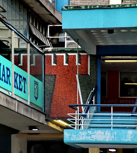
3.) Kanye West - Runaway (2010) paired with Castle Market, Sheffield, 1967


Rowe's Transparent Modernism full of Victorian furniture, African chants, and hip hop mixology.
The New Postmodernism.
Michael Jackson and the Spectacle.


Notably found within this half-hour self-directed film are African dance rituals paired with 1980s/90s sound mixing technology, and a post-industrial hangar/bunker housing what appears at first glance to be a reinterpretation of the Last Supper (a genre-bursting, symbolically loaded scene highlighted by a 2 minute solo featuring "interpretive ballerina dancing" (within a rusting post-industrial hangar) to a spoken melody broadcast via 80s-era sound distortion technology):
"There is a dinner table scene that jumps from [something] from a Noah Baumbach film — where the camera stays on the scene just long enough to make the viewer feel a little bit uncomfortable — to something out of what could be a Jim Henson creation ... within the same scene too." - Pete Wentz, reporting for MTV News
Ultimately West's film is about "social ostracism and rebirth". As we've mentioned earlier, the architectural equivalent to such themes is undoubtedly brutalism as both idea and aesthetic. So for this pairing, Sheffield's endangered Castle Market (a building I've never visited and only read about) wins. It's association with a movement whose aims are decidedly utopian and whose aesthetics are a radical departure from the heritage industry, make this place as polemic as Kanye himself (Apologies to both purist hip hop enthusiasts and architectural historians alike - two groups who probably rarely associate with one another). On the one hand you have West - and his thirty minute effort to rebel against the culturally constructed symbolism (queue Hennessy Youngman) of our day. On the other hand, Castle Market, whose brutalism (with a touch of mid-90's PoMo leftovers) overlaid on the foundations of Sheffield's authentic/original castle create the 20th century reinterpretation of the 16th century castle: a civic monument via defensive infrastructure.

December 23, 2010

Happy Holidays

Here's to a thoroughly enjoyable 2010, and an ever-more promising 2011. Season's Greetings.
Figure 1 Destroying the Farnsworth House


November 9, 2010

Slow and Steady Wins the Race

nice piece of writing over at Frieze Mag:
Perhaps the truest screw heir is Paul Octavian Nasca, a Romanian programmer who wrote the software used to create recent viral hit ‘U Smile 800% Slower’ (2010) – a Justin Bieber track stretched to 800 percent of its original length while the pitch remains unchanged. A Florida-based electronic musician used Nasca’s algorithm to smear the three-minute single into a half-hour epic of shimmering, sensual ambience. Bieber-haters and his legions of fans were equally enthralled by the transformation, which made the Canadian teen star’s corn-syrup pop sound like Icelandic band Sigur Rós. In less than a month, it was heard by more than two million people, received the endorsement of Mr Bieber (he tweeted: ‘this version of u smile is incredible to just chill out and fall asleep to. feels epic’), and spawned copycat slowdowns. - Jace Clayton, Music: The slowed-down tempos of screw and its influence on contemporary bands