August 26, 2008
David Byrne
While we're on the subject, I would call David Byrne a serious practitioner of mockitecture. He straddled the line between serious and silly, meaning and non-meaning, familiar and exotic. The first example of this is in his musical stylings. they incorporated many many different kinds of music from all over the world, exotic blends of rock, country, afro-pop and latin. but in the end, a beautiful, identifiable end product was produced. It reached across age and cultural boundaries. His lyrics did the same, but they took on the opposite philosophy. The lyrics usually were superficially silly, and seemingly had no meaning. They usually were about completely ordinary things. Lamps, post offices, dry ice factories. This is the harmonious dichotomy of Byrne's music. A touching Love Song sung to a lamp. Seriously Goofy.
August 25, 2008
David Byrne for NYCDOT???
 David Byrne designed these bike racks in NYC. They incorporate images from the lives of everyday people. [more...]
August 20, 2008
Hilarious Inspiration
This is a good video about some beautiful "reverse graffiti." It also has a great moment where English artist "Moose" tells us about the inspiration for his work. It is at the 1:29 mark. [more...]
August 19, 2008
August 18, 2008
House on stilts
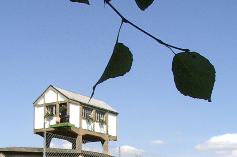 This is a goofy house on Stilts. OSA (Office for Subversive Architecture) re furbished this old Signal Box geurilla style, only to have it destroyed days later. [more...]
August 17, 2008
Basketbar by NL Architects
 First of all, that is actually the name of this building. Second, the Basketbar is great mockitecture. From what I gather, in Europe, Universal Design and Accessibility are not as important as in the US. Burdened with the reality of making the student dormatory handicap accessible, NL Architects came up with this award winning solution. They made the ramp not only wheelchair accessible, but also skateboard accessible. Then they painted it orange. Brilliant.
August 16, 2008
Bulbous Buffont
 This is a nice bit of irony. Sergio Silva's Oyule Lamps use old methods and modern materials. There is something sinister about the overtaking of the light bulbs' body, almost like a parasite which has overtaken its host. And the parasite is the old method. Beautiful design, however. [more...]
August 9, 2008
August 7, 2008
Bball-ing
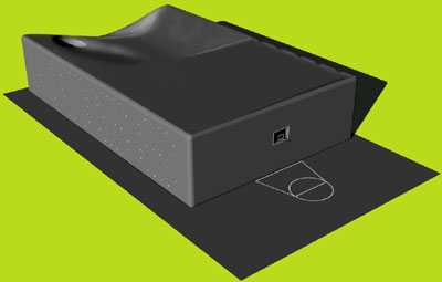 This project is by one of the leading mockitecture firms in the world, NL Architects. The basketball hoop is also the building's only window. The WOS 8 was designed to grow into a public space in the new part of Utrect, Leidsche Rijn. This building addresses the issue of applied vs. integrated ornament. This ornament is integrated, and serves a very useful purpose. This is when ornament is at its strongest. This building accepts the inevitablilty of the object, and embraces, even didacticizes the potential of the users' experience of said object. More to come on this great firm.
Subscribe to:
Comments (Atom)


