January 31, 2009

When Blogs Plagiarize

I’m a huge proponent of digital media, as anyone who works with me knows. I love combing through the various architecture and design blogs—it seems like there’s a new one every day—and I often get story ideas from these sites.

But what I don’t love is when these sites poach Mockitecture's content without permission. We at Mockitecture work very hard—and spend a lot of money—producing original content. We appreciate when our online counterparts recognize our content by posting a headline, a few sentences, and a link to the original story (Architizer and Archinect are particularly good at this!). Too often, though, sites repost the entire story and photos without permission and without proper attribution. It’s plagiarism, hands down, and it’s a violation of copyright laws.

Here’s a recent example: BLOBBLOG recently reposted my news story titled “Blobbiness.” The author of the post, Isozaki420, made a few minor modifications to the story, and then slapped his byline on it. He used my photos, as well; fortunately, He gave me credit for those. But Iso never received permission to repost the story or the images. (See links below.)

When it comes to protecting creative content, journalists and architects often face the same challenges. It’s disappointing when someone else takes credit for your work. Can’t we all just play by the rules and focus on creating fresh material? Or, in the case of aggregation sites, know where the line is between cooperation and co-optation.

Blobbiness

• Mockitecture version (the original):

http://mockitecture.blogspot.com/2009/01/blobbiness.html

News Flash: Cartoonist Claims Suburbia Will Die!

Consider this a plug to all of our local fans and readers (I apologize to the rest of the eWorld)...Warning to those unfamiliar with the city of Cincinnati, Ohio: many references to local politics, locations, and landmarks. Reading between the lines will certainly reveal the crossroads American urbanism faces today...

My good friend Jim (Borgman) enjoys drawing cartoons. In fact, he is a Pulitzer Prize-winning political cartoonist for the
Cincinnati Enquirer. His work can be found newspapers throughout the country and is even displayed in the White House. In the excerpt below (2002), he paints a very radical image of a Midwestern American city rebounding from it's more prosperous years of industrial growth. Watch out European cities...here we come:


"Suddenly everyone began streaming into the center city. Urban planners described it as the “donut-hole phenomenon”. The hotels filled to capacity as thousands of outsiders parked their SUVs and rode the Metro into the vibrancy of the urban maelstrom. “There was nothing left on the outer rings but stale crumbs,” explained a Downtown consultant."
Overnight, the inner city experienced a renaissance of retail, recreation and residency. Soon the lights were blinking out in shopping malls all around the beltway.
Strong-Mayor-For-Life Charlie Luken spent three days a week cutting ribbons at newly constructed high-rise homesteads, for which developers paid the city he fees for building rights. During much of the rest of the week, the mayor could be found on the Jack Nicklaus-designed Riverside Links – 18 holes of verdant perfection that hooked and sliced around the homes and businesses of the Banks.
Casino boats from Indiana steamed upriver, attempting to lure passengers on board at Cincinnati’s Public Landing with offers of free rides and chips. There were few takers. “Why bet on a long shot in Lawrenceburg when you’ve got a sure thing in Downtown Cincinnati?” asked one satisfied resident as she walked her Lhassa apso across the newly restored doggie green in Lytle Park.


Once the ordinance passed that prohibited automobiles from coming any closer in than the I-275 beltway, the skies cleared over the center city and D.C. (Downtown Cincinnati) became an international destination for health enthusiasts. “I come to bathe in the balm of the Ohio,” said a tourist from Tokyo, as he stood beneath the outstretched arms of the Genius of the Waters. The Hamilton County Sheriff’s Beach Patrol had to put on extra deputies during the warm weekends of summer when pilgrims seeking the rivers city’s reputed healing affects would line up for immersions along the Serpentine Wall.
Eventually the fortunate residents of Downtown began to complain at the injustice of having to pay subsidies to support the far-flung, fading suburbs. “I’m afraid to drive out there at night,” was one common complaint. “It’s eerily quiet and there are no lights to guide you but the stars and fireflies.” Others complained that the cost of maintaining miles of highways to far off points like Montgomery, Mason and Greater Deerfield Township, should be born by those who chose to live so far away from the comforting cluster of downtown humanity.
The City’s Motto: 'Why leave Downtown? Everything you could ever want is right here!' "

January 27, 2009

More Building/Songs

Per my colleague Mr. Holland's request for more "haunting digital emptiness", here is Harold Faltermeyer's Axel F (1984) and OMA's Beverly Hills Prada Epicenter (2004). This is a wonderful piece of nostalgia. I especially enjoy the headless mannequin and the laser beam lights.


Our next Building/Song is a theoretical pairing. It reaches across boundaries of genre and time. The song: Yello's 1985 classic "Oh Yeah' (Day Bow Bow) and Mies' Barcelona Pavilion (1929). Beautiful!

"Callin' out around the world/Are you ready for a brand new beat?..." Yes. And it's called New Urbanism. This is Seaside, FL, a planned community by Andres Duany and Elizabeth Plater-Zyberk(1979). The song which I feel should be blairing through the streets of Seaside is David Bowie and Mick Jagger's 1985 rendition of Martha and the Vandellas' 1964 "Dancin' In the Streets."


Redneck Mansion

This is a great picture. Really, it is. The assemblage of these trailers...mocktiecture. more at SuperUse.

January 22, 2009

Colbert Interviews Elizabeth Alexander

Poetry and architecture have alot in common. Linguistic interpretation can inform architecture. Elizabeth Alexander explains some different aspects of poetry to Stephen. To understand Colbert's humor, it is good to have an understanding of Bill O'Reilly, and keep in mind that Colbert is only a pseudo-conservative.

January 20, 2009

Obama, McFly, and the Future

First, let me start off by saying that it was a great inauguration day, and I am feeling relatively at ease with the way things are heading. Change has really caught on, as evidenced by the swift change in aesthetics of Pop in America. Literally everything seems to be changing, from advertising to the way we discuss race and politics, to how we view America. Colin Powell was spot-on with his prediciton that Obama would be a "transformational figure." It truly has impacted nearly every aspect of society. Things are remarkably positive, even in the worst "crisis" most of us have experienced.
  
Many people were disallusioned by the last decade or so (ok, I'll say it, 8 years) and now feel that we can catch up so to say, and maybe move forward. Many of the Neo-Con policies and tactics that have set us back seem to be fading, and I think that Pop is reflecting that. I haven't noticed a significant change in generational Pop for the last decade or so. even as we have significant trends blistering forward in the arenas of personal connectivity. But literally in the last three months, I have noticed that we seem to have met a critical mass of sorts, and now have realized what was bubbling beneath the surface for the last few years. We are in the future.


That clip is amazing. Start off with the accurate projection that we would love the 80's. Then, the hybridization of culture (cajun sushi). It portrays almost perfectly the two conflicting responses we experience when thinking of the future. One is a disbelief in the future, an awe inspiring phenomena which is the equivalent of looking into the future. We get a glimpse of what is to come. Because they are usually familiar objects, made unfamiliar, we percieve them as strange. The second way that we think of the future is looking back. Is this the future? If this were a movie, could this be the future. This is how I am feeling right now. It is much like 2015 from Back to the Future. I almost feel as if the whole world changed really quickly around me. We have realized the critical mass, and we are in the future. Instead of sitting around playing Phish on our guitars, we are playing Wii and listening to Daft Punk. Hello future.


The intersting thing about Obama's campaign was his embracing of popular culture, and vica-versa. He latched on to the aforementioned personal connectivity revolution, and it made all the difference in the campaign. He was on everything from facebook to twitter, and was using skype and youtube. Probably more important were the artists and musicians who gave him so much free publicity. He may not have even been nominated if not for them. The unique innovation and mix of Pop and politics (maybe I just like it because its Beyonce, but that clip is amazing, especially at the end) is another prime example of how revolutionary Obama is.
The effect of this mix is increased political awareness for everyday people. This is why Pepsi and many others have latched onto these ideas. They are not only catching on in politics, but in everyday people's lives. How will architecture respond? Will architecture speak to everyday people? Can it be political? Or popular? Will there be architecture that people understand? Can architecture transcend the boundaries that politics has and make people more aware of their surroundings? Can it participate in the pop culture/political/whatever else discourse? Could it even contribute to it?

January 19, 2009

HaPpY BiRtHdAy MoCkItEcTuRe!!!


Dear eWorld,


Mockitecture is celebrating it's one year anniversary with a monumental 100th post!!!  Join in on the festivities as we take a long look back to some of our favorite posts, retrospectively define the state of Mockitecture, and question what the future has in store.  In the meantime, a thank you to our friends here in the States and the 72 countries abroad who have joined us on our journey through the eWorld.  Please {con}tinue to {con}tribute to our {web}log with {ex}amples of {in}spiring {image}ry and {art}icles.  


Cheers,


The Mockitecture WebLog Team
dontknockitecture
N O R T O N
Isozaki420

January 18, 2009

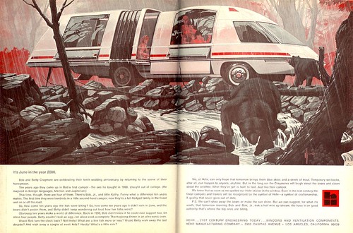
"Its June in the year 2000."


(via no2self and sesquipedalist)

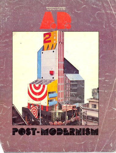
While we're on the subject of nostalgia and historical references (which we seem to always be), these old covers are great. I wonder how we will look back at our contemporary covers of popular magazines. On one hand, we may look at them in a charming way, retrospectively laughing at ourselves and our former naivite: we look at the advent of air conditioned comfort or the automobile in this fashion. This is how things become legendary, such as Dippin' Dots. (the Wave of the Future phenomena)

On the other hand, it is wholly possible that we look back at the current "Sustainability Now!"-ishness of current architecture magazines and not have the same warm and fuzzy feelings. There is a bit of skepticism, mixed with doom andgloom, with a hearty side of self righteousness. I wonder how we will think of this trend in forty years. It definitely lacks the naive energy of these covers...


This is an old advertisement offering futuristic luxury in the form of this extraordinary RV.
"Its June in the year 2000." Great Iconography. Is it a plane? An accordian? A minivan? A dustbuster? A snake? A gherkin?

January 11, 2009

Nostagiolistically Evocational

I'm wearing earplugs and headphones, with the headphones all the way up. This way, the music sounds just right to me, but the headphones are up so loud that everyone around me can hear my music. I'm using two products simultaneously to contradict each other.

So, uh, check out this recent post from a great music blog entitled 20jazzfunkgreats. It describes each track in mind-boggling detail. Each song is translated from music to words with astonishing accuracy. The experience of reading and hearing the music is an interesting one. I'm not sure if the word is "enhanced," but it is definitely a unique way of hearing a song and artist for the first time. It is not a new thing, these translations from word to song, song to word, song to building, building to word, word to building, song to song, building to building, and building to song.

Could we listen to music which would further the experience and character of a space? Can these songs "code" the space? Can music taste be translated into a building? I guess a nightclub is sort of the jumping off point for such exploration.

But there are principles which also translate from each of these scenarios. I have wondered what would happen if each building had a song that was grouped with it. For the first experimental pairing, I have chosen the holy grail of mockitecture, Charles Moore's Piazza d'Italia (1976-9), and The Isley Brothers' 1974 Classic, Live It Up...

January 9, 2009

Revisting the Duck

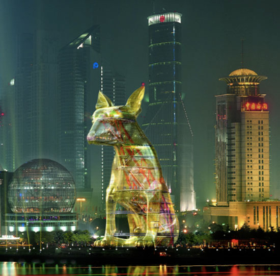
Apparently, in China "archimages" are very popular. I have been trying to discuss other forms of mockitecture, but this is a noteworthy example of the sort of architecture which everyone can like. The tectonic and high tech aspects of the dog are striking to an architect concerned with such issues. Many building are intersting in these regards. What sets the dog apart from say Lloyds in London, is that it is shaped like a dog. And anyone can tell that a dog shaped building is awesome. Is it Irony? Is it Populism? Maybe it is neither, but these sorts of image buildings are not only appropriate in an image driven world with no attention span, but they also add layers of meaning and interest to an otherwise hard to read artform.I applaude the Chinses for rendering the dog so that it looks like something out of a futuristic sci-fi movie. I guess that they are just reminding us that it is indeed 2009. The various examples that Fei Wang gives in his blog, "Chinese Archimage Phenomena" serve as some of the most hilarious examples of building as literal reference. These not only are funny to laymen because of their identifiable connotations, but also to architects. Many of the buildings are literally copied from history or contemporary architecture. That is funny.

January 8, 2009

Vitruvian Pervert

James Stirling revels in his mastery:
"A man living on his famous (now long since demolished) Runcorn housing estate with its big circular windows had been arrested for exposing himself to a busload of nurses which passed his house every morning. One aesthetically-aware nurse noted that, thus framed, he looked like Leonardo's Vitruvian Man. But what tickled Jim was the man's defence in court. Given such windows, what else could he do, he asked, claiming that his misdeed was the architect's fault. Jim insisted we publish this."
[From this article...]