February 18, 2009
Post-Acropolyptic
Not completely sure what to think of this, but anytime someone paints the Pope on naked people, it's worth noting.
February 17, 2009
McNuggetini

"McDonald's chocolate milkshake w/vanilla vodka, rimmed with barbeque sauce, garnished with a chicken McNugget."
(via thisiswhyyourefat)
February 16, 2009
Taking Graffiti to the Next Level
a MUST WATCH video by an artist named Blu...perhaps you've seen this stop animation classic? regardless, definitely check it out when you have a free 5 minutes...


February 13, 2009
Mockitecture.com Firm of the Year Award
February 12, 2009
Criticizing Critics' Criticism
I am fascinated with the way politics is discussed in our modern 24 hour news cycle. Cable news now reports on politics literally around the clock. There are 3 different all news all the time cable networks. (CNN, MSNBC, and FoxNews.) By the nature of competitive markets, sensationalization and theatre are becoming the norm. Everyone must make something more exciting so that people will watch. This not only affects how we talk about politics, but also how politicians act in the face of constant media scrutiny. Many times two politicians will be pitted against each other, and much of what you see on the news becomes opinion. Arguing and accusing sometimes replace serious discourse, and "spinning" blurs facts until no one know what to believe.
Punditry has become a commentary on commentary. One snippet of news is rehashed for 24 hours, usually between aforementioned opposite ideologies. Many times this "Crossfire" format leads to exciting and impassioned debates where name calling, yelling, and condescending smugness provides entertainment along with the analysis. Much like the news is based on reaction to news, sometimes the best part of a project is the reaction to it. In the media, in entertainment, and in architecture alike. Illicited responses are a lot of fun. Many television programs are centered around getting responses from people. This is a skit from a popular TV show:
The actions in the video are great, an absurd concept carried out to perfection. The idea of a blind guy driving and crashing into the car in front of him is successful because of its simplicity. It is clever, but not over the top. A middle ground is tread upon, and a deadpan approach underscores the blend of clever and simple. A great deal of restraint is also shown. Skits are never allowed to be taken too far. But what really makes the video and many others is the responses of the people who are inadvertently involved in such spectacle. It could be argued that the reaction is actually more important than the actual activity. Would the activity exist without the people around who will react to it? By the way, I know what you are thinking. Who links Jackass on a blog like this? Well, I am reminded of a game Robert Venturi used to play with Denise Scott Brown: "I can like something worse than you can like."
 The AT&T Building By Philip Johnson, when first constructed was very confrontational. It opened up the floodgates for the fight between the Modernists and the PostModernists. I will not get into the specifics of this fight, although there were some nasty things tossed back and forth, with each side accusing the other of things like Nazi sympathizing. Much like contemporary politics! Each side criticized the other, both with their work, and their words. Charles Jencks calls this "Critical Modernism." All -Modernisms exist simulataneously and criticize each other. PostModernism is one of those -Modernisms. The modernists called PostModernism among other things "architectural AIDS" and "transvestite architecture."

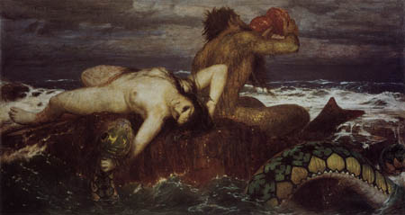
The Dada movement met similar opposition, especially in its early years. Actually, in a prelude to Dada, Arnold Bocklin's work represented one of the earliest attempts at intersecting wit and playfulness into serious art. He was a painter who would paint conventional paintings about mermaids with chicken legs instead of fish bodies and other such absurdities. It was met with strong criticism, even inciting mobs at one point.

As Bocklin's career went on, he was often attacked for his "baroque tastelessness" and his being a "degenerate." As these criticisms were being unleashed on Bocklin, the artist's advocates fought back and took their countrymen to task. It was critics criticizing criticism.
The actions in the video are great, an absurd concept carried out to perfection. The idea of a blind guy driving and crashing into the car in front of him is successful because of its simplicity. It is clever, but not over the top. A middle ground is tread upon, and a deadpan approach underscores the blend of clever and simple. A great deal of restraint is also shown. Skits are never allowed to be taken too far. But what really makes the video and many others is the responses of the people who are inadvertently involved in such spectacle. It could be argued that the reaction is actually more important than the actual activity. Would the activity exist without the people around who will react to it? By the way, I know what you are thinking. Who links Jackass on a blog like this? Well, I am reminded of a game Robert Venturi used to play with Denise Scott Brown: "I can like something worse than you can like."
 The AT&T Building By Philip Johnson, when first constructed was very confrontational. It opened up the floodgates for the fight between the Modernists and the PostModernists. I will not get into the specifics of this fight, although there were some nasty things tossed back and forth, with each side accusing the other of things like Nazi sympathizing. Much like contemporary politics! Each side criticized the other, both with their work, and their words. Charles Jencks calls this "Critical Modernism." All -Modernisms exist simulataneously and criticize each other. PostModernism is one of those -Modernisms. The modernists called PostModernism among other things "architectural AIDS" and "transvestite architecture."
Triton and Nereide, 1873-4
"With your small painting of the sirens you have provoked in Basel a highly comical revolution, a life and death struggle. The so-called connoisseurs of art huddled in armies before it, with monocles and opera glasses like blowflies around sugar granules, simultaneously screaming and quarreling with one another... only when the painting left did the storm subside."

Sirenen, 1875
"It is the intention of the artist that we laugh at some of his figures, just as some of Shakespeare's characters are meant to make us laugh. Strangely enough a number of otherwise art-loving viewers seem not to be able to understand or relate to this idea. They view it as a weakness of Bocklins work if one of his figures contributes to their amusement!"
Self Portrait
February 10, 2009
Lo-Fi Architecture
 The dialogue continues re: music-building pairings over at Life Without Buildings.
February 5, 2009
The Wild World of Twitter
I am enjoying wasting everyone's time with the newly discovered Twitter application. Any other important questions I should be tweeting to my eFriends?


February 4, 2009
February 2, 2009
Burberry Brutalism
"Brutalism" - for those of you not entirely familiar - is an architectural movement made popular at the height of the modernist movement in the 1960's. It's name is lovingly adopted from the French term "Beton Brut" meaning "raw concrete". Buildings designed in this "style" (if you will) are characteristically rough and blocky - typically constructed of cast-in-place concrete. Wood grain from formwork used to cast the concrete often becomes embedded in the structure, suggesting (of other things) man's dominance over nature! Such structures poetically reinforce the ideals of the modern era and its "one-size-fits-all" internationalist attitudes. Above all, this architectural movement has undoubtedly succeeded in creating an enduring symbol of strength and force - an icon cheerfully adopted by city governments and universities worldwide.
Critics of the movement would argue that the necessity to achieve an architectural ideal has overshadowed the needs of people who use the buildings. I defend: brutalist buildings also loyally and respectfully tell a story about how the building is being used. From the exterior, one can differentiate between the spaces where people tend to their business and the spaces designated specifically for structure or service. The same cannot always be said for today's technologically advanced rain screen systems and super-duper perforated metal skins. We must ask ourselves, why must we cover our buildings with a veil of technological fabric - what do we have to hide?
I am and always will be a strong advocate for the resurgence of brutalist architecture in today's scary scary world, however I know this seems to be a confusing and horrible idea for most people to stomach. In response, I offer a truce to all of you critics in the eWorld who simply hate brutalism. I want to advocate for a Pop-Brutalist architectural movement by responding to the tastes of our times: let's dress our beloved Beton Bruts up in trendy new fashionable clothing. Can you imagine Boston City Hall...or the Hayward Gallery (and its Brutalist neighbors) dressed in a nice Burberry scarf? How fashionable!


February 1, 2009
Pop and Things Like That
After reading this post from Owen, of South East London, connecting post-punk with brutalism, and this post, by Charles, more Building-Songs are in order.
If architecture is a part of the contextual condition which leads to pop, and therefore helps to dictate the course of music written in such a context...
 The broken glass, boarded up windows, and dark alleys along with authoritarian housing projects like Cabrini Green definitely portray the underpinnings (anger and poverty) of the early 90's gangsta rap movement.
Maybe a little dark, but I thought it was a pretty good Building-Place/Song. Perhaps architecture has always been ahead of its time, and therefore has failed to meet the goals of its intended users because the social conditions change so quickly. By the time conditions are right for Modernist social housing, the buildings are already outdated? This is a huge success of PostModernism. Going back to the Charles Moore/Soul Train pairing, perhaps Moore and Venturi were on to something. When architecture looked to pop, it "slowed down" and became humanist again. The incorporation of playfulness and pleasure relates well to Pop.
 On a lighter note, this is the elementary school that I attended. Parkside Elementary, Columbus, IN. Look at the beautiful grass, the trees, and the curvy entrance. A suburban dream. Nintendo music, while imported from Japan, is a kind of audible PCP, made to entrance children into their dreamy suburban existence. Even the MIDI structuring of the music suggests the modernist rigidity seen in Parkside's bay system.
Or maybe that concept would be more fitting if you knew that there was a brutalist elementary school that was our rival. Southside Elementary, 1969 by Eliot Noyes.
I am not saying that Nintendo music was explicitly made in a conspiracy from the Japanese ministry of education and Nintendo, but the cultural constructs, which govern and tie together architecture, pop, music, government, etc. infuence music and architecture, and are also influenced by each.
If architecture is a part of the contextual condition which leads to pop, and therefore helps to dictate the course of music written in such a context...
 The broken glass, boarded up windows, and dark alleys along with authoritarian housing projects like Cabrini Green definitely portray the underpinnings (anger and poverty) of the early 90's gangsta rap movement.
 On a lighter note, this is the elementary school that I attended. Parkside Elementary, Columbus, IN. Look at the beautiful grass, the trees, and the curvy entrance. A suburban dream. Nintendo music, while imported from Japan, is a kind of audible PCP, made to entrance children into their dreamy suburban existence. Even the MIDI structuring of the music suggests the modernist rigidity seen in Parkside's bay system.
Or maybe that concept would be more fitting if you knew that there was a brutalist elementary school that was our rival. Southside Elementary, 1969 by Eliot Noyes.
I am not saying that Nintendo music was explicitly made in a conspiracy from the Japanese ministry of education and Nintendo, but the cultural constructs, which govern and tie together architecture, pop, music, government, etc. infuence music and architecture, and are also influenced by each.
Subscribe to:
Comments (Atom)
 The
The 

