Showing posts with label mannerism. Show all posts

January 11, 2012

Columbus, Indiana B-Sides, Part 2

Welcome back. Another example of classic B-side design is the Cummins Occupational Health Center by Hardy Holzman Pfeiffer Associates (1973).  The firm was notorious for its playful, purposeful rejection of the International Style.  All of the components can be seen in this building.  
Above, the use of diagonals and a whimsical extension of the reflective glass creates a canopy. The sloped covering resembles the diagonals used in residential construction of the period, and this pop architecture reference incorporates multiple styles in a collage.  The best part, however, is the structural joke being played here.  The tension elements tie the diagonal cross brace back, creating a point of support for the canopy above the circular driveway.  This entire sculptural structure is designed to eliminate a column which would otherwise be located in the drive.  Now there is a large column in the sidewalk.  It is a reminder that while the architecture is world-class in Columbus, the urbanity is not.  What it lacks in true urban space, it makes up for with a Dan Kiley lawn. Actually, the same could be said for all of Columbus. 
More dynamic Modernist elements, stylized.  Technology and building systems are exposed to express the building as a machine.  Each component is a different color.  These are Cummins' corporate colors, but the original structure was a vibrant-ish mix of green and blue. (A 2008 flood did significant damage to the COHA.) A nurse who gave us a tour did not understand the original color choices, nor the low slung furniture, which she described as "Something you would see in a 70s night club". But she astutely followed up with, "But thats the way they did things back then, I guess."
HHP often deconstructed the spaces, taking the free plan to new heights.  Here, a ramp connects open spaces, waiting areas, exam rooms, and peripheral hallways.  This deconstruction of layout is expressed with the proto-deconstructivist architecture. The plan is a shifted grid, and prefab industrial materials are reinterpreted, a simultaneous rejection and acceptance of Modernism, respectively. The sculptural air handling system reminds us that we did indeed land in the future, but it wasn't quite the kind of utopia we had expected.  Below, some beautiful precast concrete detailing, in the manner of High Modernism.

Below, Mount Healthy Elementary is another masterpiece by Hardy Holzman Pfeiffer Associates (1972), located 20 minutes outside of Columbus returns to the nostalgic idea of the one room school house. Here the geometric purity of Warnecke's McDowell (1960) was remixed, shuffled about, and smushed together to create less formal, more varied spaces for learning. The exterior evokes all of the industrial charm of the ubiquitous Midwestern city in its deployment of repetitive sawtooth forms. Mt. Healthy's color coordinated systems and pod-like office appendages add a mysterious blend of '70s Japanese and Dutch to the place.  One of several pieces in Columbus, such as Paul Kennon's SBC Switching Station, to show an evolution of architecture in the late 60s and early 70s.  The exposed structure (shown here), bright colors, and formal pastiche contrasts nicely with Columbus' earlier elementary schools, such as Schmitt Elementary

Below is Becker's Root Beer, a drive-in which @mockitecture worked at in High School.  It is a very nice place to dine while perusing architecture on a spring or summer day. Beware, however, that it is only open from roughly March to October.  
A pagoda-like restaurant services the canopy, which is supported by beautiful googie columns.  It is a contemporary of Columbus' famous buildings, and it's LA style urbanity reminds us exactly what was going on during the 50's and 60's.  Cars, more specifically American cars, dominated pop culture.
I recommend the Coney with cheese and a root beer.  Or if you prefer pizza, below is Noble Romans, one of the greatest commercial buildings to ever be built.
It is in close proximity to Venturi's Fire House #4, and it employs a curious folly-building to create a covering for the drive thru and a sign for the restaurant.  The small shard building has a door (not shown) and is used for storage.  It is a (literal) shed, a sign, and a structural support.  Sublime.  Also note the different fonts used on each "pizza".
Above, diagonals create a light and nimble shard, but below, Greenbelt Golf Club is a blocky, simply constructed angular building dressed in diagonal cladding.
The bold move of splitting such an ordinary building, breaking the simple mass apart, is celebrated by the appliqué of a supergraphic along the center crease.
The supersuper logo graphic faces the street, which happens to the in the rear of the building. This causes a tension between the communication and utility: the messiness of contemporary life is celebrated by the collision of a golf ball tee into air conditioning units. A massive evergreen, curiously planted in front of the logo towers two-and-one-half-fold over the Club. This building is both heroic and ordinary at once.

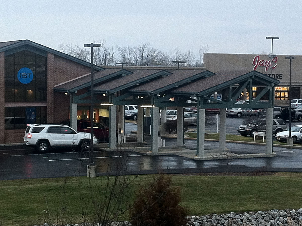
Below an otherwise anonymous commercial strip is activated by an array of diagonal timber-trussed sheds for driving vehicles through. A spiraling diagonal pattern pressed into the concrete from sonotube forms reinforces the diagonality of the roofs.
Here a precursor to the 1990's game of wrapping websites on buildings, a stylized cartoon brick wrap on an unassuming shotgun house in the throes of Columbus. This could be read as DIY pop brick, but might be more usefuly thought of as an object of pixels and contemporary media. It's no Miller House, Eero Saarinen and Alexander Girard's Mannerist High Modern masterpiece, but it's almost there.

October 30, 2011

Green Design Troublemakers

The beginning of the self-parody of the green design movement is upon us. "Green" can now function both as resource conserver and disruptive force: parody saturated with symbolically loaded, eco-friendly green washed content. Such an agenda might best be understood as a mannerist reaction to the Green Design Movement.

Central to this discussion is Peter Hutchinson's Mannerism in the Abstract, appearing first in Art and Artists (1966) and later reprinted in Minimal Art: A Critical Anthology (1968). The article identifies works of art which seem to subtly attack the emerging Minimal Art movement from within. Hutchinson describes these pieces as largely unnoticed, yet profoundly radical in their departure from the purist values of Minimal Art. Just how something could play by the rules of Minimalism while at the same time challenging it's ideals requires extreme intellectual rigor and restraint.

Untitled, Larry Poons, 1960s. (image credit)
"Larry Poon's ovals, while strongly suggesting an undiscovered, perhaps musical symmetry, refuse to rely on such symettry. Instead they leap accross the surface. The eye jumps from one oval to the next, as the eye jumps from detail to detail in a Mannerist facade...the purist philosophy of absolute "rightness" is already breaking down."
Hutchinson unleashes an onslaught of Mannerist reaction to Minimalist Art:

"Anuszkiewicz destroys the extreme classicality of his compositions simply by causing the eye to jolt back and forth...Hinman's convoluted canvases have a curving diagonal space plunging out at the viewer, who must retreat...Ginnever's green and black sculpture appears voluminous. Seen from the side, it reveals itself as a superstructure, a false-front...Grosvenor's giant structures mock other giantist sculptures in a Mannerist way...Valledor's parallelograms lean forward, in a way mocking geometric stability yet retaining symettry...There is no end to the Mannerist love of reversal, double meaning and spoof."

Kazimir Malevich's refined and pure 'Black Square' (1913) paired with Dan Flavin's "dramatic hysterical" take on Minimal Art, 'the diagonal of May 25' (1963).
The purist philosophy of 1960's Minimal Art seems almost as unanswerable as the absolute truths of today's Green Design movement, which seeks to "eliminate negative environmental impact completely through skillful, sensitive design." How could anyone in their right mind reject or even dare challenge a design movement with such lofty ambitions!? A home improvement project/art installation in the Ohio River Valley suggests a possible future for Mannerist Green Design. A developer installed solar panels on his property, blocking the views of his next door neighbor, a builder (who built the developer's house).

The developer is quoted saying, "The only way it would function is to cut down all the trees" ... "It was placed there because that's the only spot where it could collect the rays of the sun and function appropriately."

The builder's wife contends, "I don't know how you do this to somebody. I just don't. We want to retire here. This is our retirement home. And then we have to be neighbors with someone who would do that, for the rest of our life? My question is why?"

Gonzosaint's colorful comments on the article importantly hint at the connections between the self-parody of the green design movement and a capitalist desire for greed à la green:
"Are we actually supposed to feel sorry for this "victim"? Only the enquirer could be this tone deaf. Today is the 10th anniversary of 9/11 and our local paper is "reporting" on the trials and tribulations of some rich strumpet having one of her 3 views obstructed by her even richer neighbor's solar panels. Of course there is no mention of the poor people whose neighborhood was eminent domained and subsequently razed to make room for these monuments to American excess. My only regret is that her neighbor's solar panels aren't in the shape of an extended middle finger."
The essence of the slippery nature of Mannerist Green Design is called out by Tara Dodrill, of the Yahoo! Contributor Network : "Is Neyer [the Developer] a rude neighbor or did he simply place the solar panels in the direct path of the sunshine to fuel his home?" 
Green Design as idea (left) and reality (right). Right Image Credit: The Enquirer/Patrick Reddy.
Hutchinson, in talking about Mannerist Minimal Art, could just as easily have been talking about this solar panel slop fest: "This new sensibility looks at first sight remarkably like the [eco-friendly construction] from which it departs. It appears to the causal viewer as a [solar collecting device]. It is disguised as [required for LEED credit], shrugged off as [malicious]. Behind the charming but "impure" [array] are great disquiet, turmoil, cynicism, and self-doubt."

Mannerist Green Design might also take on the role of the Spite House, or the Spite Fence: a bending of the rules for selfish gain, yielding the architectural equivalent of the exclamation point. Numerous examples exist, from the Richardson Spite House in New York City of 1882 to Atelier Bow Wow's catalog of Pet Architecture in 2002. Mannerist Green Design might contribute to this tradition of building in spite of your neighbor. It will certainly challenge our evolving understanding of natural resource rights (i.e. the right to solar access, public vs. private rights to water, wind leases & easements, air rights, etc.).

Jan Pol's (b. 1894) "Monument to Injustice" (image credit) paired with 1m wide by 10m tall house in Madre de Deus, Brazil (image credit) 
Hutchinson's conclusion is at once both beautiful and deeply dark. It might be one of my favorite pieces of writing on art. It's brilliant in that it gives us an understanding of just why somebody would want to challenge (or disrupt) the Minimal Art, and subsequently, the Green Design Movement:
"Contemporary Mannerist work sometimes gets so extreme in its use of acid color, exaggeration of shape, and in its drama that it appears hysterical. Indeed in today's reaction against Romanticism, against Freudian explanation, against pure logic, these artists see themselves as useless members in a society where everybody is useless. Where art was once the only useless thing, now everything has lost meaning. If the artist himself feels he is losing meaning, no wonder he reacts with hysteria. He does super works with the directionless energy of a hysteric - and the result is often hysteria's attendant paralysis. The coldness, the lack of motion, the acidity of color, the lack of detail (expression), are Mannerist symptoms felt before in other centuries in times of mounting disbelief. Bronzino's human contemporary view will break out into horizons broader than hitherto, views not seen entirely from the human scope. It would be a true Mannerist convention that works done despairingly, that desperately parody, should turn out to be truly significant.
The scientist offers a hopeful world, a world where inevitable progress discovers more and more, a world that gets better and better. This world is sane, stable, and knows where it is going. The Mannerist counters with a world in intellectual hysteria, punctuated by frozen activity, a world where space-time cease to have meaning, a world of soundless gestures, where humans do not live."