Showing posts with label advertisement. Show all posts

June 6, 2010

Society as Spectacle

American Highway Roadmaps from the 60s are perhaps the single greatest cultural artifact from the modernist era.  The purpose of these maps were to encourage multi-day auto trips to discover the vast corners of the country.  They embrace the spirit of modernism by celebrating the triumph of man over nature: the progress of a nation through innovative use of technology.  Seen from the perspective of the ongoing BP oil spill, a technological blooper in the grandest sense, these postcards and maps present an image of society as spectacle: a no longer accurate view of technology as savior. 
 
This playful 1962 South Dakota highway map packs a punch.  Imagine the shocking surprise I received after opening up the map to read this text on the inside cover:
"The Missouri is being gentled. A whole generation of human intelligence, muscle and desire, armies of brute machines, and billions of wealth are transmuting the wild proud river into a vast chain of blue water lakes that stretch across South Dakota. Four gigantic dams - dams so big they beggar the imagination and confound the camera's ability to capture their hugeness - are harnessing the Missouri ... there is a sense of involvement in America, in knowing and understanding a strong free nation whose direction is west and which creates its own future."
The "World's Largest Interchange" in Ohio gives South Dakota a run for it's money.  A family somewhere between these two places must have had a difficult time deciding whether to head east or west.  
 
Concurrently, in 1963, we see an aerial view of the Iowa landscape: a lone highway slices through the agricultural heartland of the country.    

 
Unfortunately, not all attractions seem worthy of visiting to me, but for some reason still warranted a postcard.  Take, for instance, the "Sweeden House Smorgasbord" pictured above...

 
...or the Anderson Clock Exhibit: "An entire room is devoted to this display owned by Mr. H. E. Anderson. We like to refer to it as horology's finest hour. Some are more than 250 years old. All are in excellent condition."

It seems fitting here to conclude a post about artifacts from the American Roadside with Guy Debord, and his 1967 Society of the Spectacle: "In societies where modern conditions of production prevail, all of life presents itself as an immense accumulation of spectacles. Everything that was directly lived has moved away into a representation."

*for more of this, see Postcards From the Future
**I've stolen the same link to Debord's text which was was included in a456's post just two days ago. I'm secretly proud of this, but somehow think that it is a new experimental contemporary/subversive form of plagiarism that should be brought to your attention.
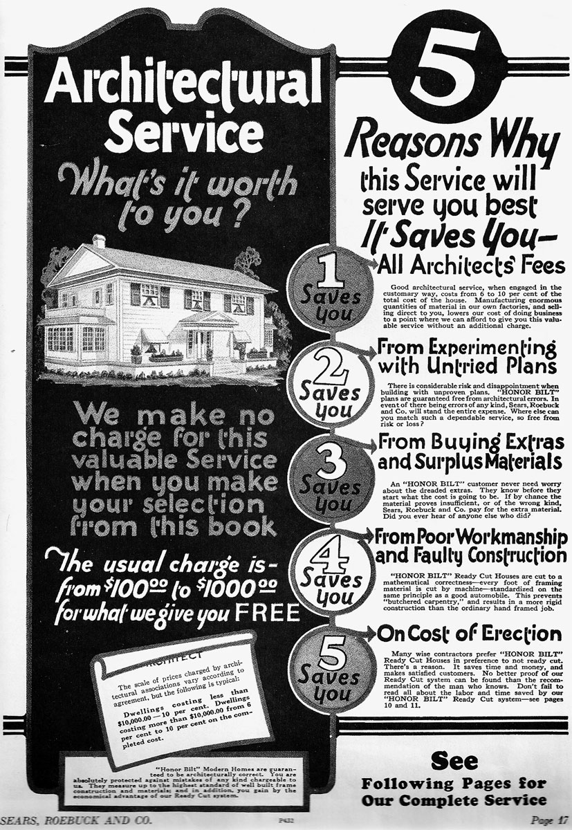
May 16, 2010

Fancy Home Styles

Apologies for an absence of posts lately. I've been sifting through some old Sears Catalogs (circa 1910-1920) and have some curious, but certainly rambling thoughts which quite honestly do the topic no justice at all. Nevertheless...


This advertisement should make architects tremble with fear: "Architectural Service: What's it worth to you? We make no charge for this valuable service..."  It appears that the catalogs would have effectively shut out the architecture profession from operating in the design of suburbia.  Despite being a recklessly naive statement, I still can't help but wonder if Sears' timely role in suburban development doesn't have some affect on today's lack of interest in suburban design and development.


The Sears Catalogs were a sort of super-firm, providing "architecture" for free by prescribing a series of carefully selected styles, 22 to be exact, in a mass-produced method. The perfect compliment to Henry Ford's Model T, which debuted the same year as the first catalog.


Reflecting the nostalgia of an assortment of European vernacular (vernaculaii?), the catalogs exist as a form of early pop art; elaborately conceived objects of desire accessible to a mass audience at a delightful price. But were the Catalogs liked or disliked by practicing architects at the time? And how did they affect the profession?  I can't help but wonder if there were rogue architects at the time who attempted to challenge Sears' model of home production.


Finally, I can't help but wonder if "green" design will embrace the same architecture-meets-capitalism agenda of Sears, Roebuck & Co.  LEED may have already co-opted the system of building by catalog components: a green roof here, bicycle parking there, etc.

December 29, 2009

Hacked Advertisement

This brochure was found along a roadside stop in the middle of Ohio.  Aside from being a ridiculous advertisement, it raises some interesting thoughts regarding appropriation in design and architecture: the "borrowing" of aesthetic ideas, the exploitation of someone else's work for the advancement of an alternative agenda, an "additive" architecture generating unintended meaning through radicalist ad hoc design practices.  Anyway, here is an otherwise anonymous historic brick building monumentally converted to an iconic midwestern memorial.

December 10, 2009

Neo-Venturian Activism, Anyone?

"Suburban sprawl eludes our concepts of urban form.  It isn't enclosed or directed like the space of traditional cities -- it is open and indeterminate. [...] Traditional urban architecture is praised for its "unity" and suburbia is denigrated for its "conformity." [...] In the undefined space of the commercial strip, we find our way through signs and symbols, and in the vast space of suburbia there is a similar need for explicit symbolism." - Robert Venturi


Venturi Scott Brown and Associates’ Signs of Life exhibition – a by-product of their 1970 Yale studio, Learning From Levitown – explored the chaotic topic of American suburban aesthetics.  The messiness of a landscape otherwise unacknowledged by academia and the profession demanded new methods of documentation and analysis.  It just so happens that one of the most exciting aspects of VSBA’s work during this time was the manner in which they adapted their urban analysis techniques to a non-place (suburbia).  I'm referring specifically to the hierarchical maps of signs on the commercialized "Strip" of Las Vegas, their overwhelmingly informative image-boards, and yes, even those infamous scenes of banal suburban spaces speaking (via glorified cartoon bubbles) about the multitude of – often ironic – juxtapositions of architectural styles found embedded within the fabric of our everyday lives.  


Experimentation with documentation and analysis emphasizes the value VSBA places in understanding context – that immediate and no-so immediate surroundings can inform and interact with a specific building and visa versa.  And nowhere is this lesson more critical than in the suburbs where "messiness" and "chaos" are the only adjectives to describe the product of sprawling, vehicular-scaled spaces with a developer-led haphazard eclecticism of nostalgic architectural styles and time periods. There is something to be said for the blatant, matter-of-fact manner in which VSBA communicates how the built environment communicates to us.  It's almost as if you don't know whether you are expected to laugh or take notes.  This type of "serious-but-funny" inquiry strikes me as both dynamic and richly layered, and a characteristic theme of VSBA's work as a whole.  Such qualities are evident in the 1975 City Edges Planning Study (Philadelphia).


It was as if VSBA’s playful cartoon bubble descriptions, originally a fantastical thought contained within the walls of the art museum, were all of a sudden released into the wild.  Now the billboards surrounding prominent roadways could be exploited for the dissemination of information to passersby about their environment. 


VSBA’s seminal work in articulating the relationship between constructs and context is neither wholly unique to VSBA nor at the leading edge of contemporary theory.  On the contrary, their work builds upon a line of thought that was shared by - among others - Renaissance-era Mannerists who dealt with themes of dialogue, play, and communication centuries ago.  Today, nearly forty years after VSBA's work with signs and symbols in the American city, street artists are subversively working with the same ideas.


Alas, the economy we are in has afforded us the blessing of vacant advertisement space: and no media is left out (television, print, and billboard space is all up for grabs!)  This provides an extraordinary opportunity to revisit VSBA’s extra-ordinary work concerning signs and symbols contained within the American landscape.  No longer will billboards along thorofares and highways needlessly promote messages of local and national corporations; of private interests and narrowly held points of view. Rather, the space can be used to promote a more civic and nationalist agenda at a time when the entire country is recovering from the worst of the economic downturn.  At the very least, Venturi-inspired environmental graphics can contribute to and expand upon the American landscape, rather than adding a particularly inauthentic quality to our beloved towns and cities. 

I'll leave you with these rather simple proposals for unassuming billboards I pass every day on my commute to work.  Rather than spending the time to photograph each case study, I've found Google Street View to be a much quicker and perhaps easier-to-digest method of representation.  These were influenced both by VSBA's passion for discovering the signs and symbols of American life, and street artists attempts to reconfigure advertisment space in the public sphere.  A sort-of Neo-Venturian Activism, I guess?!

Figure 1.

The first example occurs at a prominent intersection just before the entrance to a highway.  The billboard attempts to point out a historic hilltop neighborhood, which happens to be ironically partially blocked by its own form.


Figure 2.

Next, we see a spectacular downhill approach to the city, framed by painted ladies staring longingly at the city below.  This image is wholly a representation of "San Francisco" - both in spirit and content.


Figure 3.

With the silhouette of the city skyline beyond, this billboard references the vacant lot immediately in front of it.  It favors the extra-ordinary over the extraordinary, and for that I believe VSBA would be proud.


Figure 4.

Finally, a billboard that challenges its immediate surroundings - those which have become quite uninteresting and dull over the years.

December 4, 2009

Decorated Sheds and Other Things


In the spirit of the upcoming holidays, the Mockitecture WebLog has designed a series of Christmas cards!  A collection of beautifully photographed modernist buildings have been unnecessarily decorated with festive holiday ornaments.  Mies' Seagram Building is topped with a monumental santa hat - and a minimal "clip art" santa hat, at that!  You're welcome, Mies.

Below, Mies' Farnsworth House is cluttered with - among other things - an extra-large inflatable Santa Claus.  It's quite surprising how unrecognizable the building looks under all of that applied ornament.  While designing this image, I came to the realization that high modernist buildings make fantastic decorated sheds.  Their simply pure forms  are essentially blank canvasses for the artist to attack.  Perhaps in the near future we will all be adaptively reusing minimalist glass and steel frame Miesian buildings into neon-clad hot dog stands?  I can only hope so...


I digress.  Next, a view of the Western Approach Car Park in Plymouth (Devon County, UK).  In this surreal scene, massive candy cane columns emerge out of the top deck of the brutalist parking structure.  Meanwhile, Santa is desperately clinging to a rope (detail photo at bottom) presumably because parking garages are lacking chimneys - which happen to be Mr. Claus' most comfortable form of egress.


Upon further research, I have discovered this is the lowest priced car park in Plymouth and is located adjacent to a Toys R Us!  Perhaps Santa was stealing borrowing toys?  As for the candy cane columns, I think they should be added to all brutalist buildings during the holidays.  How could you disagree!?