Welcome back. Another example of classic B-side design is the Cummins Occupational Health Center by Hardy Holzman Pfeiffer Associates (1973). The firm was notorious for its playful, purposeful rejection of the International Style. All of the components can be seen in this building.

Above, the use of diagonals and a whimsical extension of the reflective glass creates a canopy. The sloped covering resembles the diagonals used in residential construction of the period, and this pop architecture reference incorporates multiple styles in a collage. The best part, however, is the structural joke being played here. The tension elements tie the diagonal cross brace back, creating a point of support for the canopy above the circular driveway. This entire sculptural structure is designed to eliminate a column which would otherwise be located in the drive. Now there is a large column in the sidewalk. It is a reminder that while the architecture is world-class in Columbus, the urbanity is not. What it lacks in true urban space, it makes up for with a Dan Kiley lawn. Actually, the same could be said for all of Columbus.

More dynamic Modernist elements, stylized. Technology and building systems are exposed to express the building as a machine. Each component is a different color. These are Cummins' corporate colors, but the original structure was a vibrant-ish mix of green and blue. (A 2008 flood did significant damage to the COHA.) A nurse who gave us a tour did not understand the original color choices, nor the low slung furniture, which she described as "Something you would see in a 70s night club". But she astutely followed up with, "But thats the way they did things back then, I guess."

HHP often deconstructed the spaces, taking the free plan to new heights. Here, a ramp connects open spaces, waiting areas, exam rooms, and peripheral hallways. This deconstruction of layout is expressed with the proto-deconstructivist architecture. The plan is a shifted grid, and prefab industrial materials are reinterpreted, a simultaneous rejection and acceptance of Modernism, respectively. The sculptural air handling system reminds us that we did indeed land in the future, but it wasn't quite the kind of utopia we had expected. Below, some beautiful precast concrete detailing, in the manner of High Modernism.

Below, Mount Healthy Elementary is another masterpiece by Hardy Holzman Pfeiffer Associates (1972), located 20 minutes outside of Columbus returns to the nostalgic idea of the one room school house. Here the geometric purity of Warnecke's McDowell (1960) was remixed, shuffled about, and smushed together to create less formal, more varied spaces for learning. The exterior evokes all of the industrial charm of the ubiquitous Midwestern city in its deployment of repetitive sawtooth forms. Mt. Healthy's color coordinated systems and pod-like office appendages add a mysterious blend of '70s Japanese and Dutch to the place. One of several pieces in Columbus, such as Paul Kennon's SBC Switching Station, to show an evolution of architecture in the late 60s and early 70s. The exposed structure (shown here), bright colors, and formal pastiche contrasts nicely with Columbus' earlier elementary schools, such as Schmitt Elementary.

Below is Becker's Root Beer, a drive-in which @mockitecture worked at in High School. It is a very nice place to dine while perusing architecture on a spring or summer day. Beware, however, that it is only open from roughly March to October.

A pagoda-like restaurant services the canopy, which is supported by beautiful googie columns. It is a contemporary of Columbus' famous buildings, and it's LA style urbanity reminds us exactly what was going on during the 50's and 60's. Cars, more specifically American cars, dominated pop culture.

I recommend the Coney with cheese and a root beer. Or if you prefer pizza, below is Noble Romans, one of the greatest commercial buildings to ever be built.

It is in close proximity to Venturi's Fire House #4, and it employs a curious folly-building to create a covering for the drive thru and a sign for the restaurant. The small shard building has a door (not shown) and is used for storage. It is a (literal) shed, a sign, and a structural support. Sublime. Also note the different fonts used on each "pizza".


The bold move of splitting such an ordinary building, breaking the simple mass apart, is celebrated by the appliqué of a supergraphic along the center crease.

The supersuper logo graphic faces the street, which happens to the in the rear of the building. This causes a tension between the communication and utility: the messiness of contemporary life is celebrated by the collision of a golf ball tee into air conditioning units. A massive evergreen, curiously planted in front of the logo towers two-and-one-half-fold over the Club. This building is both heroic and ordinary at once.

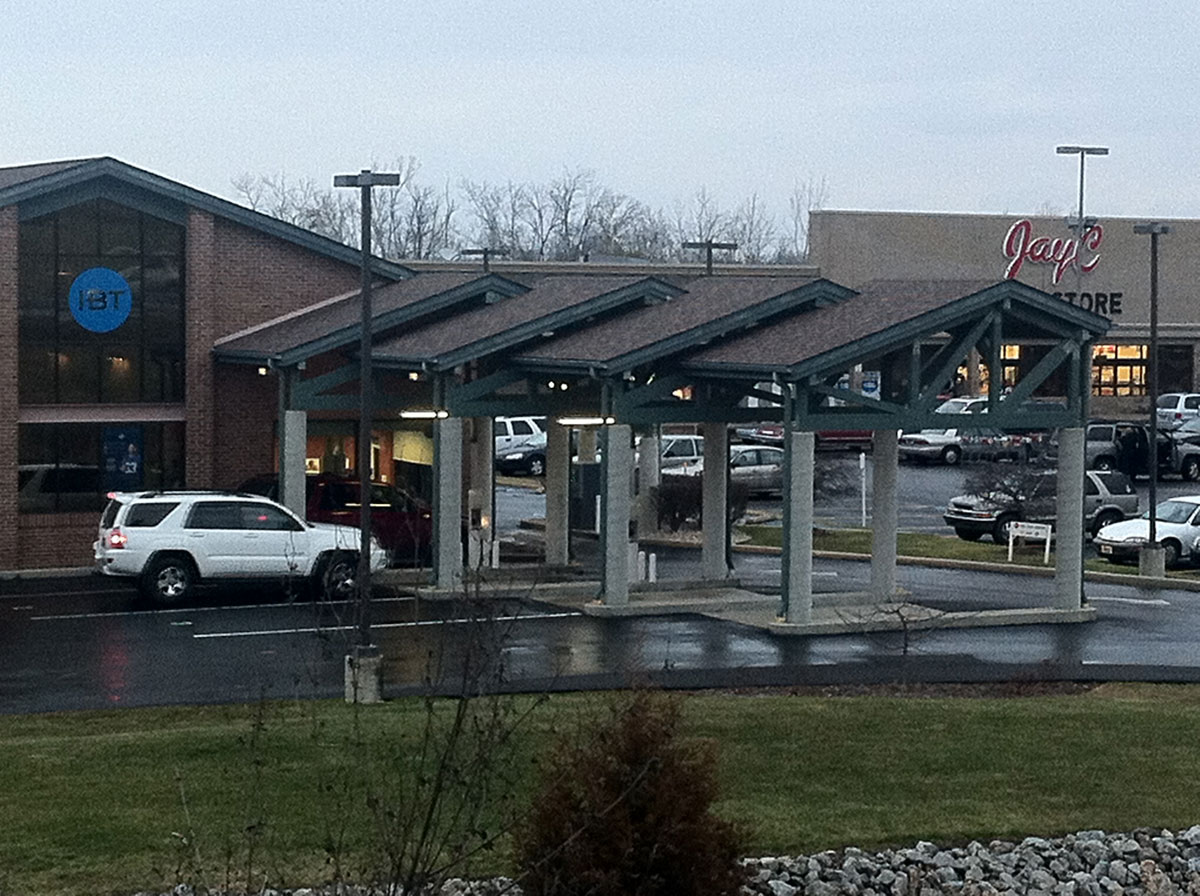
Below an otherwise anonymous commercial strip is activated by an array of diagonal timber-trussed sheds for driving vehicles through. A spiraling diagonal pattern pressed into the concrete from sonotube forms reinforces the diagonality of the roofs.
Here a precursor to the 1990's game of wrapping websites on buildings, a stylized cartoon brick wrap on an unassuming shotgun house in the throes of Columbus. This could be read as DIY pop brick, but might be more usefuly thought of as an object of pixels and contemporary media. It's no Miller House, Eero Saarinen and Alexander Girard's Mannerist High Modern masterpiece, but it's almost there.

No comments:
Post a Comment